Interested in this domain and website? Contact [email protected]

Deal Dragon
Deal Dragon
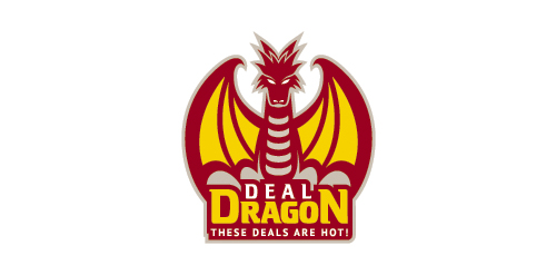


- Get unique ready made logos for $99.99
- Logo design for coupons and discounts site.
- Featured: 08/07/2011
- Stats: This logo design has 24991 views and is 0 times added to someone's favorites. It has 10 votes with an average of 3.60 out of 5.
Designer
Comments: 3
Leave a Reply
Our logo inspiration gallery will give you the creative boost you're looking for. Get your daily dose of logo design inspiration to work on your own logo design projects and get your business going. Be amazed by our logo designers and their brand guidelines. We are here to help you impress your clients and our fellow designers. Professionalize your logo design skills and get yourself to a new level. Browse our logo design gallery and discover all the new logo design trends and much more. We know you love logos!
Clean art, but not a logo.
Replyyes..so nice like “logo” but is not a simple logo…
ReplyThanks for the input guys! Actually the client wanted a complex logo instead of simple, and they gave us some examples of ‘hockey/sport’ logo for our references. ;)
Reply