Interested in this domain and website? Contact [email protected]
Exclusive Format
Exclusive Format

- Get unique ready made logos for $99.99
- Logo for the company producing the paper in various formats, colors and textures.
- Submitted: 05/11/2011 • Featured: 07/08/2011
- Stats: This logo design has 6360 views and is 1 times added to someone's favorites. It has 13 votes with an average of 3.77 out of 5.
Our logo inspiration gallery will give you the creative boost you're looking for. Get your daily dose of logo design inspiration to work on your own logo design projects and get your business going. Be amazed by our logo designers and their brand guidelines. We are here to help you impress your clients and our fellow designers. Professionalize your logo design skills and get yourself to a new level. Browse our logo design gallery and discover all the new logo design trends and much more. We know you love logos!


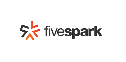
I keep coming back to this one. Good concept. How about some more negative space between the orange fold and the square and F? Maybe make the orange a texture of some kind?
Be bold with that negative space. It’ll be easier to read at smaller sizes.
ReplyThanks HerbyDerby!
It would be possible to make more places between F and an orange triangle but then letter F breaks.
If to look narrowly, it is appreciable that all lines in a sign are constructed exactly on a grid :)
Replygreat!!
ReplyNice! Although if it was me I would have lined out the text with the letters from the mark instead of the top and bottom of the mark itself.
ReplyGood concept.
ReplyI like the paper folds style, nice concept
Replylike!
ReplyThanks guys!
ReplyNice concept!
ReplyVery Neat and pixel perfect… Good Job Artvento!!
ReplySuper-format, Dima!
Reply