Interested in this domain and website? Contact [email protected]

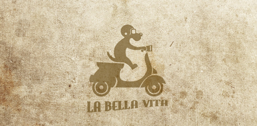
la bella vita
la bella vita


- Get unique ready made logos for $99.99
- The good life! .. logo inspired by the beautiful Roman life of the '50s and '60s as the famous Fellini film. To make the logo a lot of fun and interesting I put a dog on the famous Vespa, a symbol of those years. The logo sums up the light-heartedness and joy, with a very humorous tone, in those years logo suitable for all business-like look and inspire joy in their brand
- Submitted: 04/20/2011 • Featured: 04/30/2011
- Stats: This logo design has 6031 views and is 0 times added to someone's favorites. It has 25 votes with an average of 3.96 out of 5.
Designer
Comments: 8
Leave a Reply


Our logo inspiration gallery will give you the creative boost you're looking for. Get your daily dose of logo design inspiration to work on your own logo design projects and get your business going. Be amazed by our logo designers and their brand guidelines. We are here to help you impress your clients and our fellow designers. Professionalize your logo design skills and get yourself to a new level. Browse our logo design gallery and discover all the new logo design trends and much more. We know you love logos!
molto bella la vita! :))
ReplyNice work Manu :)
Replyheah, great work!:)
ReplyLooks awesome! Congrats! :)
ReplyLOGO OF THE MONTH AT BRANDSTACK!
Replyha, ha, good work!
ReplySuper!
ReplyClever doggy)
Reply