
Logo inspiration
Inspirational logos
Day's logo


elite kindergarten

Antivirus for android
Coffee Bar


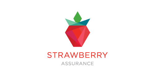
Strawberry Assurance is a consultancy firm specialising in risk assessments, security, installation and disaster recovery of IT systems and networks. The logo mark was constructed using triangular shapes to represent the 3 point process in which Strawberry Assurance operates: risk assessment, undertake required tasks to secure IT systems and provide in-house training to the organisation where applicable. The bold angular shape of the mark combined with a carefully selected logo type and colour palette provides the company a with a powerful and authority presence whilst remaining friendly and approachable.
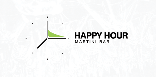
"Happy Hour | Martini Bar" Logo Design by EvolveRed.com Martini + Clock
Owned by dracula :)
For more: https://www.behance.net/LucasCassim
Logo for a candy shop
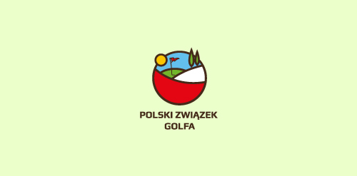
second concept for Polish Golf Union

Logo for the photo studio.
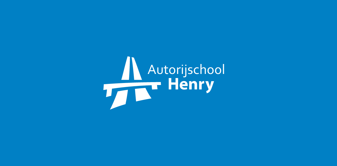
Driving school in The Netherlands. The logo features a highway icon in the shape of an H and A.

BN (Be Naya) Monogram Exploration
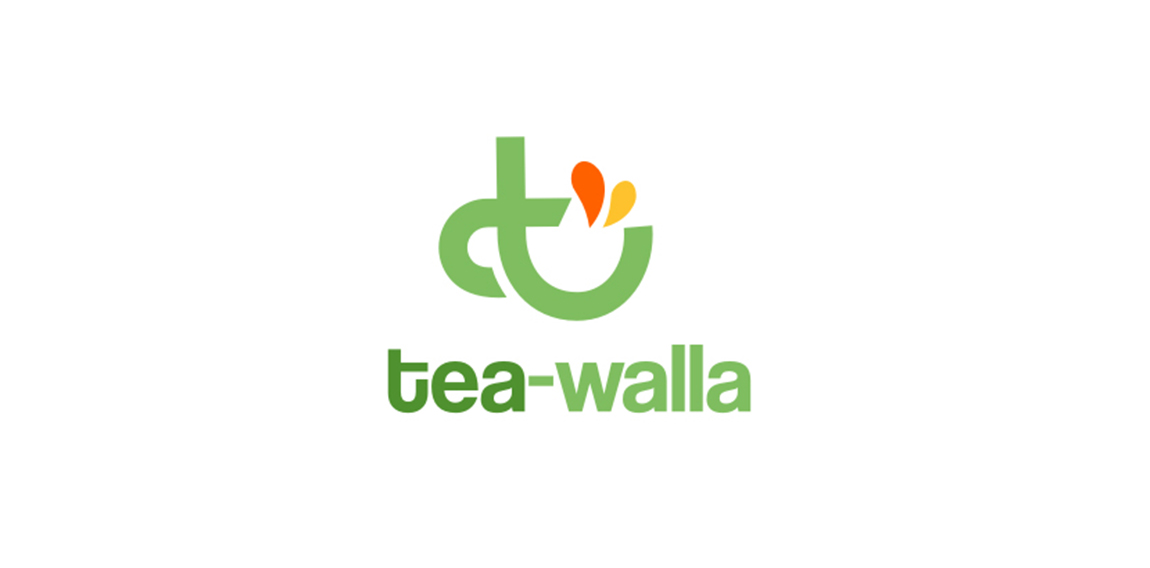
tea walla logo
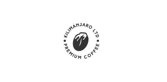
A mark that created from combination of 'Mount Kilimanjaro' and 'coffee bean' shapes.
New logo for Webkolm web-agency. Webkolm is an Italian Web Agency based in Trentino. They develop website and other web stuff "into the wild". The agency is formed by three people: an UX Designer a Crazy Programmer and an Social Media Manager & SEO Specialist. Three different mind with different skills one identity. The old logo rapresent a "UI arrow" shaped like pine. The new logo mantain this elements but in a modern way thank to the "Impossible triangle structure" ispired to Escher works. The font is "The Sans" with a semi-serif that caracterize the K word.

Konscience, a soon-to-be student domotic project.

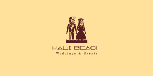
Created for a Hawaiian weddings and events organizer, inspired by Tiki art.
☆ HONORS ☆

-
shtef-sokolovich
190 logos
-
Boldflower Design Studio
189 logos
-
Ailton Marques
115 logos
-
Light Rainer
114 logos
-
Alek • Triptic.pl
107 logos
-
almosh82
96 logos
-
sadany
96 logos
-
Duminda Perera
93 logos
-
pizelato™
91 logos
-
Aleksandar
91 logos

Recent comments
حسین:
please send me...
chirag_j:
Hello is the above issue resolved?...
mrgraphics:
great logo...
Aleksandar:
Thank you Gile!...
fraGile:
Thanks a lot!...
Marko Bulatovic:
Great work!...
Popular tags
Our logo inspiration gallery will give you the creative boost you're looking for. Get your daily dose of logo design inspiration to work on your own logo design projects and get your business going. Be amazed by our logo designers and their brand guidelines. We are here to help you impress your clients and our fellow designers. Professionalize your logo design skills and get yourself to a new level. Browse our logo design gallery and discover all the new logo design trends and much more. We know you love logos!