
Logo inspiration
Inspirational logos
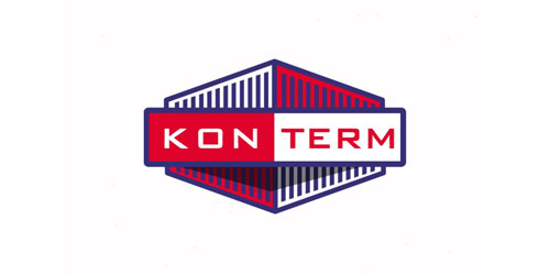
Project created for a company which works in the sphere of warehousing ISO- containers. http://logomachine.net/


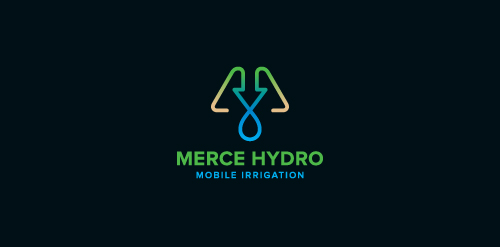
Merce Hydro, a mobile irrigation company based in Northern Victoria, Australia specialise in redevelopment of drought effected areas for the purpose of farming & residential properties. The Mark is based on the use of a water drop, an arrow, pipes & finished off with an M. The arrow symbolises function & the arrow/drop cross section symbolises design - both core factors in engineering & invention of their systems. Green represents growth, their aim. Brown represents destination (drought area) their market. Water represents sustainabilty, their long term plan, and finally the pipe represents management, their ongoing analysis & monitoring of their network.

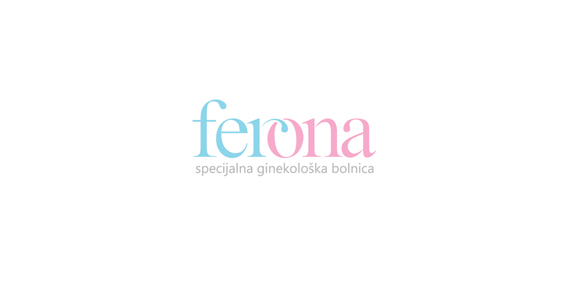
"Ferona" (fertility clinic)- logo. Idea: part of a letter "r" represents a spermatozoon wich enters the letter "o" that represents an ovum.
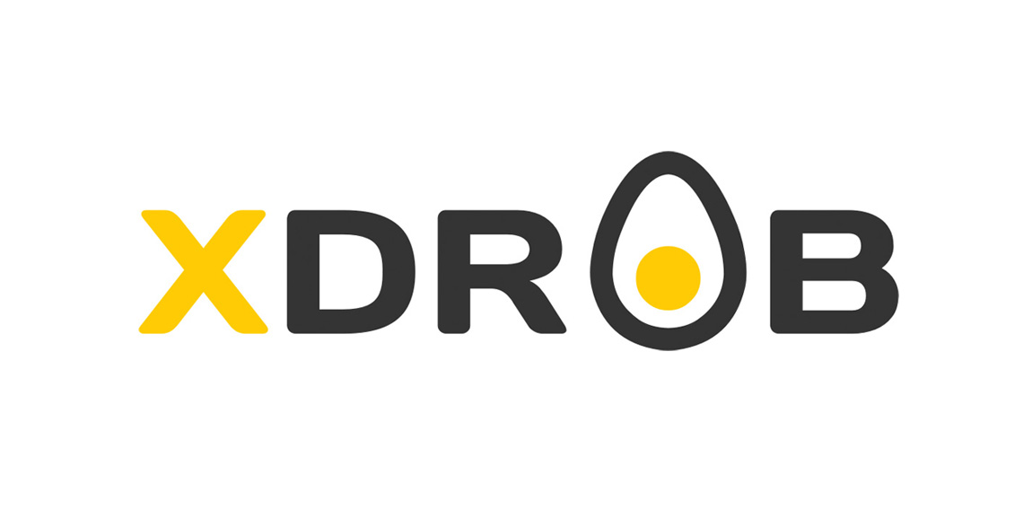
XDROB logo
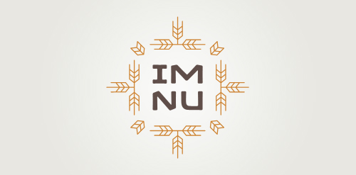
New logo concept for the barley & rye malt based drink »im nu«. See the process behind the custom type here: http://dl.dropbox.com/u/14259079/im_nu_process.png Big view including »Chocolate
Logo for kids furniture brand.
fun with cigarettes ;)

http://wp.me/s4571j-senco
New general logo for an online Expert Witness Directory, incorporating a themed pictogram. A very challenging project, but immensely pleased with the result, as is the client, which always helps. Finding that 'apparently simple' solution proved painstaking, but when I look at the icon now, it looks so easy. Just create the Good Book/and or reference Directory out of the shape of a D, and place the left hand (giving oath etc) on it. Ta daaaa… Anything but ta daaaa tho. Fonts used for Witness Directory: Kefa II Pro Bold and tag-line: Zona Pro Italic, both purchased from Myfonts.


An additional concept for the same project here, http://samadarag.deviantart.com/art/Nineteen-455034919 More on Behance, https://www.behance.net/gallery/17196859/Nineteen-Monogram
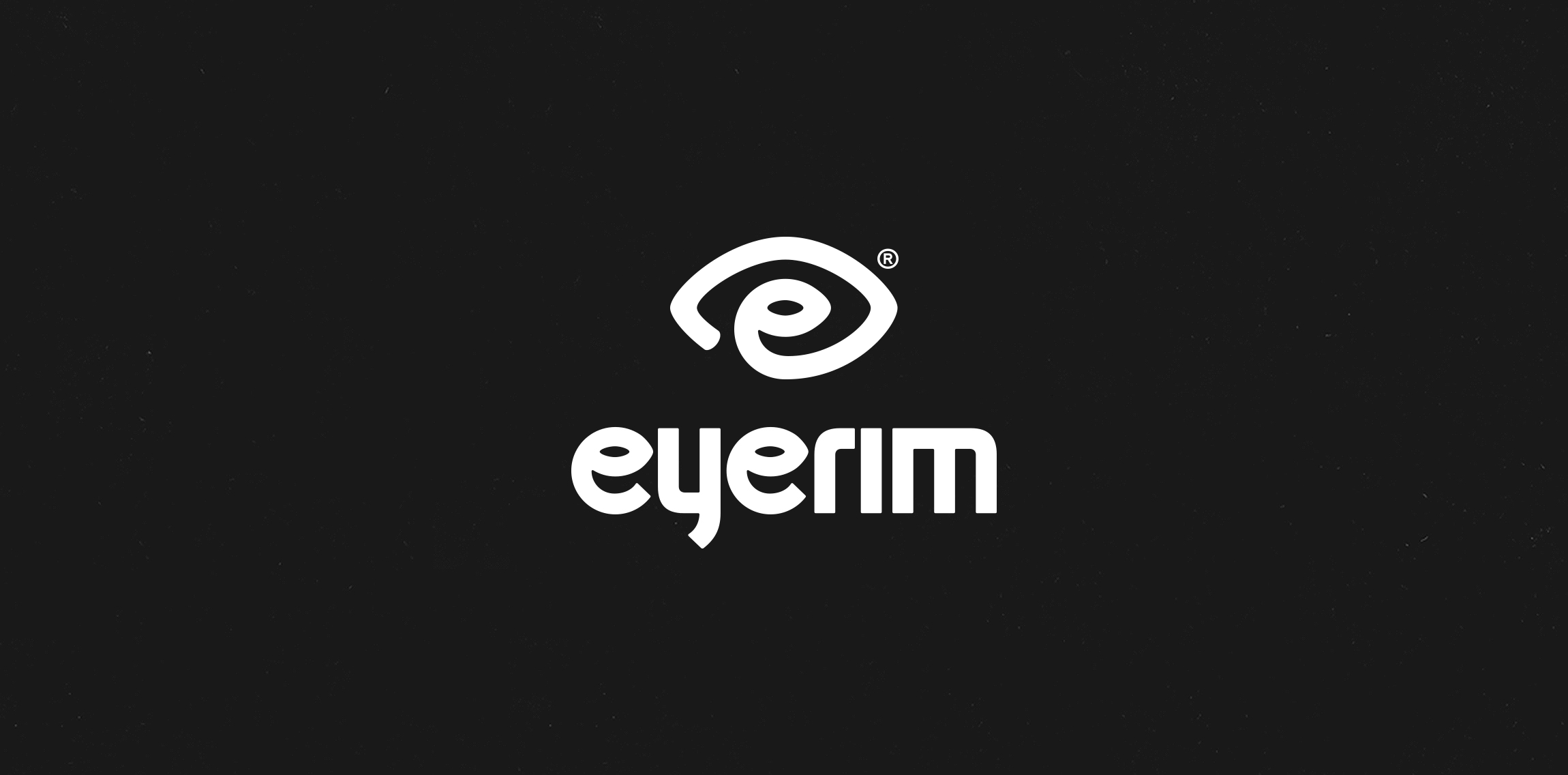
Eyerim is fashion eshop selling designer eyewear across Europe. Basic symbol of the new logo is eye. It is the combination name (eyerim), symbol (eye) & initials (e).
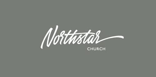
Logo for the baptist church from Panama-city, Florida
Owlstand is an online platform which allow users to set up their online exhibitions
Ingenious and simple brand. For sale!
Logo for little pension in Poland mountains. ROZA comes from the first name of owner RÓŻA which mean in english ROSE. Custom typography.

Cici Corner - Restaurant
Football Club
"Mermaid" is the name of a seaside resort.
Logo perfect for races and speeds. For sale.
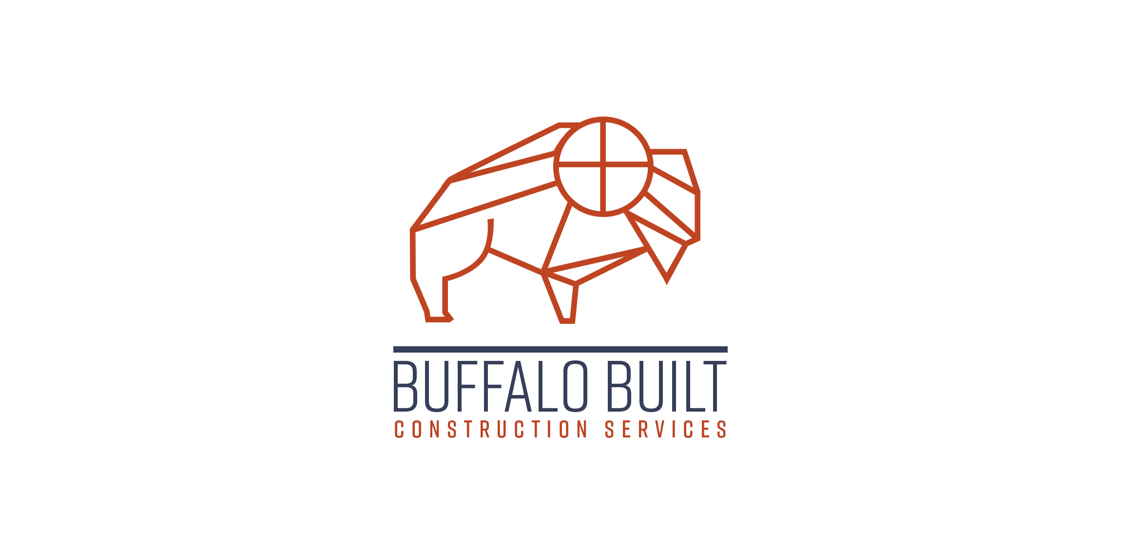
Concept logo design for a client in the construction and building industry here in St. Louis.
logo design for a rock band
☆ HONORS ☆

-
shtef-sokolovich
190 logos
-
Boldflower Design Studio
189 logos
-
Ailton Marques
115 logos
-
Light Rainer
114 logos
-
Alek • Triptic.pl
107 logos
-
almosh82
96 logos
-
sadany
96 logos
-
Duminda Perera
93 logos
-
pizelato™
91 logos
-
Aleksandar
91 logos

Recent comments
حسین:
please send me...
chirag_j:
Hello is the above issue resolved?...
mrgraphics:
great logo...
Aleksandar:
Thank you Gile!...
fraGile:
Thanks a lot!...
Marko Bulatovic:
Great work!...
Popular tags
Our logo inspiration gallery will give you the creative boost you're looking for. Get your daily dose of logo design inspiration to work on your own logo design projects and get your business going. Be amazed by our logo designers and their brand guidelines. We are here to help you impress your clients and our fellow designers. Professionalize your logo design skills and get yourself to a new level. Browse our logo design gallery and discover all the new logo design trends and much more. We know you love logos!