
atomicvibe
 Joined November 2010
 19 logos
 http://www.atomicvibe.com/
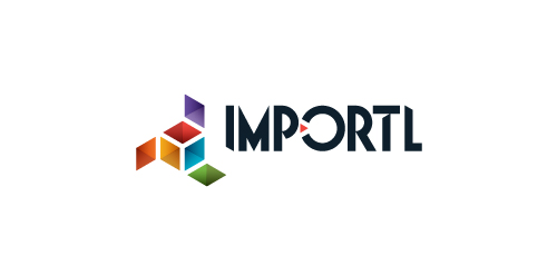
This is a logo for a completely fictitious entity named IMPORTL, which could be an open source web development site, or some type of developer software.
The idea is that the triangular facets form a series of open holes, or "portals," in multidimensional space. The central facets can also be seen to form a cube which is open on three sides. Lying before each opening is another opening on that side's respective "floor," yet, in an Escher-like paradox, where spatial orientation is an irrelevant construct, there is no floor. There is no up, down, left, right, back, or forth. This hyperspatial environment suggests infinite possibilities for the arrangement, manipulation, and exchange of data.
For color, the idea is that the primary colors that form the central cube beget the secondary colors that rotate outward, suggesting expansion, transformation, evolution.
The mark employs a custom typeface that compliments the angularity of the mark.
Click here to see the case study for this logo, which chronicles its development, and includes full design rationale, sketches, electronic roughs, and alternate designs.


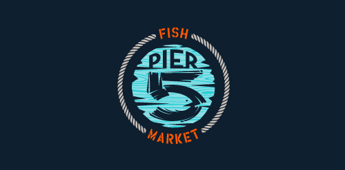
This logo is for a completely fictitious fish market.
The idea came to me when I discovered that it was possible to achieve a fish shape in the negative space within the bowl of the number 5. Dubbing my hypothetical company Pier 5 Fish Market, I created this illustrative mark in the hopes of really capturing the spirit of the nautical and maritime aesthetic. Type is custom for "Pier" and also the number 5, which is hand-rendered to look like it was painted on a wooden sign with a very wide, worn-out, thick-bristled brush. While it was important for the fish to show in negative space, it needed to look like a seemingly happenstance result of logical, real-world brush strokes. This is the minimal, alternate version of this logo.
Click here to see the case study for this logo, which chronicles its development, and includes full design rationale, sketches, electronic roughs, and alternate designs.
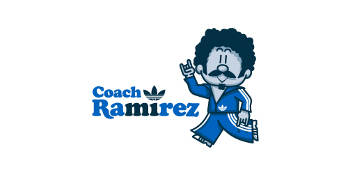
Fictional logo for an Adidas-themed résumé. This is in no way affiliated with Adidas.
Earlier this year, Adidas Originals had an open Design Director position in their Portland HQ, and, being a lover of the brand, I decided to apply. To demonstrate not only my skills as a graphic designer, but also my knowledge and respect for the adidas brand and its legacy, I designed a self-promo booklet (a highly-conceptual adaptation of my current résumé) that is aesthetically inspired by adidas Originals marketing brochures. The booklet chronicles the accomplishments of a fictional alter-ego, Coach Ramirez — an adidas track suit wearing, afro'd, mustachioed designer — and is written as if he's actually the Design Director at adidas Originals. Sadly, I didn't get the job.
Click here to view my Flickr stream for full design rationale and additional images.

This is a logo for a completely fictitious entity named IMPORTL, which could be an open source web development site, or some type of developer software.
This wordmark features triangular facets — symbolic of the flow of data — that point inward toward the name, reinforcing the namesake.
The mark employs a custom typeface that compliments the triangle shapes.
Click here to see the case study for this logo, which chronicles its development, and includes full design rationale, sketches, electronic roughs, and alternate designs.
Unused proposal for an education-based initiative to reconnect with participants of a 50 year-old national survey of high school student aptitude in math, reasoning, and language. The current initiative aims to share these participants' stories from the past 50 years, and the collected data could be used in a variety of academic, economic, sociological, and health-related ways.
This mark is steeped in uplifting, motivational symbolism. It's constructed such that it could represent two hands clasped, two birds in flight, or even one hand cradling or releasing a bird. The hand-drawn line quality, typography, and offset color evoke a nostalgic '60s feel. Unused proposal.
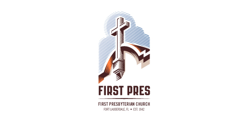
Redesign of the church's old logo in a stylized, illustrative manner, making it more welcoming, contemporary, friendly, casual, & upbeat. Client specified a rendering of the church’s architectural arch and cross in the perspective in this photo, and required an emphasis on the church's nickname, “First Pres."
Here, crisp, exacting vectors emphasize the architectural soundness of the church — a metaphor for the concept of faith as the solid foundation in one's life. This design makes use of hatching to add gradient dimensionality, enabling it to easily reduce down to 1-color. Colors are indicative of the building itself, including terracotta roof. Check my Flickr case study or Dribbble for more images, detail, and full design rationale.
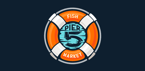
This logo is for a completely fictitious fish market.
The idea came to me when I discovered that it was possible to achieve a fish shape in the negative space within the bowl of the number 5. Dubbing my hypothetical company Pier 5 Fish Market, I created this very maximalist and illustrative mark in the hopes of really capturing the spirit of the nautical and maritime aesthetic. Type is custom for "Pier" and also the number 5, which is hand-rendered to look like it was painted on a wooden sign with a very wide, worn-out, thick-bristled brush. While it was important for the fish to show in negative space, it needed to look like a seemingly happenstance result of logical, real-world brush strokes. In the full lockup, the addition of the life preserver takes less emphasis off this gimmick, allowing one to slowly discover the fish.
Click here to see the case study for this logo, which chronicles its development, and includes full design rationale, sketches, electronic roughs, and alternate designs.
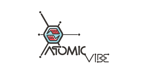
Logo for my art & design studio.
I define ATOMICvibe as the "a-HA!" moment of clarity in the creative process. Like nuclear fusion, it's when tiny ideas coalesce, and then explode into beautiful design.
The logo visually depicts this creative reaction. Forming abstract A & V shapes, the converging hands cradle the tiny beginnings of a big idea, fusing them until they discharge a shockwave of creativity. The custom type, designed to perfectly integrate with the mark, is meant to symbolize electron paths. Heavily inspired by retro imagery from the Atomic Age: science, the Space Race, Sputnik, the iconic George Nelson Ball Clock.
Click here to see the case study for this logo, which chronicles its development, and includes full design rationale, sketches, electronic roughs, and alternate designs.
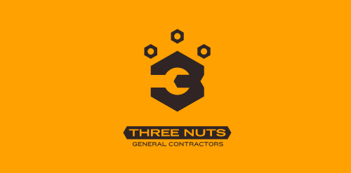
This logo is for a completely fictitious entity named Three Nuts General Contractors.
The idea for this brand came to me when I was out and about in the world, and saw a contractor's work van drive by. As I looked at the number 3 in the telephone number on the van, I started thinking about how a cleverly constructed 3 could reveal a wrench in negative space.
Using a hexagonal bolt nut as my main source of inspiration, I thought of a whimsical name which would support the concept I had in mind. In this hypothetical situation, the "Three Nuts" could be a team of three general contractors.
The icon is built from the angles of the bolt nut, and the entire mark should evoke a heavy industrial feel; something that could be stamped into metal, etched into wood, or simply affixed on the side of a work van.
Click here to see the case study for this logo, which chronicles its development, and includes full design rationale, sketches, electronic roughs, and alternate designs.
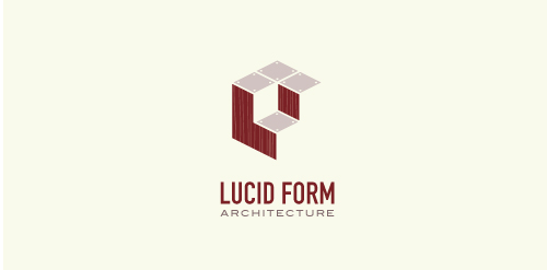
This logo is for a completely fictitious architecture studio called Lucid Form Architecture.
The icon is based on an optical illusion of a cube within a cube. Primarily, the form depicts a big cube, made of wood walls and metal-plated top surfaces, with a notch cut out of the center, resulting in a 3-D "L" shape. However, the longer one looks at this, perception begins to shift, resulting in a couple of different interpretations: 1) a small cube with a wooden wall and metal-plated bottom, in the corner of a room, hovering near the top of a tiled ceiling; 2) a room, tilted 90° clockwise, with hardwood floors, tiled walls, and a cube with a wood countertop and metal-plated side on the floor in the corner. This perception shift is important to the name, because it presents an ironic twist. To make "lucid" means to make clear, and while the icon seems to initially baffle and confuse, it ultimately encourages the viewer to challenge his or her preconceived notions of "perception." So too is the Lucid Form methodology for creating seeming impossible structures.
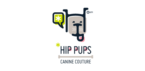
This fictitious company logo is the result of happenstance typographic exploration. I was playing around with H and I letterforms set in Platelet, and, after placing the I within the H, I noticed that it started to look like a dog face. After some modification, and with the addition of a curved P for an extended dog tongue, the resulting typographic illustration spelled "HIP." I thought it would be fun to name this fictitious company Hip Pups, which could be a shop that sells high-end dog accessories. The Registered symbol is integrated creatively into the mark by spelling "RUFF!"
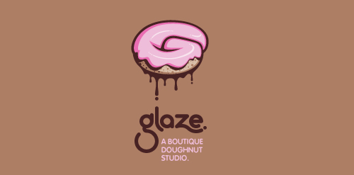
This is a totally fictional company that I refer to as "a boutique doughnut studio." I envision it as a trendy, metropolitan bakery that allows customers to glaze and decorate their own unique doughnuts. I wanted this to look really tactile, gooey, and sweet - like you really want to take a bite. Type for "glaze" is custom, and reflects the roundness of a doughnut. Click here to view my Flickr stream for full design rationale and additional images.
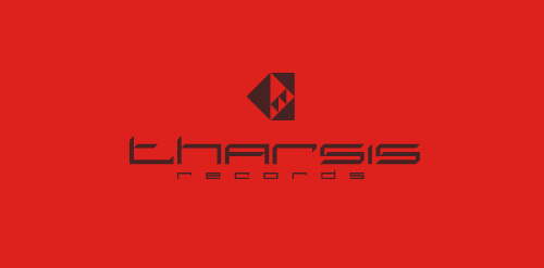
Unused proposal for an electronic dance music label, specializing in Tech House and Electro.
The name is taken from the Tharsis region on Mars, the largest volcano range in our solar system.
The symbol represents the blips and bleeps of the electronic music. Color is indicative of Mars. Custom type coincides with the roundness of the dots, and reflects the synthetic techiness of the music.
Click here to see the case study for this logo, which chronicles its development, and includes full design rationale, sketches, electronic roughs, and alternate designs.
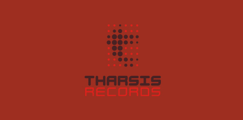
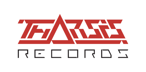
Unused proposal for an electronic dance music label, specializing in Tech House and Electro.
The name is taken from the Tharsis region on Mars, the largest volcano range in our solar system.
The symbol is a stylized, geometrical representation of the unique arrangement of the Tharsis volcanoes, while the individual facets can be seen to represent movement in music. The type is custom, and reflects the 45 degree angles in the symbol. Color is indicative of Mars. Overall, I wanted the aesthetics of the mark to coincide with the synthetic techiness of the music, but I also wanted it to look very futuristic and sci-fi, as if it were an emblem on a Martian spacecraft.
Click here to see the case study for this logo, which chronicles its development, and includes full design rationale, sketches, electronic roughs, and alternate designs.
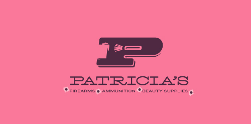
This logo for a completely fictitious company started when I noticed that the negative space with the letter P set in the typeface Blackoak looked a bit like a gun firing a bullet. This got me thinking of how interesting it would be if there were a super-girly, female-owned and operated boutique, catering only to women, which sells not only firearms and ammunition, but also beauty supplies. Everything a modern woman needs! Hey, if you're gonna make up a logo and a company to go with it, why not have a little fun with it? Here, the left side of the P reveals the profile of a gun barrel in negative space, while the negative space within the bowl of the P reveals a makeup brush, which doubles as a bullet being fired. The P mark, based on the Blackoak letterform, is constructed by hand, and the type for "Patricia's" is based on Archive Antique Extended, and is also constructed by hand. I did this because I wanted rounded corners and edges to give the logo a more feminine touch.
Click here to see the case study for this logo, which chronicles its development, and includes full design rationale, sketches, electronic roughs, and alternate designs.
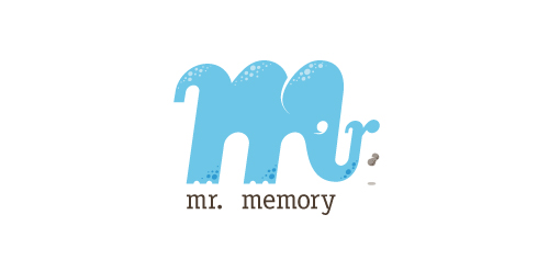
This completely fictitious company logo is the result of happenstance typographic exploration.
Through modification, I discovered that a lowercase M, set in Matrix Script Bold, began to resemble an elephant. Realizing the potential for a self-initiated logo development exercise, I dubbed my hypothetical company "Mr. Memory," an allusion to the idiom, "an elephant never forgets." With the addition of the R and the peanut as a punctuation replacement, the character exists both as an elephant as well as Mr. Memory, himself. This company could be one that manufactures RAM or external hard drives, or it could be a learning center.
Click here to see the case study for this logo, which chronicles its development, and includes full design rationale, sketches, electronic roughs, and alternate designs.
Our logo inspiration gallery will give you the creative boost you're looking for. Get your daily dose of logo design inspiration to work on your own logo design projects and get your business going. Be amazed by our logo designers and their brand guidelines. We are here to help you impress your clients and our fellow designers. Professionalize your logo design skills and get yourself to a new level. Browse our logo design gallery and discover all the new logo design trends and much more. We know you love logos!