
Arrows logos (11)
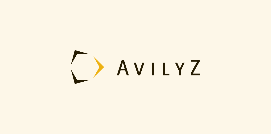
Avilyz is a Dutch consultancy agency specializing in arbitration services and means beehive in Lithuanian. The arrows from the mark represents the diffent directions and services. The white space that appears inside the arrows form a hive.


Copyright © 2014 Marius Fechete
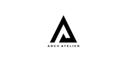
ARCH ATELIER is an architecture and interior design studio based in Damascus, Syria. Formed and ran by a group of young architects who carry big dreams to establish their atelier into a global brandmark. The logo uses the initials of Arch Atelier, with negative space. The two "A"s where transformed into triangles that act like arrows upwards, which is the core concept of architecture, building towards the sky. The negative space also helps to give ascending harmony to the logo, which resembles innovation.
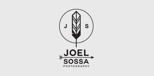
Personal identity for Joel Sossa, professional photographer from Guadalajara, México.Passionate by arrows, feathers and all about yaqui, cherokee, north american indians and their culture, the reason why the logo is. One of the most important and subtle elements on this logo is the circle, which represents the dream catcher like the circle of the camera lens, Joel Sossa is always capturing natural moments, people and landscapes with a particular style.
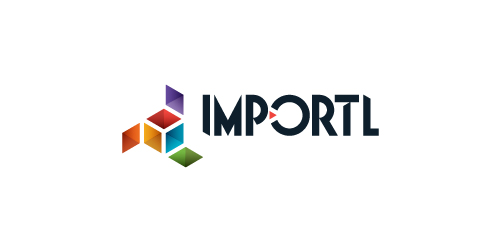
This is a logo for a completely fictitious entity named IMPORTL, which could be an open source web development site, or some type of developer software.
The idea is that the triangular facets form a series of open holes, or "portals," in multidimensional space. The central facets can also be seen to form a cube which is open on three sides. Lying before each opening is another opening on that side's respective "floor," yet, in an Escher-like paradox, where spatial orientation is an irrelevant construct, there is no floor. There is no up, down, left, right, back, or forth. This hyperspatial environment suggests infinite possibilities for the arrangement, manipulation, and exchange of data.
For color, the idea is that the primary colors that form the central cube beget the secondary colors that rotate outward, suggesting expansion, transformation, evolution.
The mark employs a custom typeface that compliments the angularity of the mark.
Click here to see the case study for this logo, which chronicles its development, and includes full design rationale, sketches, electronic roughs, and alternate designs.
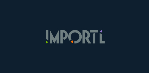
This is a logo for a completely fictitious entity named IMPORTL, which could be an open source web development site, or some type of developer software.
This wordmark features triangular facets — symbolic of the flow of data — that point inward toward the name, reinforcing the namesake.
The mark employs a custom typeface that compliments the triangle shapes.
Click here to see the case study for this logo, which chronicles its development, and includes full design rationale, sketches, electronic roughs, and alternate designs.
Background screening intelligence
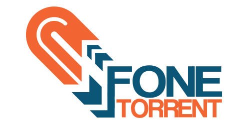
With Millennials as its target market, Urban Jungle designed an identity for Fone Torrent, an app used to torrent content from the customer's smart phone to a remote hard drive. Midnight blue was partnered with bright orange to capture the essence of the company's youthful and edgy spirit, while remaining clean and professional.
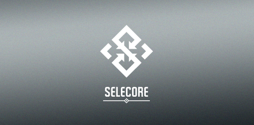
Selecore is company located in Finland, primarily focusing on importing new innovative products and secondary focus is in exporting items produced in Finland. Client wanted serious, modern and strong logo. He also mentioned that he loves when the logo has a hidden feature or message.
In the mark letter "S" is made of arrows pointing inside (import). In the negative space you can see arrows pointing out(export). The negative space also forms a cross which is connection to Finnish flag.
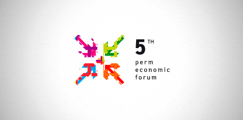
Designer: Denis Aristov Client: The government of Perm region Industry: Event, Forum Keywords: arrows, motion, dynamic, forum, economic, perm, colors, parts

Strategija magazine portal about business and strategies.
Our logo inspiration gallery will give you the creative boost you're looking for. Get your daily dose of logo design inspiration to work on your own logo design projects and get your business going. Be amazed by our logo designers and their brand guidelines. We are here to help you impress your clients and our fellow designers. Professionalize your logo design skills and get yourself to a new level. Browse our logo design gallery and discover all the new logo design trends and much more. We know you love logos!