
Black logos (268)
Darby-Hope Leather Goods Logo


National Highway 1 | India
Finger Note
This logo was created for the Cape Fear Aquatic Club Storm. This logo uses the hurricane flag as both the flag and the "O" in the word storm. The flag shape has a wave and tattered edges subtly referencing the bravado of the team.
This logo was created for the Cape Fear Aquatic Club Storm. This logo uses the hurricane flag as both the flag and the "O" in the word storm. The flag shape has a wave and tattered edges subtly referencing the bravado of the team.
Logo for our up and coming shirts/prints/design shop. Crazy excited, we launch in January so keep a look out www.loudlion.us
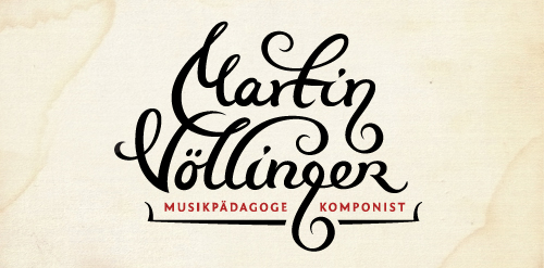
Logo design for composer, music pedagog, organist and conductor. The "g" letter is made to look like violin key. The client wanted happy and joyful look but still to represent proffesional musician.
Unused logo proposal for ux / ui designer Alvin Thong
Runner logo. All reviews are welcome. Thank you very much.
Logo made for a company that distributes movies on digital format.
One color version.
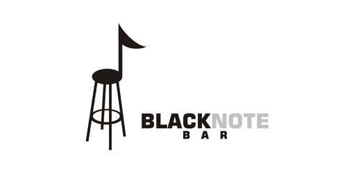
Logo for Jazz club.
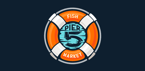
This logo is for a completely fictitious fish market.
The idea came to me when I discovered that it was possible to achieve a fish shape in the negative space within the bowl of the number 5. Dubbing my hypothetical company Pier 5 Fish Market, I created this very maximalist and illustrative mark in the hopes of really capturing the spirit of the nautical and maritime aesthetic. Type is custom for "Pier" and also the number 5, which is hand-rendered to look like it was painted on a wooden sign with a very wide, worn-out, thick-bristled brush. While it was important for the fish to show in negative space, it needed to look like a seemingly happenstance result of logical, real-world brush strokes. In the full lockup, the addition of the life preserver takes less emphasis off this gimmick, allowing one to slowly discover the fish.
Click here to see the case study for this logo, which chronicles its development, and includes full design rationale, sketches, electronic roughs, and alternate designs.
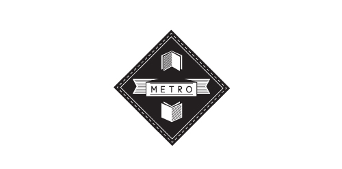
logo for publishing company. Features thin sans-serif font with wide tracking a simple book design with hatch shading for added depth. Made in one colour to enable its use on various coloured backgrounds via simple colour change. To be used on stationary, web and on books of various colours.
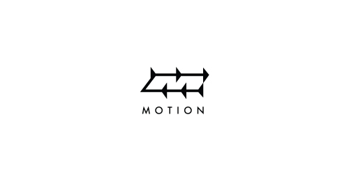
Directional arrows representing motion also form an 'M' in negative space.
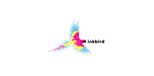
A bird made up of the colors cyan, magenta, yellow, and black to represent a printing company.
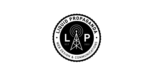
A web design & communications company.
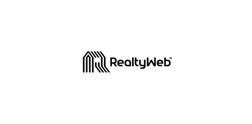
Approved logodesign for Realtyweb.com Custom made Typography. RealtyWeb.com combines 3rd party data and information on close to 30,000 state and local real estate markets to help the consumer and the real estate professional make educated decisions.
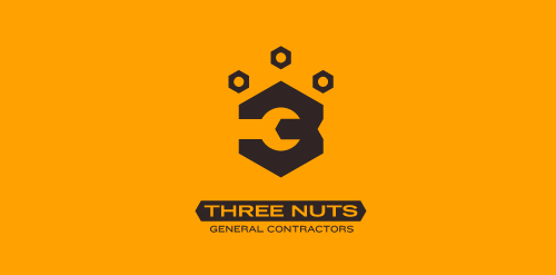
This logo is for a completely fictitious entity named Three Nuts General Contractors.
The idea for this brand came to me when I was out and about in the world, and saw a contractor's work van drive by. As I looked at the number 3 in the telephone number on the van, I started thinking about how a cleverly constructed 3 could reveal a wrench in negative space.
Using a hexagonal bolt nut as my main source of inspiration, I thought of a whimsical name which would support the concept I had in mind. In this hypothetical situation, the "Three Nuts" could be a team of three general contractors.
The icon is built from the angles of the bolt nut, and the entire mark should evoke a heavy industrial feel; something that could be stamped into metal, etched into wood, or simply affixed on the side of a work van.
Click here to see the case study for this logo, which chronicles its development, and includes full design rationale, sketches, electronic roughs, and alternate designs.
Experimental / concept work
Company based in Shropshire, England. Natural Eco Friendly Rural Brewery, producing a range of english beers with a contemporary feel and with all ingredients produced locally.
Logo for architect studio.
Classic with a modern feel. Black and Yellow
For an immigration law firm. Nemecek loved origami. Hence the origami style on the typography.
Our logo inspiration gallery will give you the creative boost you're looking for. Get your daily dose of logo design inspiration to work on your own logo design projects and get your business going. Be amazed by our logo designers and their brand guidelines. We are here to help you impress your clients and our fellow designers. Professionalize your logo design skills and get yourself to a new level. Browse our logo design gallery and discover all the new logo design trends and much more. We know you love logos!