
Black logos (268)
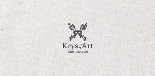
In the designer's words: An elegant logo infused with meaning. Functional both in the color version and in the version in black and white. Designed for galleries and museums open to all forms of art / Ideal for these industries: Art & Photography, Events, Design & Creative Services.


Logo design for a Manchester-based Collective, 2011.

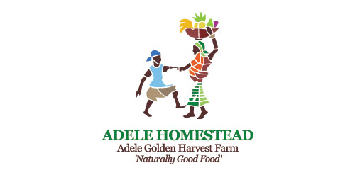
Logo design for a subsistence farm, Ghana. "The project is for a farm in Ghana, run by and on behalf of an orphanage, now in the third generation. The farm will grow vegetables and possibly fruit for their own use and that of a larger orphanage in Africa. Within a year, there will be enough produce to start providing some of the surrounding countries (Togoland, Burkina Faso, Mali, etc) with vegetables and fruit. The soil is fertile, the climate good; and as soon as a well is dug, there will be adequate water, and crops will be grown, year round. The image that I'd like to convey is one of family, best of natural fresh vegetables and fruits, healthy; planted tended and harvested by hand by the boys, girls and me n (all orphans of different generations) who work on the farm."
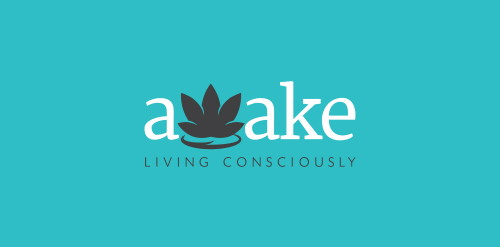
Awake: Living Consciously is a lifestyle blog focusing on enlightening yourself to live a more conscious life.
In the designer's words: Lettering full-bodied for a combination of letters used in amazement. To design agencies, graphic design, web design and media who want to impress clients with their products. A young agency that is placed on the market with a spirit of innovation. The lettering is also a perfect ambigram / Ideal for these industries: Entertainment & Media, Art & Photography, Design & Creative Services.
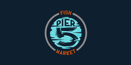
This logo is for a completely fictitious fish market.
The idea came to me when I discovered that it was possible to achieve a fish shape in the negative space within the bowl of the number 5. Dubbing my hypothetical company Pier 5 Fish Market, I created this illustrative mark in the hopes of really capturing the spirit of the nautical and maritime aesthetic. Type is custom for "Pier" and also the number 5, which is hand-rendered to look like it was painted on a wooden sign with a very wide, worn-out, thick-bristled brush. While it was important for the fish to show in negative space, it needed to look like a seemingly happenstance result of logical, real-world brush strokes. This is the minimal, alternate version of this logo.
Click here to see the case study for this logo, which chronicles its development, and includes full design rationale, sketches, electronic roughs, and alternate designs.
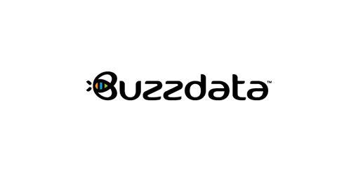
BuzzData is a social platform/network where you can publish and discuss data. BuzzData lets you publish your data in a smarter, easier way. It's about data and a part of it to visualize the information. You can attach articles, visualizations, apps and even source code... etc. www.buzzdata.com Identity solution: A custom made uniqe Typography with a varying thickness shows buzz and motion. The front letter "B"ee can also be used as a standalone favicon which is very important for a social network company since it is easier to incorporate it in very small sizes around the web for buttons and links. The Bee has a uniqe shape, is very memorable and iconic. The colors which are used into the negative space of the bee are resembling the companies main product >data< which comes from the social network users in unlimited variations... everyone can publish and discuss data. The color forms are reminiscent of chart bars, pies (statistics).
Customer's info: I assess individual and business needs and offer solutions via referral to other individuals and businesses.
Metal band
Concept proposal for branding for go cloud.
New personal logo. The two black E's hide an S which are the initials of my name.
This logo represents the brand of advertising in Sevilla
An idea studio and multi-purpose vintage furniture store
Created for fun only
Logo created for my freelance design studio.
This logo can be used by many companies: corporate, entertainment, fashion, interior design, games, internet & web and many more.
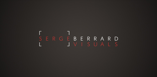
Logo for a new lifestyle photographer, Serge Berrard.
www.mikemark.com Personal logo
Logo for a belgian restaurant between 2 and 3 star segment.
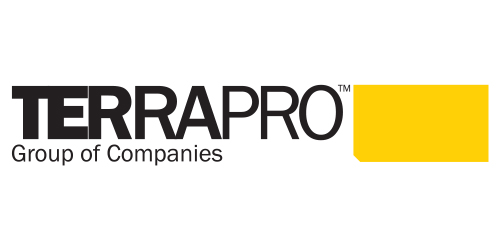
Urban Jungle took a graphical approach to Terrapro‘s identity, drawing from the colour and shape of their flagship product—the synthetic rig mat. The cropped corner of the rig mat’s design, was integrated through all aspects of Terrapro’s design system, including their letterhead and business cards and website.
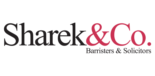
Urban Jungle developed a simple and stylish corporate identity that was initiated by distilling the firm’s name to simply Sharek&Co. From there, the wordmark and colour palate were created. The updated identity is contemporary yet classic, professional yet relaxed, it’s personable and balanced—just like the firm and its staff.
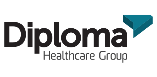
Inspired by the ancient Japanese art of folding paper, the negative space from an origami-styled “D” creates Diploma’s icon. Using a deep charcoal colour treatment on a bold stylized version of the Museo Sans typeface, the identity combines vivid aqua and chartreuse colours, designed to strengthen the company’s fortified position as “the definitive partner for medical device sales in specialized healthcare markets.”
Logo study for our start-up company
Combining the letter of "i" and the letter of "V" to be the first letter of wedding (W). This logo is for the wedding of Iris & Vincent