
Black logos (268)
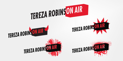
Dynamic logo for the lively radio and television presenter and actress Tereza Robinson. The logo is playful and has several variations which represent Tereza's riches of expression as a presenter: she can be wild, devilish, chilled, delicate as a flower, etc...


Bank logo
Heart Beat Malfunction, just messing around...
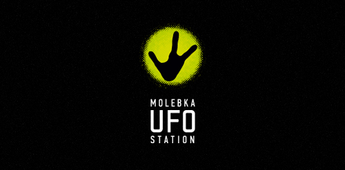
Designer: Denis Aristov Client: The Government of Perm Region Industry: Tourism Keywords: hand, black, green, light, ufo-people, UFO, station, aliens, Molebka

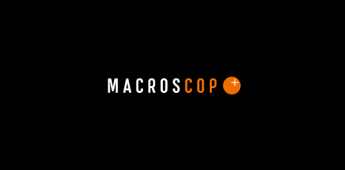
Designer: Denis Aristov Client: MacrosCop Industry: Monitoring & Guard Keywords: video, monitoring, guard, cop, sight, point, orange, black
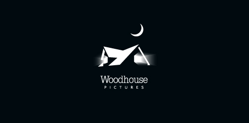
Created for an independent film company.
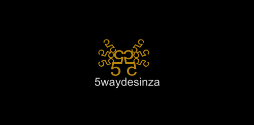
5 Way Design
Skate-influenced brand identity for a clothing line called "Hiromi (宏美) VM (Visual Media)". The reason we decided to move on from this design was because it did capture the skate mentality and feel, and it looked nice, BUT it didn't quite capture feel of the "slim, sleek, futuristic, chic" brand the client was going for.
Graphic identity for the Oslo based musical group Midi Mantra. Focusing on the word such as Midi Mantra was the starting point of a good idea; we combined these two words to be a creative outcome with a clear visual language and a strong logo signature and a style that follows a certain set of strength and clarity to organize the creative outcome. To top it all we created a visual language that will help the logo/name of the band to come out clearly and communicate the right associations the band want to convey in their visual and musical language. Hoping to leave a massive impression when visual language is carried out amongst other posters on a poster bulletin board.
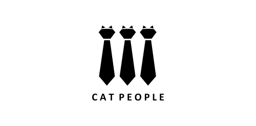
Logo for cat clothes.
Logo for a company specialised in web design, graphical design and photography for kids.
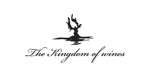
logo for exclusive wine cellar
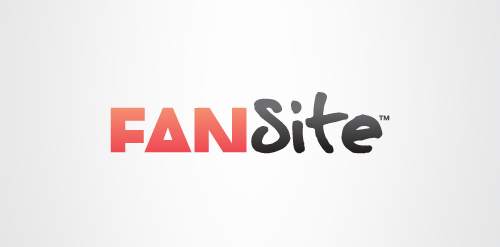
Here is one option for a logo and branding project for a brand new social network. It revolves around the idea that through Fansite, fans can meet other fans through their common interest in a musician, sports star or celebrity etc. This is signified by the choice of typefaces; ‘Fan’ is in one typeface while ‘Site’ is in another. The two typefaces have been chosen carefully to offer all the right messages and personality. ‘Site’ is written in a hand written typeface, inspired by a celebrity’s autograph which helps give the logotype a unique identity. ‘Fan’ is written in a modern, 'cropped' typeface that represents the fan community and social network aspect of Fansite. Fansite is a modern, digital equivalent of a fan scrapbook or fanzine, or at least this forms the basis. The 'Fan' typeface is modern and has a strong relevant personality itself, but it is treated in a unique way. Each letter is tightly cropped, yet still legible, inspired from old fanzines when fans would use scissors to cut and layout their magazines.
logo for a online business firm....
Obvious joke object project
Music and entertainment industry
Play the negative space with the letter of "S" and the icon of "+" to be the logo.
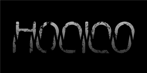
Description: hocico means mouth. Hocico it´s an industrial band from México. The type represents fangs, so that way you should see a big mouth!
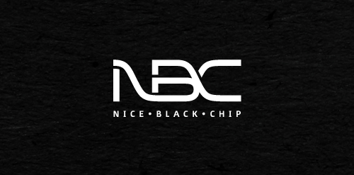
Nice Black Chip is a small, intelligent team of experts in fields of electronics hardware and software.
Client wanted strong, clean design in black and white.
For fun.
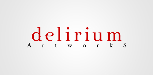
The logotype made for Delirium Artworks agency.
Combining the letter of “P” and the letter of “S” to be the logo.
Finger Note
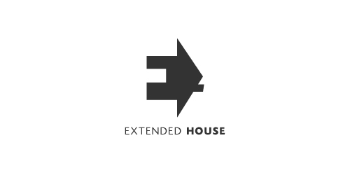
Extended House. Negative space used for the letter E. The house serves as a perspective to this letter E.
Our logo inspiration gallery will give you the creative boost you're looking for. Get your daily dose of logo design inspiration to work on your own logo design projects and get your business going. Be amazed by our logo designers and their brand guidelines. We are here to help you impress your clients and our fellow designers. Professionalize your logo design skills and get yourself to a new level. Browse our logo design gallery and discover all the new logo design trends and much more. We know you love logos!