
Branding logos (454)
Conceptual logo design made for fun. Quick idea and quick execution.


N8 (Serbian "N-osam") apparel brand logo
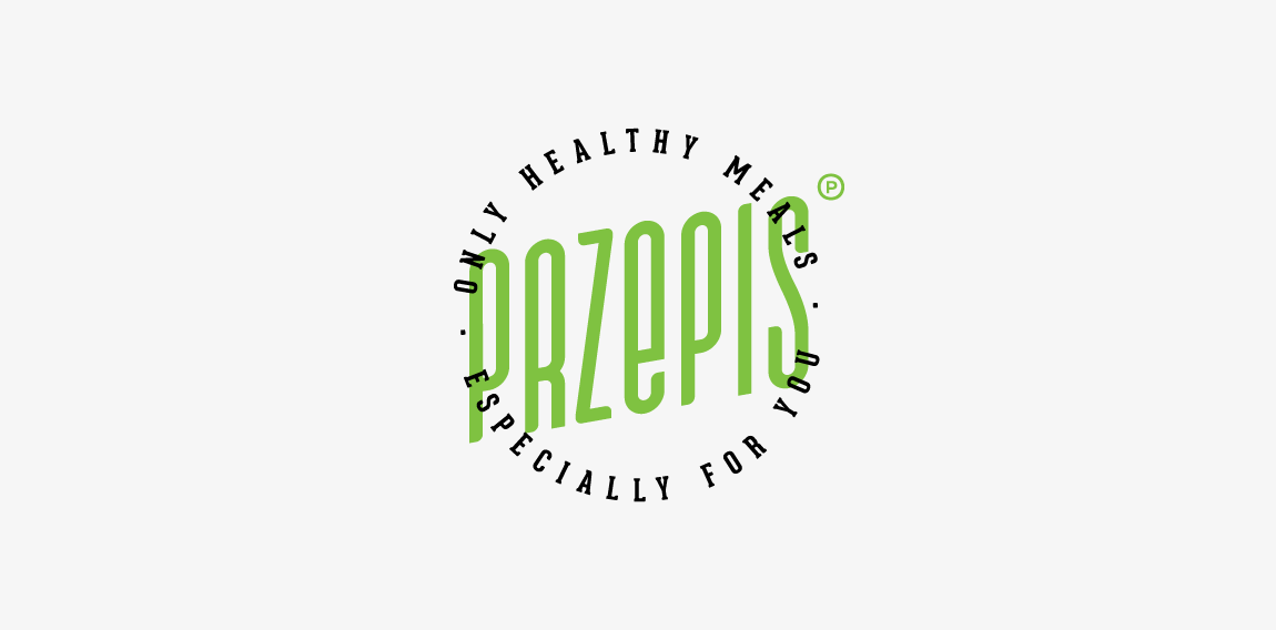
A hipster emblem designed for small company offers healthy meals with delivered to your workplace. "Przepis" means "recipe". • • • Made for Motyf Studio • • • follow us on www.instagram.com/triptic.pl
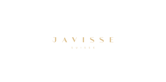
Custom made logotype design for one of my upcoming projects - an exclusive Swiss cosmetic line-up for women. Made from scratch. www.dominikpacholczyk.com
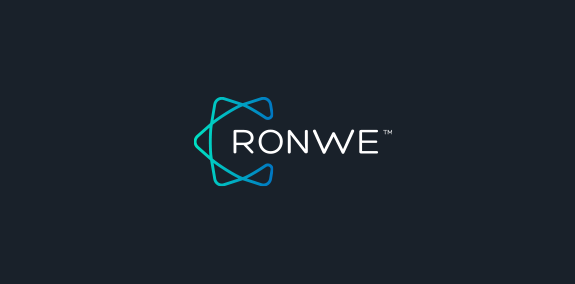
Alternative logo design for one of my branding projects. Final case study you can check on www.dominikpacholczyk.com/ronwe
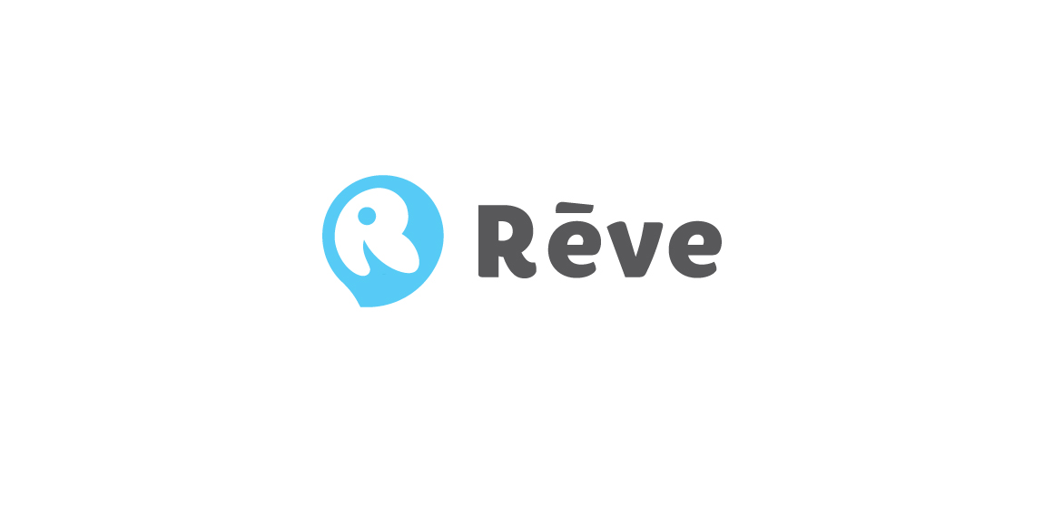
Rève is an design agency in Ho Chi Minh City, Vietnam. The logo is the combination of balloon(dream), dolphin(intelligent) and "R".
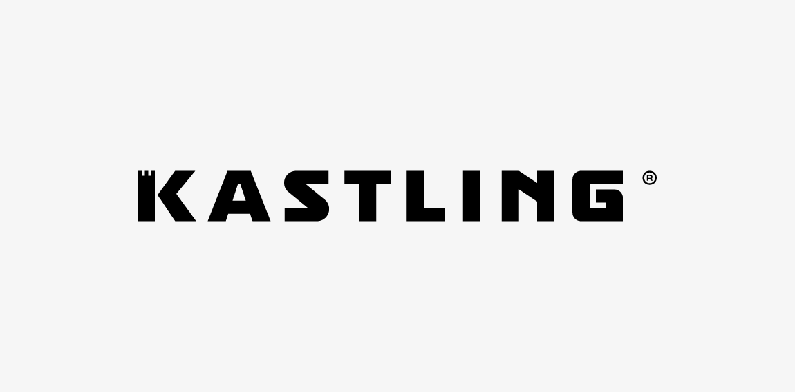
Custom letters created for marketing company. "K" letter has incorporated a rook/tower shape which refers to "protect the King" idea. • • • Follow us on www.instagram.com/triptic.pl
Logo for my own project
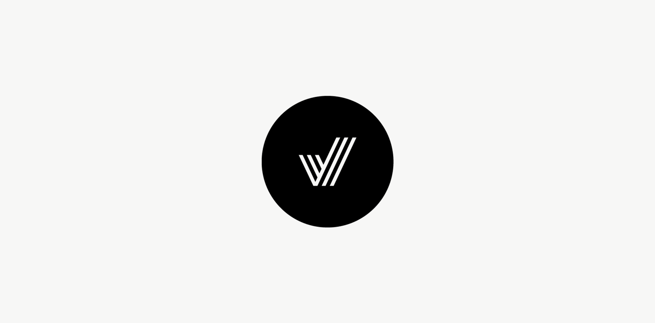
My new personal logo, inspired on my initial and a check mark.
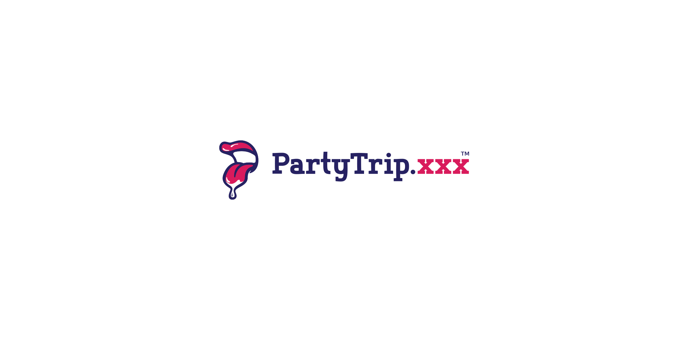
Naughty logo for unspecifed erotic company :)
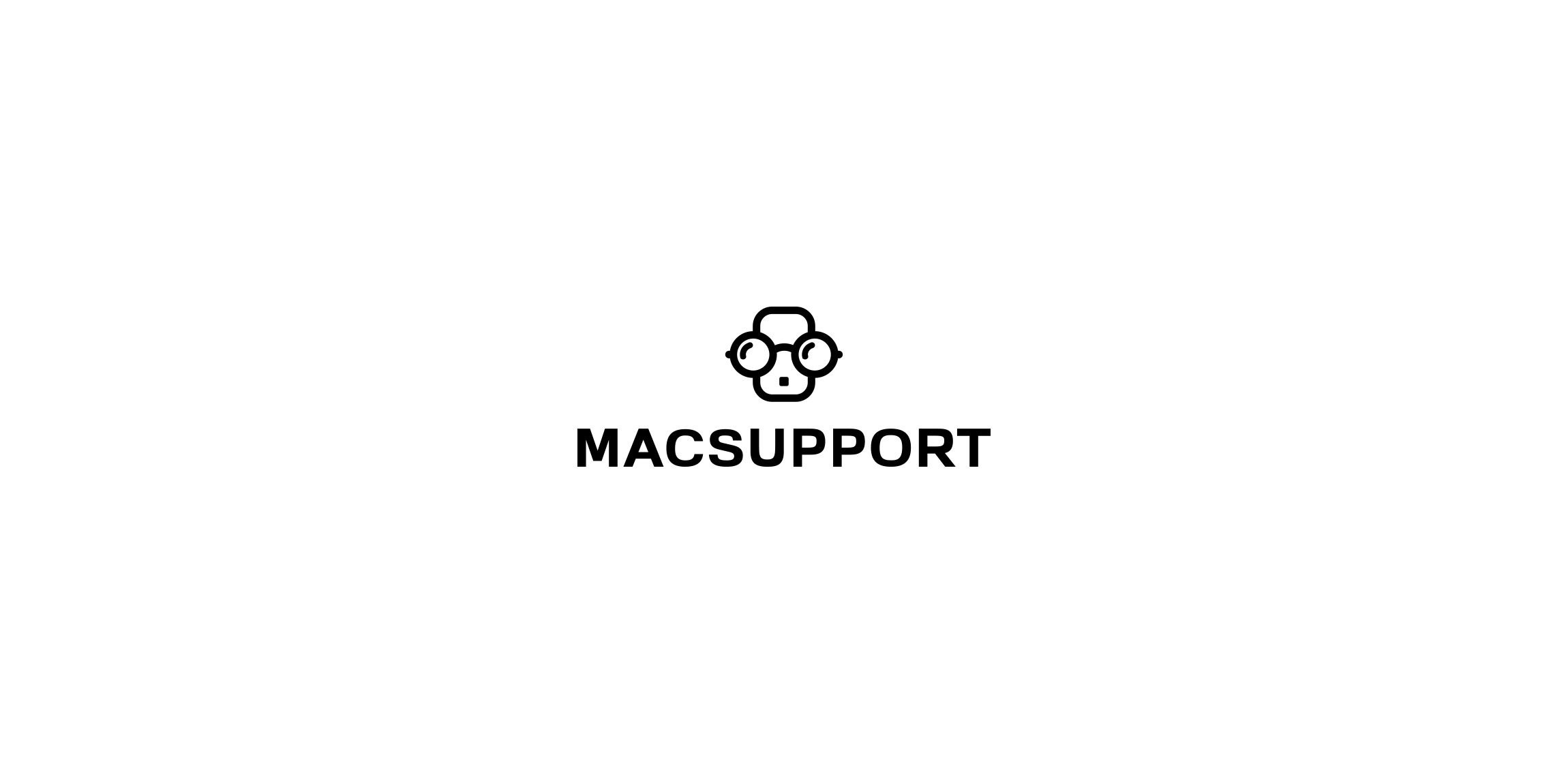
Macsupport - company dealing with service post-warranty hardware from Apple. Mark inspired by Steve Jobs character and iPhone form.
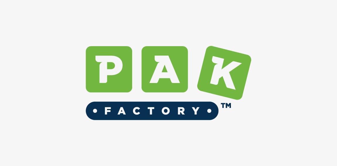
PakFactory is a canadian company producing and selling eco-friendly packages. Logotype is a combination of conveyor belt (factory) with moving boxes (packs).
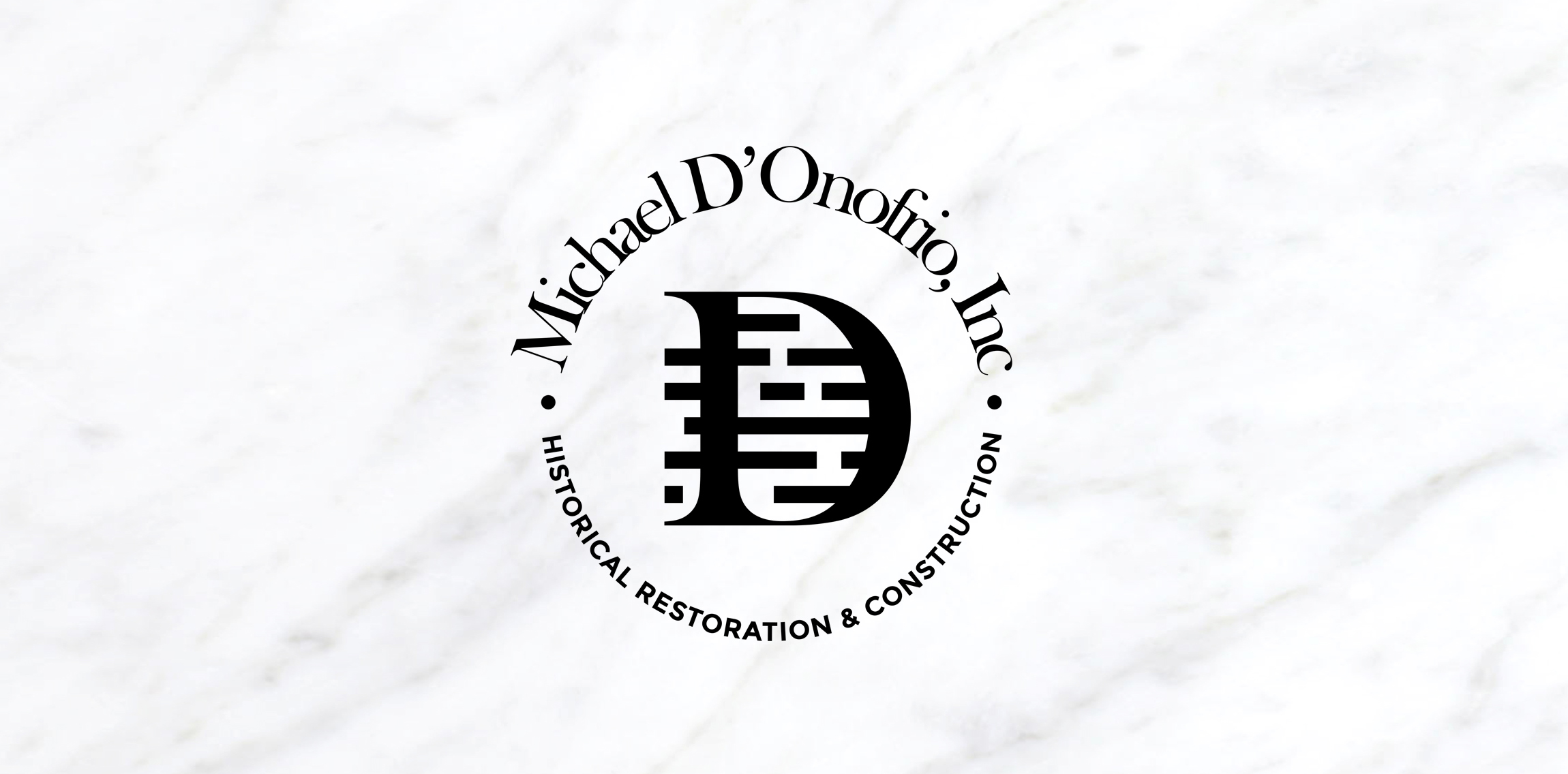
Marble brick moods of the logo design first proposal concept for Michael D'Onofrio, Inc.
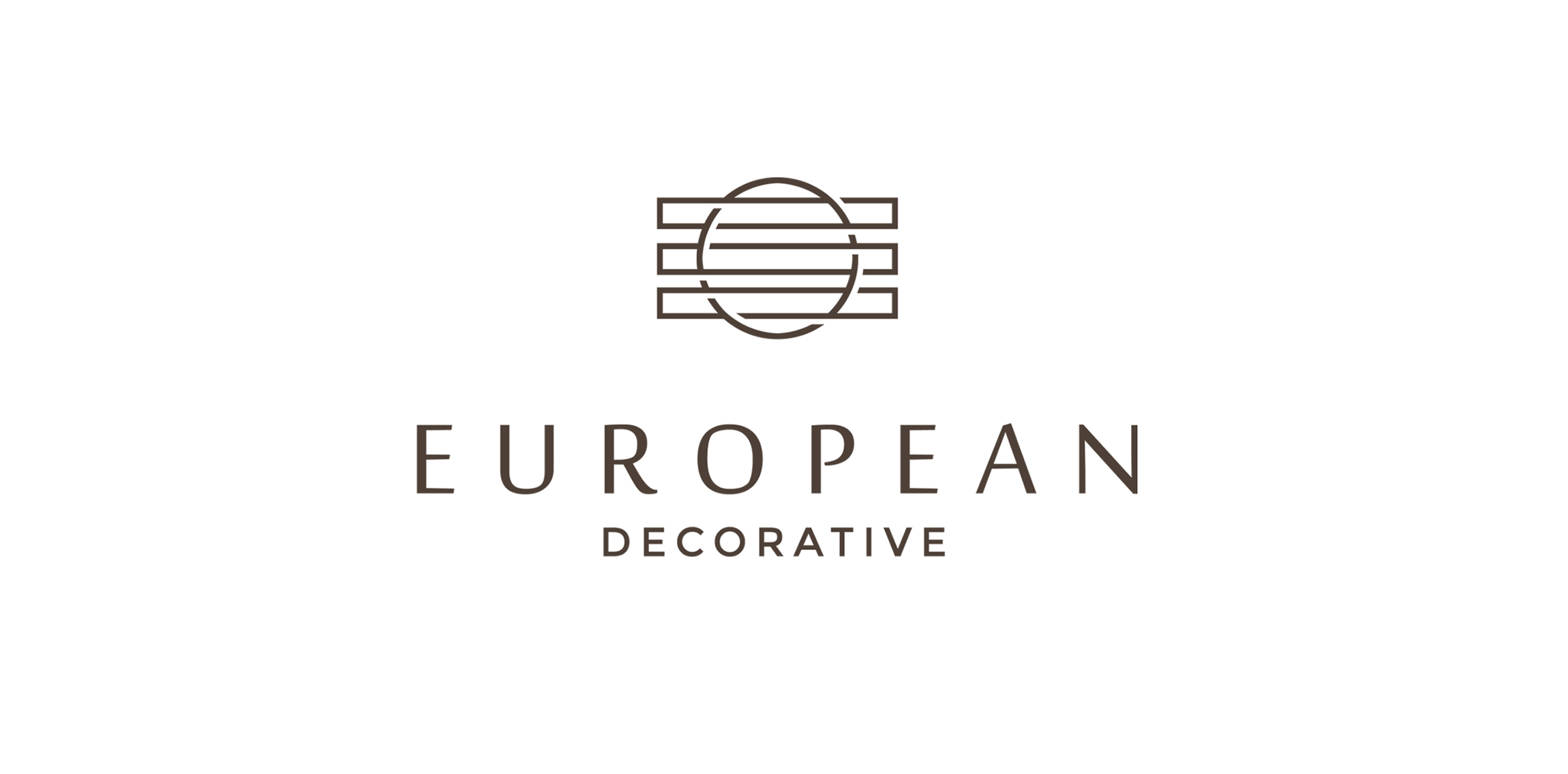
Identity! That's what European Decorative's architects and designers were looking for. Here is a concept logo design for their brand using minimalistic mood with wooden colors.
"Glitwave" icon symbolism speaks about fluid music waves, projecting light, active gaming.
Logo for the website with offers of housing sales.
B for bakery identity. Identity for a French bakery located in the Netherlands.
OC (Organizing Corporation
A logo for a consumer seafood business. I chose to encapsulate a fish, fishhook, and the company initial, 'S' in the mark.
A mark for a sports supplement supplier called 'Stackz.' The concept was to create the letter 'S' from stacked elements.
This is lovely fox logo design for "FOXO" and its construction. Icon simulates fox creating "O" – round, elegant & endless shape.
A logo created for a Japanese Restaurant called Tabe Tai (Want to Eat). The idea was to create a mark around the Japanese Torii while incorporating the restaurant's initials. Additionally, I designed the entire mark to reflect upon the ink strokes used in ancient Japanese paintings.
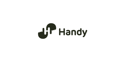
Logo proposal with a negative space showing "H" letter. Two hands together creates H letter. Find us on Instagram! http://instagram.com/tieatie_agency/ Check out other works portfolio: Branding Agency
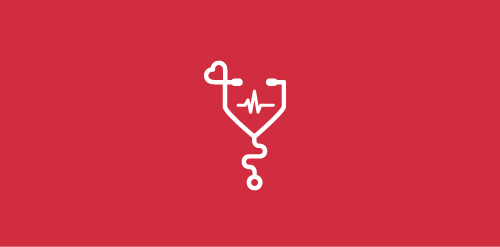
A branding concept for a medical clinic. The goal was to create a clean, playful logo to promote a stress-free and fun atmosphere. The stethoscope is a symbol known around the world as a tool used by doctors to listen to hearts and lungs. The heart shape represents love and care - something that is essential for any business whose purpose is to help those in need. And finally, the globally-recognized symbol for everlasting life - the heartbeat.
Our logo inspiration gallery will give you the creative boost you're looking for. Get your daily dose of logo design inspiration to work on your own logo design projects and get your business going. Be amazed by our logo designers and their brand guidelines. We are here to help you impress your clients and our fellow designers. Professionalize your logo design skills and get yourself to a new level. Browse our logo design gallery and discover all the new logo design trends and much more. We know you love logos!