
Branding logos (454)
Client: True Beauty OS Field: Fashion shop Location: VietNam Year: 2014


Personal branding.
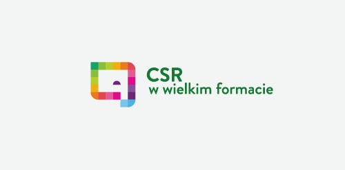
"CSR w wielkim formacie" in english mean "CSR in large format". It is a Corporate Social Responsibility program started by Opinion company (large printhouse). - - - An elephant is a symbol of big/large (format), intelligent/wisdom (responsibility) in multicolor squares form as a symbol of print. - - - As seen on www.csropinion.pl
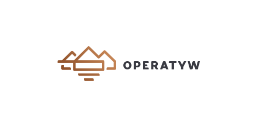
Branding for "Operatyw". Company focused mainly on real estate valuation. Full presentation here - https://www.behance.net/gallery/20291471/Operatyw
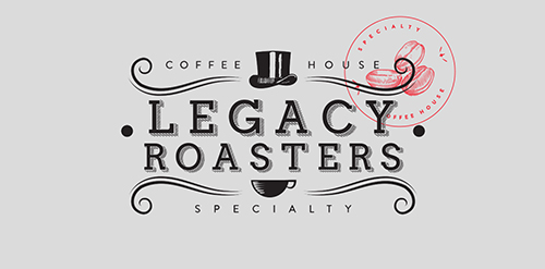
Is an establishment dedicated to the sell and preparation of speciality food and coffee. They know the place where the coffee grew and the different procedures are realized to obtain a variety of flavors, smells and acidity. In the part of the tea we work with one of the best houses of tea in the country named Carabanserai, located in Roma D.F., they provide french tea and realize their own mixtures of excellent quality. By our part we realize the redesign of their identity where we look to keep and stylize the main elements of their old logo, as the top hatted, the gentleman’s mustache and the cup of coffee, the result is a clean logo, sophisticated and with an european tendency, to give the classic touch on the composition of the new identity and unique consume experience. On the packaging we use ziploc type bags of rice paper to keep the freshness of the tea and also the coffee, and we tag with two stickers, one with the illustration of coffee beans and another one with the picture of a cup of tea.
Italian Music Band branding
"Casa do Salame is a family company that has worked for over 15 years with handmade production of sausages and several other farm products. For the development of this brand, we added a more traditional/manufactured feel to it so that the public can feel that the products are unique and handmade. We used color tones that remind of Italy (the origin of the products and the family), and to make the handmade aspect clear, we used golden hotstamping on the materials.”
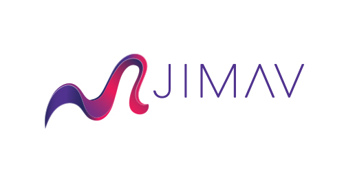
The identity of the builder JIMAV is based on the inspiration that we had with organic architecture. With curved forms we achieved a symbol with plenty life, which is balanced with a simple, legible and solid typography. The logo is a form developed with the approach of the letter “J” of Jiménez and the letter “A”of Avelar, which compound the name of the builder JIMAV. We developed a variety of the logo’s versions and compositions for the use in different applications and to make easier it’s reproduction.
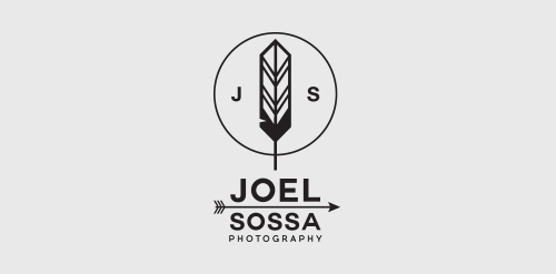
Personal identity for Joel Sossa, professional photographer from Guadalajara, México.Passionate by arrows, feathers and all about yaqui, cherokee, north american indians and their culture, the reason why the logo is. One of the most important and subtle elements on this logo is the circle, which represents the dream catcher like the circle of the camera lens, Joel Sossa is always capturing natural moments, people and landscapes with a particular style.
BigS logo design by Art Fox Studio
A logo for a producent of Bubble Tea.
"At Tesla, we don’t merely design or execute projects, but develop ideas and solutions that contribute to the well being of our planet. We think and act in a sustainable way. We entered the market selling products related to sustainability, due to this recent discovery made by the society.”

100água is a company that has a special technique to develop products to clean vehicles using carnaúba wax, which uses no water. Besides protecting the environment, it also protects your car more than a regular wash.”
"We seek to refer the "S" in a caravel, indicating demand for the ideal property for each client.”
Logo was designed based on the shape of the camera and that is the basic tool in the work of photographers and has been simplified form to just one line only for more information : http://bit.ly/1n476Qm
Logotype for Theme.Works. Website to design your Wordpress theme.
Been working on this custom lettering logotype for a design agency based in Australia last week, we are both really excited about the outcome.
Italian software house https://www.behance.net/gallery/19643809/Gemma-Software
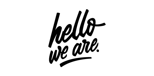
Lettering logotype for "hello, we are." a studio based in Austria which specializes in animation and visuals.
"The Studio Water is an aquarium company. It works with the development of personal projects to aquariums of sweet and salty water. The idea here was to work with navy, ocean and patterns concepts.”
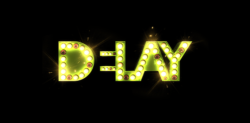
"DELAY is all about keeping you updated on everything that happens in the music industry without taking away our references. A music and events producer that exceeds the limits of stereotypes. Here is your meeting with DELAY. After all, everything that involves music deserves an echo, an effect, a little extra time of reproduction. For the design of this brand we aimed to work in a way that it would represent several different applications in different situations like rock, indie or pop. The brand would change according to what would be released, to adecquate itself to the kind of information it should bring.”
Acipencer is a restaurant specializing in processing specialty dishes using ingredients sturgeon, the fish are highly valued fishery, their flesh are more firmer than other fish common, aromatic flavor. Concept: In England and Wales, the sturgeon, along with whales and porpoises, is a royal fish. logo based on this idea to show pictures sturgeon, stately, noble
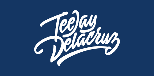
Logotype for photographer TeeJay Delacruz.
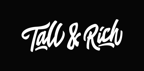
Logo for Tall & Rich, a DJ couple from the Netherlands.
Our logo inspiration gallery will give you the creative boost you're looking for. Get your daily dose of logo design inspiration to work on your own logo design projects and get your business going. Be amazed by our logo designers and their brand guidelines. We are here to help you impress your clients and our fellow designers. Professionalize your logo design skills and get yourself to a new level. Browse our logo design gallery and discover all the new logo design trends and much more. We know you love logos!