
Brown logos (76)
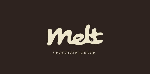
Brand: A Chocolate Lounge


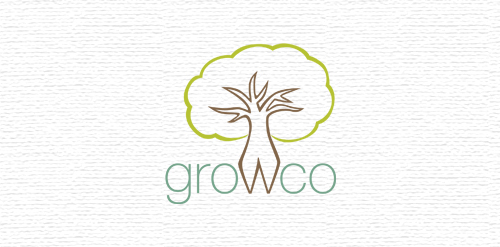
A logo I did for a business selling trees, vines, shrubs, seeds etc.

An icon for a bakery.
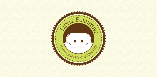
Website that sells personalized chairs for kids.
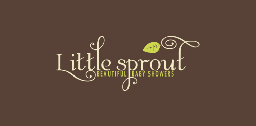
A logo created for an event planning business that focuses on baby showers.
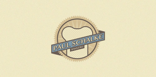
old bakery that was looking for a simple logo in an old style.
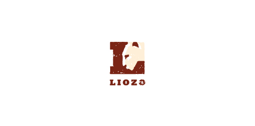
A profile of a lion with surrounding space forming an 'L'
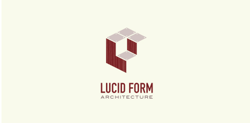
This logo is for a completely fictitious architecture studio called Lucid Form Architecture.
The icon is based on an optical illusion of a cube within a cube. Primarily, the form depicts a big cube, made of wood walls and metal-plated top surfaces, with a notch cut out of the center, resulting in a 3-D "L" shape. However, the longer one looks at this, perception begins to shift, resulting in a couple of different interpretations: 1) a small cube with a wooden wall and metal-plated bottom, in the corner of a room, hovering near the top of a tiled ceiling; 2) a room, tilted 90° clockwise, with hardwood floors, tiled walls, and a cube with a wood countertop and metal-plated side on the floor in the corner. This perception shift is important to the name, because it presents an ironic twist. To make "lucid" means to make clear, and while the icon seems to initially baffle and confuse, it ultimately encourages the viewer to challenge his or her preconceived notions of "perception." So too is the Lucid Form methodology for creating seeming impossible structures.
Well the idea is pretty clear.
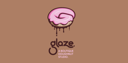
This is a totally fictional company that I refer to as "a boutique doughnut studio." I envision it as a trendy, metropolitan bakery that allows customers to glaze and decorate their own unique doughnuts. I wanted this to look really tactile, gooey, and sweet - like you really want to take a bite. Type for "glaze" is custom, and reflects the roundness of a doughnut. Click here to view my Flickr stream for full design rationale and additional images.

Logo made for an Indian themed lounge.
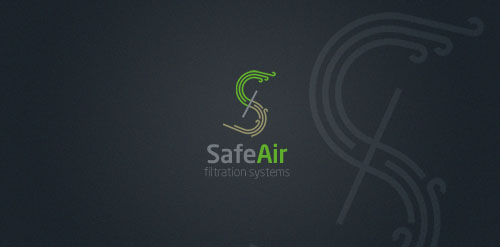
Startup company that produces filtration systems for heavy equipment operators
This completely fictitious company logo is the result of happenstance typographic exploration.
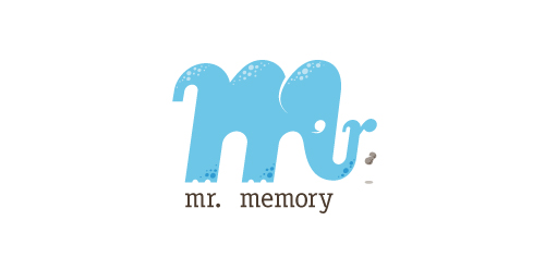
Through modification, I discovered that a lowercase M, set in Matrix Script Bold, began to resemble an elephant. Realizing the potential for a self-initiated logo development exercise, I dubbed my hypothetical company "Mr. Memory," an allusion to the idiom, "an elephant never forgets." With the addition of the R and the peanut as a punctuation replacement, the character exists both as an elephant as well as Mr. Memory, himself. This company could be one that manufactures RAM or external hard drives, or it could be a learning center.
Click here to see the case study for this logo, which chronicles its development, and includes full design rationale, sketches, electronic roughs, and alternate designs.

This logo was designed for a Texas attorney. It was to represent a Texas style with a legal feel. The client wanted a logo that stood out from the rest and desired a logo with depth rather than flat color. I was inspired by the law enforcement agency, Texas Rangers.
Logo for an URL shortening service. "Legível" means "legible" in portuguese.
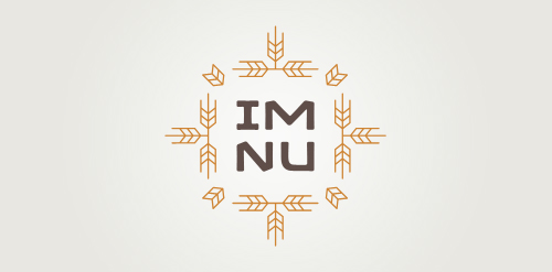
New logo concept for the barley & rye malt based drink »im nu«. See the process behind the custom type here: http://dl.dropbox.com/u/14259079/im_nu_process.png Big view including »Chocolate
free work.
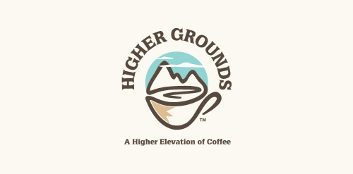
'Higher Grounds' is coffee shop in Cloudcroft (New Mexico) situated 9000ft above the sea level with cool hills.. It's a kinda tourist spot.. So that's where this logo came from.. My idea is to show the place (Cloudcroft) with mountains and to take it over the coffee in a single line drawing.. And few colors added to make it more scenic by having the business on the core of the logo.. so it's kinda 50% for the business and 50% for the place..
My new personal logo. Full project on Behance: http://www.behance.net/gallery/Self-Logo/1470725
fun, country gal style.
Logo for a potential higher end housing development in a nice secluded wooded area. Many deer live in the area.
Logo for new business that enables people to sell their homes privately online.
Tourism guide - know your edge Stylized footprint, the idea is that these curves represent the trip, during which we visit all the places in Lithuania(can be your country), and Lithuania(can be your country) shows instead a thumb. That would put a hidden message to the customer (tourist).
Our logo inspiration gallery will give you the creative boost you're looking for. Get your daily dose of logo design inspiration to work on your own logo design projects and get your business going. Be amazed by our logo designers and their brand guidelines. We are here to help you impress your clients and our fellow designers. Professionalize your logo design skills and get yourself to a new level. Browse our logo design gallery and discover all the new logo design trends and much more. We know you love logos!