
Circle logos (97)
Our logotype.


New simple logo for company from Germany.
Unused concept for digital agency. - - - follow us on www.fb.me/triptic.design - -
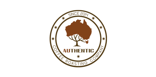
The AUthentic logo design resembles the map of Australia. It presents a strongly formed approach suitable in the coffee roasting industry. With this new brand name, you can establish new position in the coffee industry.
Copyright © 2014 Marius Fechete
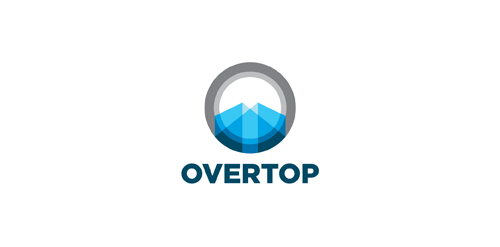
Exclusive Customizable Logo at http://wp.me/s4571j-overtop
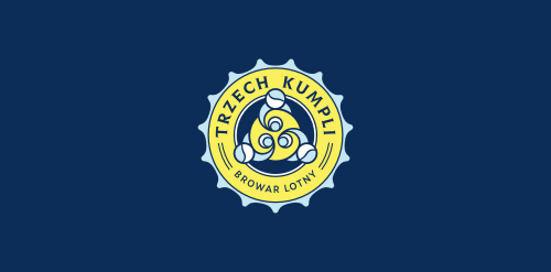
Trzech Kumpli - Browar Lotny (Three Pals - Flying Brewery). Indie beer.
Modern day logo with lights of spectrum colors inside a forming circle
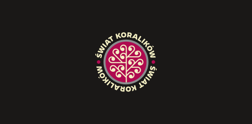
Internet shop selling materials for handicrafts.
Monogram for grocery company
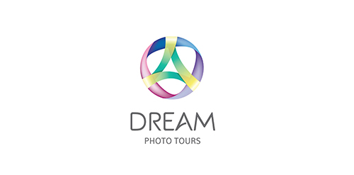
Client: Dream Photo Tour Location: US Branding Agency: Bratus

Web application that helps to effectively manage time, employees/co-workers, customers, and sales. DayTab supports the process of customer communication, collaboration and information sharing within the company. Its functionality centers around the concept of structure, hence the simple "tree" metaphor in the logo. The symbol is built only with circle segments and - with a bit of imagination - you could even see human silhouettes there. It shouldn`t require much effort to notice the "D" initial.
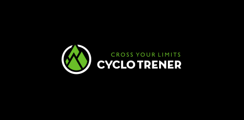
Personal trainer services.
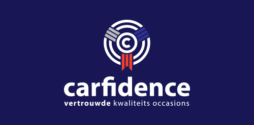
Car dealer who sells mainly ford mustangs and occassions.
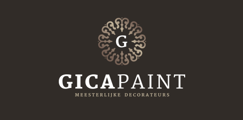
Logo for a painter/decorator
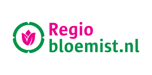
Regiobloemist.nl delivers flowers in any place in the Netherlands. The logo can be viewed at www.regiobloemist.nl
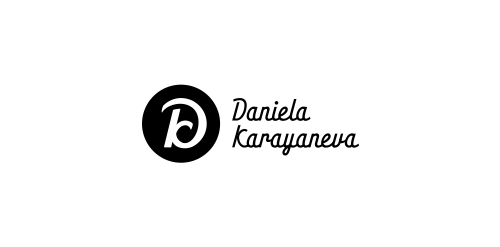
A logo monogram created from the first letters of company's name and, actually the owner's name.
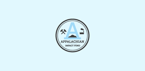
A concept made for a investment fund in the appalachian region - strong mark showing the past and the future of the region - coal mines, factories, business ect.
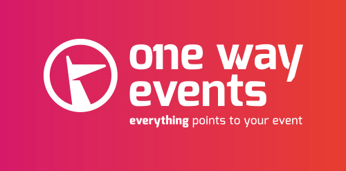
There's only one company for your event. Everything points to your event...
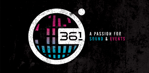
361º does just that little bit more during the organization of events. They do offer more than 360º degrees. It's the one degree that matters.
Logo for a company that stands for sustainable, industrial lighting solutions, aimed at businesses.
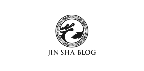
Brand name: Jin Sha Blog - Field: Travel, Restaurant & Resort - Year: 2013 - Location: Austria - Web: www.jinshablog.org - More About It: http://www.behance.net/gallery/Jin-Sha-Blog/9836717
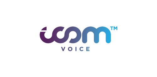
Logo design by Mehdi Hassan Liverpool for iCom Voice, one of the most promising Telecommunication Service Providers based in the UK.
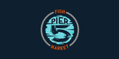
This logo is for a completely fictitious fish market.
The idea came to me when I discovered that it was possible to achieve a fish shape in the negative space within the bowl of the number 5. Dubbing my hypothetical company Pier 5 Fish Market, I created this illustrative mark in the hopes of really capturing the spirit of the nautical and maritime aesthetic. Type is custom for "Pier" and also the number 5, which is hand-rendered to look like it was painted on a wooden sign with a very wide, worn-out, thick-bristled brush. While it was important for the fish to show in negative space, it needed to look like a seemingly happenstance result of logical, real-world brush strokes. This is the minimal, alternate version of this logo.
Click here to see the case study for this logo, which chronicles its development, and includes full design rationale, sketches, electronic roughs, and alternate designs.
Our logo inspiration gallery will give you the creative boost you're looking for. Get your daily dose of logo design inspiration to work on your own logo design projects and get your business going. Be amazed by our logo designers and their brand guidelines. We are here to help you impress your clients and our fellow designers. Professionalize your logo design skills and get yourself to a new level. Browse our logo design gallery and discover all the new logo design trends and much more. We know you love logos!