
Design logos (795)
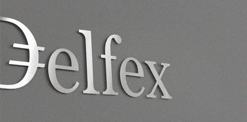
Logo and corporate identity for company trading with foreign currency. I was working on this project last two month. I made for client whole identity set from logo design, stationery design, web design with programming part, copy-writing including slogan and finally design manual. Logo on this photo is mounted in headquarters office on a wall. It was carved out of brushed aluminum plate to gain metallic look which is symbolic interpretation of currency, money and prosperity. Metallic effect literally connects whole identity. All stationery is printed by PANTONE 811 C metallic silver color. For selected materials such as business cards, compliment cards, envelopes and documents folder was used special silver metallic paper.


Kingdom Puzzles - Identidade
Designed for PSekiMG, Graphic Designer in Brazil in 2011
I started a small graphic tshirt and poster print company. Launching this September...hopefully.
My name is [Mi]ke, my partner is [Vi]rode Together we are http://Vimi.co Trustworthy, simple and fun website design and development (based in Bangkok Thailand).
Logo and type design for music label owned by Dutch singer Ilse DeLange.
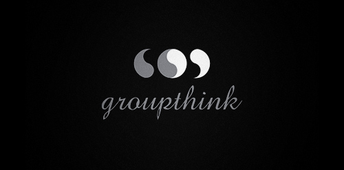
Groupthink - Identidade
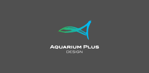
Aquarium Plus — Plant, Fish, Design
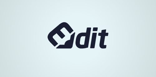
concept : pencil / edit / typography

Juliane Clemente - Especialista em beleza feminina - Identidade
A simple thought to represent 'perfect' by a simple dot which can represent completion, perfect and this is it kind...
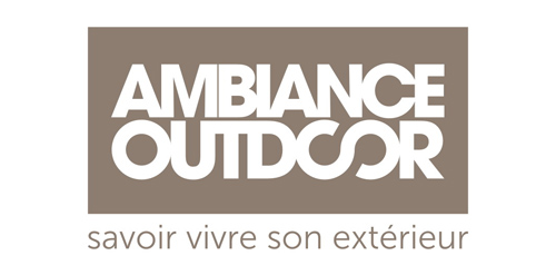
Premium trading that specializes in outdoor furniture and accessories, Ambiance Outdoor is an Elynes brand, as well as 'La Maison de Tante Agathe'. A sophisticated and contemporary global identity, sleek graphic codes, enhancement of all distributed products and brands, the complete branding conceived by Brand Brothers generated a high quality visual environment for Ambiance Outdoor and its customers.
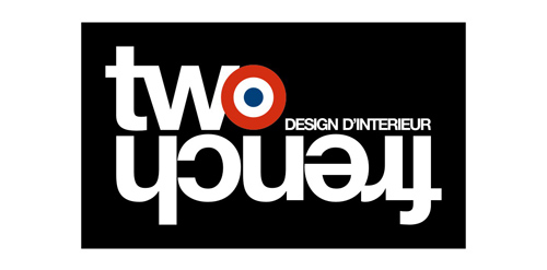
Two french is a Parisian interior designers duo. Brand Brothers created for them their global identity as well as different variations and graphics applications.
Logo for a design/creative studio or anything related to design business would be perfect.
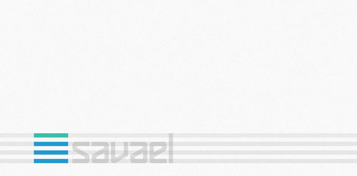
Top of the shelf design by Savael. This renewed logo has a better feel with his font, colors and kerning.
Alternate logo for local fashion designer.
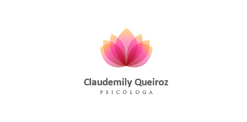
Designed for Claudemily Queiroz, Psychologist in Brazil in 2011
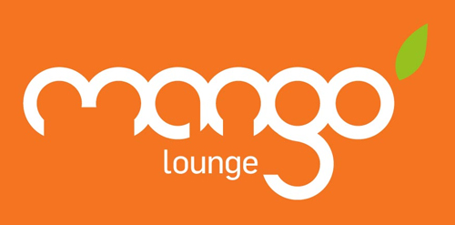
This was a second year university brief to choose a local client and show the benefits of design to a business. I choose a local tapas bar in Cardiff, after talking to the owners and a slight name change from 'Mango - Tapas Bar' to 'Mango - Lounge' I began working on concepts. After attempting to modify different fonts I created my own custom mark from scratch. Based on the shape of a mango and other cypriot fruit I realized all the letters could be formed from circles. I used this discovery to create the logotype, each letter hand drawn based on one or two interlocking circles. A bright orange colour that reflects the bar's food and atmosphere and a single green leaf to suggest freshness.
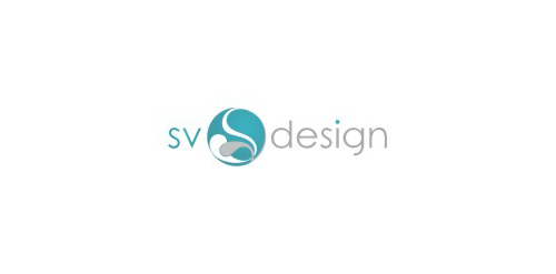
"S" and "V" letters within harmonising circle.
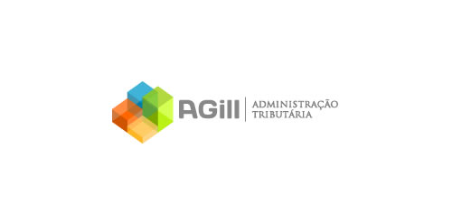
Designed for AGill, Tax Administration in Brazil in 2011
Art(fresco) & programing(code).
Objective- Simple, professional, meaningful & clean.
Symbol- art brush enclosed in html tags, art & programing working together.
Typography- curved & sharp edges used alternatively(artistic look), each alphabet approximately a square(digital look)
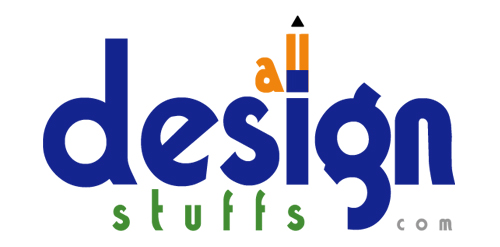
All Design Stuffs is a blog designed and maintained by Sagar Ranpise. Presented in the blog is most valuable techniques, ideas and resources for Web designers. Topics focus on mainly web design, tutorials, and modern design trends.

Designed for Andrea Flóres, Clinical Physiologist in Brazil in 2009
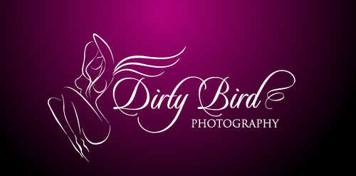
this logo is for a high-class boudoir photography company. Client wanted a very edgy yet elegant and classy logo which needed to transfer well as a watermark for photos.
Our logo inspiration gallery will give you the creative boost you're looking for. Get your daily dose of logo design inspiration to work on your own logo design projects and get your business going. Be amazed by our logo designers and their brand guidelines. We are here to help you impress your clients and our fellow designers. Professionalize your logo design skills and get yourself to a new level. Browse our logo design gallery and discover all the new logo design trends and much more. We know you love logos!