
Graphic Design logos (43)
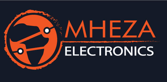
Mhza Electronics is a logo design by New perspective , it incorporates orange as this is a colour of unity whilst the name is local language for looking after your neighbour. The African continent is striped to fgive it a modern origin with electronic drawing style pins as circuitry to represent global influence.


Namami is a leading Florida based Custom Web Design Development Company specializes in providing WordPress Web Design, Social Media Branding services... Namami Inc represents a team of highly skilled and experienced experts in brand development, social media implementation, retail approach, operations strategy and execution with over 25 years.

Logo for a gym fitness type setting red colour for aggressive impulsiveness in training and grunge effect for the newer generation
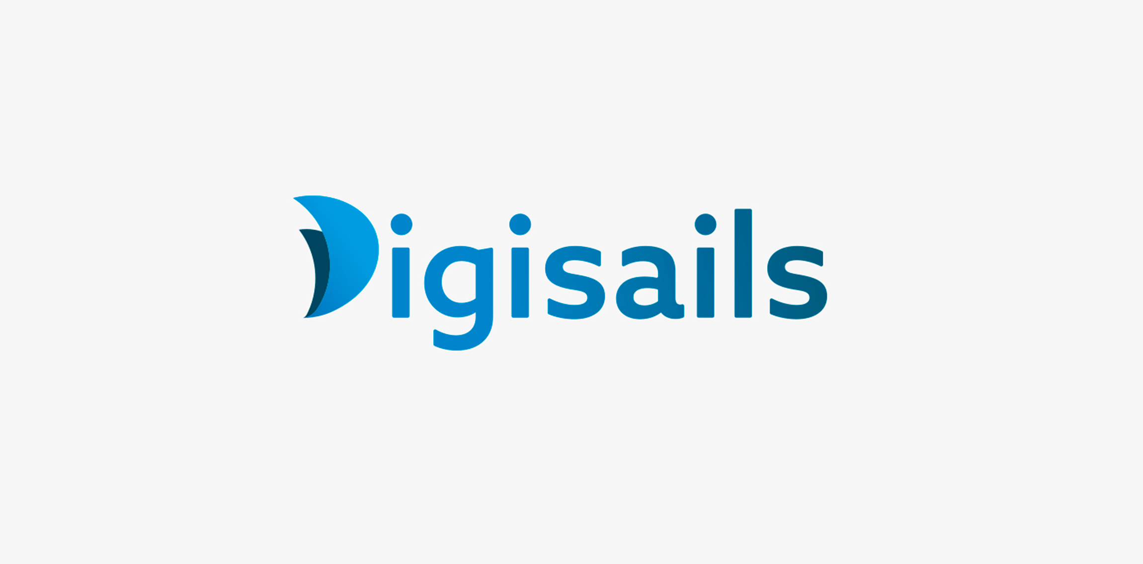
THE CLIENT Digisails is a brand new consulting company that focus on assisting businesses in the digitalization of their internal and external services. Digsails's aim is to shape companies’DNA and take them step by step on the road to success in the digital world. Digisails’s values: · Research · Innovation · Transformation · Involvement · Technology THE CONCEPT "Set sail in the digital world". Companies can’t ignore the ongoing digital revolution anymore. Sailing in this new era is not an effortless task, hence the nautical metaphor: Digisails is the best solution for proceeding along the right course and not get lost in the shifting of your own core. THE OBJECTIVE To instil these values in an up-to-date logotype, clear and tailored to each company’s needs. An increasingly web-oriented logo, nevertheless viable on printouts and unusual media, such as fabrics or other materials. THE SOLUTION The logo is a combination of symbols and typography. The initial, “D”, is represented by two sails swelled by the wind. This symbol will be repeated in the development of the entire identity system. Its colours reflect the blue sea, conveying, at once, a modern and technologic spirit.
Logo Design for Renegade Refinery.
The logo idea for a company, which deals with business tourism in China, providing logistics services, assistance in finding suppliers and cargo declaration.
A logo designed for a cattery.
A logo concept for a South African Game Lodge.
...
A logo design for a graphic design agency.
A logo concept for online store of personalized t-shirts.
exceptional
Company Logo
It's a logo for a new company works in producing juices ( Not Real )
The logotype for a company, which has 20 years of experience in the flooring throughout the UK in order to increase sales and number of customers.
A design concept of the logo for a young and ambitious company that specializes in providing consulting services in the field of software developed by leading Russian developer of information systems, the company "1C".
An idea of the logo as a birthday present for a person, who is falling into various stories associated with the salvation of people, due to his specific nature.
Logo created just for fun for a non existent company of catering services.
I used my initials EC to build the brand with a square module, later I joined the logotype {Futura Std (Regular-Light)}.
You can see the complete project here
https://www.behance.net/gallery/15135001/Personal-Brand-Identity-EC
JAMMBOREE - E-commerce Web Site - Logo and Stationery https://www.behance.net/wip/733985/1347547
Logo for my personal branding for graphic design services.
Wedding hall in the south of Italy
Logo Design for a small Trucking Company in Texas
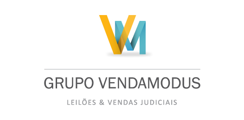
Grupo Venda Modus is a housing and auctioning group. Spot Creative Media designed the new identity, refreshed and updated their current website.
Our logo inspiration gallery will give you the creative boost you're looking for. Get your daily dose of logo design inspiration to work on your own logo design projects and get your business going. Be amazed by our logo designers and their brand guidelines. We are here to help you impress your clients and our fellow designers. Professionalize your logo design skills and get yourself to a new level. Browse our logo design gallery and discover all the new logo design trends and much more. We know you love logos!