
Illustration logos (102)
This logo was created for a hand made toy brand.


Self logo and identity of my face.

Logo for an Indonesian cuisine restaurant.
Because the sheep's for me the most naive "thing" on earth... I think graphicNAIVETY is proudly represented in this one !
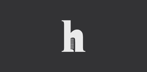
Logo for my own graphic design studio, web design, communication, illustration and graffiti. Playing with the first letter of my name (H) and the word "illustra" (illustrated in English) You can see some of my work in http://www.facebook.com/hilustra
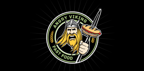
Client work. The original name is "Now make me a sandwich", but i just renamed it. They have a Food truck, makes all kinds of sandwiches. The client wanted illustration of viking.
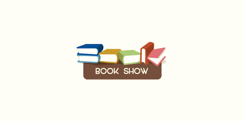
Logo for a local book fair.
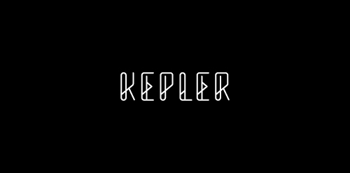
Custom type created from some font options I'm exploring.
Logo for a new cool startup company.
Thats a Logo i did for a CoffeeShop which is specialized to Good Coffee, Limited Editions Sneaker and Artworks.
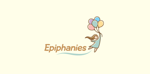
Logo for a personal blog about life and all its positive quirkiness.
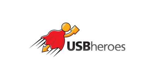
Here is USB superhero!
This is just my idea which came into life at last.
Logo is perfect for any kind of business related to USB devices,flash drives etc.
A logo for a growing business SL firm
A very simple hairdresser logo.
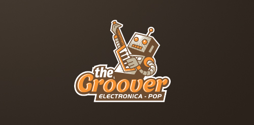
Logo for an iOS music app specializing in electronica-pop genre.
Logo for a content website for online freelance writers.
Handy Books For Children, 6-15 years. The first logo was a mistake! This one is finished.
Bear quotes
Runner logo. All reviews are welcome. Thank you very much.
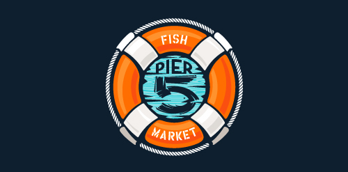
This logo is for a completely fictitious fish market.
The idea came to me when I discovered that it was possible to achieve a fish shape in the negative space within the bowl of the number 5. Dubbing my hypothetical company Pier 5 Fish Market, I created this very maximalist and illustrative mark in the hopes of really capturing the spirit of the nautical and maritime aesthetic. Type is custom for "Pier" and also the number 5, which is hand-rendered to look like it was painted on a wooden sign with a very wide, worn-out, thick-bristled brush. While it was important for the fish to show in negative space, it needed to look like a seemingly happenstance result of logical, real-world brush strokes. In the full lockup, the addition of the life preserver takes less emphasis off this gimmick, allowing one to slowly discover the fish.
Click here to see the case study for this logo, which chronicles its development, and includes full design rationale, sketches, electronic roughs, and alternate designs.
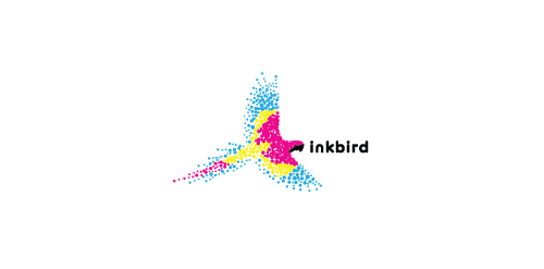
A bird made up of the colors cyan, magenta, yellow, and black to represent a printing company.
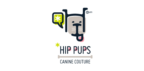
This fictitious company logo is the result of happenstance typographic exploration. I was playing around with H and I letterforms set in Platelet, and, after placing the I within the H, I noticed that it started to look like a dog face. After some modification, and with the addition of a curved P for an extended dog tongue, the resulting typographic illustration spelled "HIP." I thought it would be fun to name this fictitious company Hip Pups, which could be a shop that sells high-end dog accessories. The Registered symbol is integrated creatively into the mark by spelling "RUFF!"
Illustration T-shirt contest for the UN World to end violence against women

Magic show is very nice logo very illustrative and funny work!
Our logo inspiration gallery will give you the creative boost you're looking for. Get your daily dose of logo design inspiration to work on your own logo design projects and get your business going. Be amazed by our logo designers and their brand guidelines. We are here to help you impress your clients and our fellow designers. Professionalize your logo design skills and get yourself to a new level. Browse our logo design gallery and discover all the new logo design trends and much more. We know you love logos!