
Logo Design logos (87)
Bach Phong Travel


IDORO creates custom pure gold busts for clients in the Middle East. The whole company has an antique vibe, represented partly by the Name, which combines "Adoro"(=ital. Love)/"ID"(=Identity) and "Oro" (=ital. Gold). As well as by the Logo itself, which has elements of an antique helmet and a falcon representing luxury and power.
Client: True Beauty OS Field: Fashion shop Location: VietNam Year: 2014
BigS logo design by Art Fox Studio
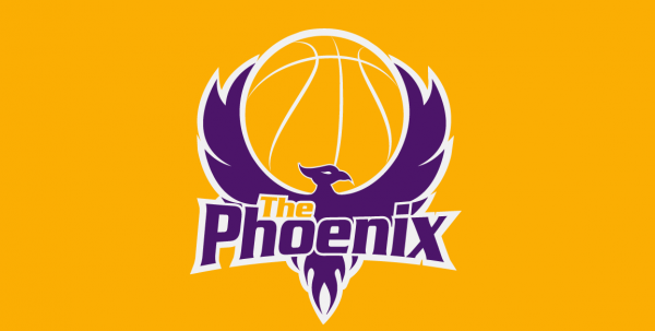
This logo was created for a basketball school. The main concept which client asked to create was to merge phoenix and basketball in a new way with only 2 colors in it, so that it can be used on t-shirts and other printing materials.
Logo created just for fun for a non existent company of catering services.
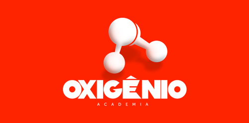
"The concept of a gym nowadays isn’t just about weight loss or muscular mass gain. The Oxygen Gym went through a process of brand development where we aimed to enlighten the good vibes that the physical exercise can bring. So, we presented a brand with no color restrictions so that its application could embrace all of the sports.The color pallete established isn’t an issue as long as there is contrast where the brand is applied. However, because it is a gym that offers several different sports, we decided to use more vibrant colors ."
"The conception for this idea was simple, to join M and B with a CDJ and a lonpglay disc, frequently used by DJs. On the construction grid we developed a system where it doesn’t matter the angle or rotation of the brand, you will always be reading and M and a B just like a disc or CDJ.”
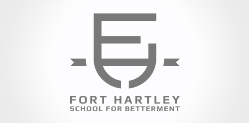
Fort Hartley School for Betterment is a Branding Consultancy Agency in Cape Town. Believing that brands at all times should reflect their personality through great design. The name Fort Hartley is taken from a family trading store in Lesotho from the 1950's - history is important. School for Betterment ties into the companies school theme. Clients are students and students are valued.
A brand reflecting different cultures from around Africa.
Logo for my personal branding for graphic design services.
Fancy Design is my personal project. This is the branding for Fancy Design. My work includes designing branding, logo and website. I work with people all over the world.
Interprotrans is a translation company provides kinds of translation services for business and personal customers with professional and high quatity services.
Wingo provides fashion products. Logo wingo was designed base on the name of brand "Win Go" and the image of the crown and the victory.
ICT24H is an information technology in Vietnam. ICT24H is a IT service company, provides the quantity training program, strategy and consulting technical about many products and technologies.
Deer and Frog is a branding & graphic design agency which is based in Jakarta, Indonesia.
The Philosophy Behind The Logo
Many people view design and function as two totally different things just like deer and frog are two very different animals. However, we at Deer and Frog completely understand that design and function are connected.
This is why the logo is the unity of letter D & F which stand for design and function.
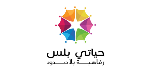
Logo design project for Hayati Plus brand
The logo is created for a cloth & zari manufacturer, Mariya Fabs. The icon is designed from the letters M & F which are the initials of the company name.
The horizon brings about a reel of hipe while the red was used to depict a bright, glowing and rising organization
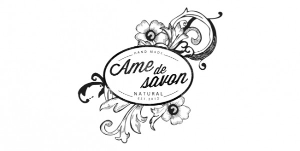
Local hand made soap & beauty care eco-natural products small bussines. - vintage designed elements -
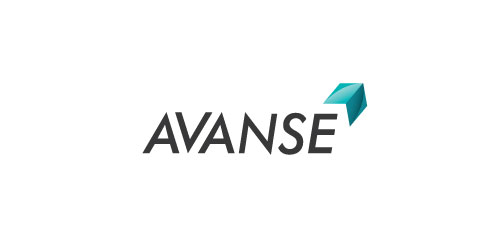
The arrow portrays Avanse as a tool that breaks through barriers through education.
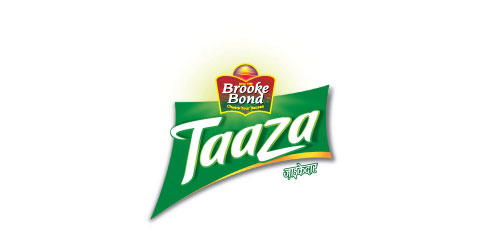
The ribbon that runs across evokes refreshment. The‘t’ & ‘z’ denotes active motion. Green colour brings out the freshness of the tea.
The cut gives the logo a sharp upword movement
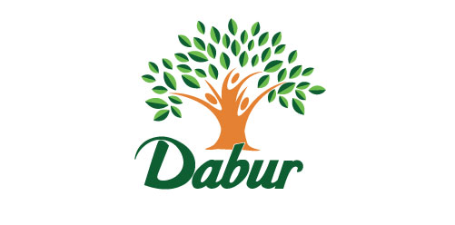
The age old Banyan tree which is essential to the brands identity was rejuvenated bith to showcase the brands heritage as well as to contemporize the brand. The green was derived from the category and the orange was used to show optimism.
Our logo inspiration gallery will give you the creative boost you're looking for. Get your daily dose of logo design inspiration to work on your own logo design projects and get your business going. Be amazed by our logo designers and their brand guidelines. We are here to help you impress your clients and our fellow designers. Professionalize your logo design skills and get yourself to a new level. Browse our logo design gallery and discover all the new logo design trends and much more. We know you love logos!