
Mark logos (241)
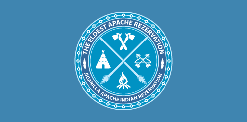
Badge for an Indian community made in a minimalistic style (made for fun).


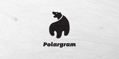
Logo for Polargram
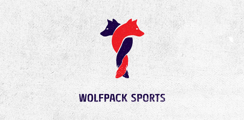
Logo design for Wolfpack Sports Client: RAINFALL
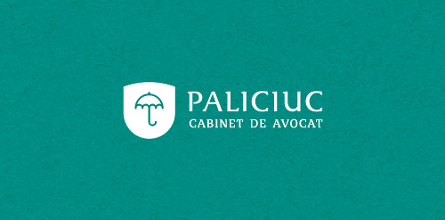
Logo design for law office. Legal shield for your needs.
Custom type created from some font options I'm exploring.
The concept is based of my ideation process. The dynamite represents the initial spark of an idea, while the pencil relates to the creative result.
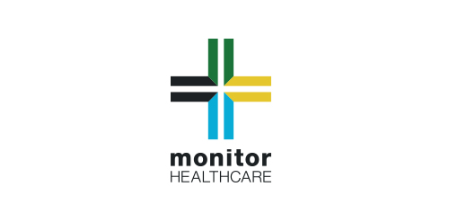
I was approached by new organisation 'Monitor Healthcare' to design their logo and brand identity.
Monitor Healthcare aim to provide people all around Africa with free medical advice via online and telephone methods. As this service is to be for the full continent I wanted to create a logo that would represent this unity.
The different colours of each section of the cross are representative of the North, East, South and West regions of Africa. The individual colours were picked based on the flags of the countries within each region.
The white cross in the middle of the logo is to symbalise the unity of the continent which Monitor Healthcare aim to provide.
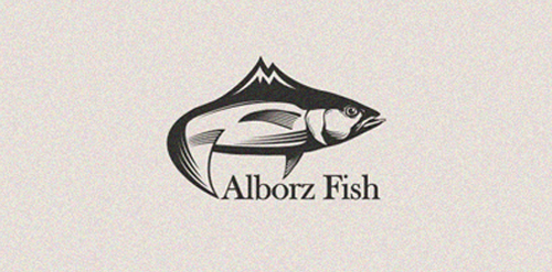
this logo is for fish packages and these fishes are giving of between mountain, s rivers.
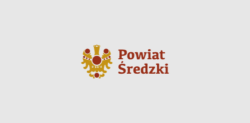
first concept made for Powiat Sredzki region in Poland - showing a eagle which is a part of a great treasure found in the 80s in this region - made for a competition.
a logo made for my own project - custom type.
a logo made for a it technology company from Poland - unused concept.
For a iPhone app development company
Logo for small jewelry brand and shop.
My own personal mark.
B/flying horse monogram proposal for an apparel brand.
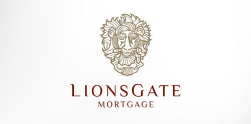
Antique, ornate, brass lion head door knocker logo for a growing and expanding mortgage company that wanted a new look, name, brand and image for their company. The brass knocker represents the entry way into the threshold of the home and the comfort a home signifies.
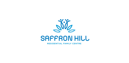
Saffron Hill - Residential Family Centre Mark Saffron Hill is a non-profit agency that provides assessment and support services to parents who have difficulty in caring for their child due to problems like violence, mental health condition, mild learning difficulty, drug problems... etc... Saffron is the most valuable spice in the world it and is worth more then gold in weight. The saffron flower has 6 blossoms and bears 3 stigmas from which the spice is produced. The family resembles the 3 valuable styles from the flower. SAFFRON HILL Typography is custom from scratch.
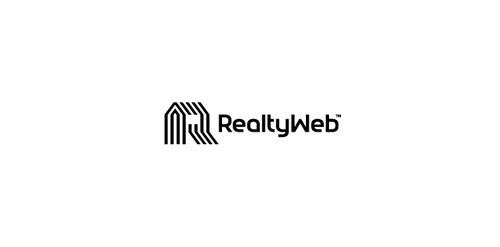
Approved logodesign for Realtyweb.com Custom made Typography. RealtyWeb.com combines 3rd party data and information on close to 30,000 state and local real estate markets to help the consumer and the real estate professional make educated decisions.
Indoor/outdoor music venue and restaurant serving the best food from around the world.
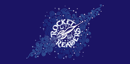
A special program for gifted readers Age 3 - 6, the formative years
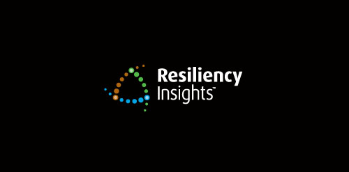
Branding for a recently completed project. Resiliency Insights is a start-up New Zealand based consulting firm. The client wanted to convey interconnections between three specific economies: 1) Primary economy (services and resources provided by nature) 2) Secondary economy (manufacturing industry and commercial services) 3) Tertiary economy (money and financial)
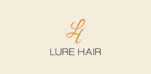
Identity for upcoming hair extensions brand from New Jersey, United States. Lure Hair sells 100% indian human hair extensions to women and salons.
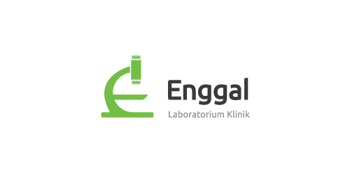
Identity for a Indonesia based clinical laboratory where tests are done on clinical specimens in order to get information about the health of a patient as pertaining to the diagnosis, treatment, and prevention of disease.
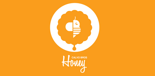
CALVO BROS or CALVO Brothers is a new company that specializes in organic honey and pollen. The Calvo Brothers wanted a logo that included a "C" and a "B", They also wanted one logo that could work across all mediums and have the ability to evolve with company. The Logo Finished Logo includes an abstract B inside a flower and at the bottom of the flower there is a drop of honey. The abstract Bee in the center is "C" (the wing) and a "B" the Body.
Our logo inspiration gallery will give you the creative boost you're looking for. Get your daily dose of logo design inspiration to work on your own logo design projects and get your business going. Be amazed by our logo designers and their brand guidelines. We are here to help you impress your clients and our fellow designers. Professionalize your logo design skills and get yourself to a new level. Browse our logo design gallery and discover all the new logo design trends and much more. We know you love logos!