
Minimal logos (268)
Pizzeria Fast Pizza logo for a training and my personal 30 Day Logo Challenge.


Logo redesign for the company selling tyres. Also for a training, contest and my personal 30 Day Logo Challenge
Pencil Box - logo for store with art supply, for a training and my personal 30 Day Logo Challenge.
Customtype logo for prestige lingerie store, for a training and my personal 30 Day Logo Challenge.
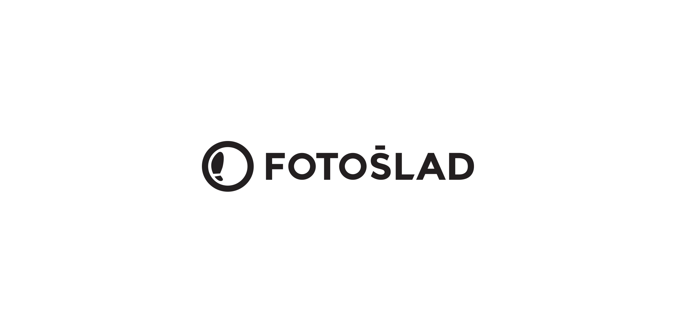
Logo lifting proposal for existing, polish brand dealing with photography. Also for a training and my personal 30 Day Logo Challenge. Polish name means "photographic mark/sign".
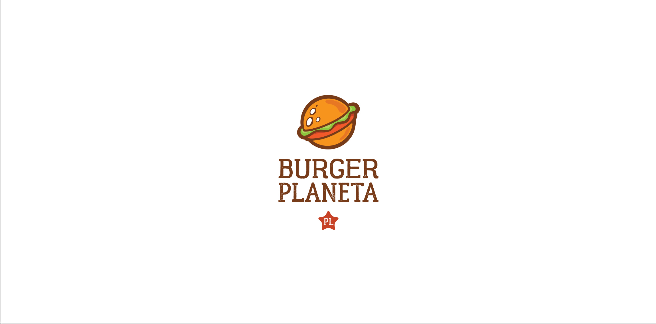
Burger Planeta fast food logo for a training and my personal 30 Day Logo Challenge.
Logo for company engaged in the renovation of old furniture from the communist era (PRL). Also for a training and my personal 30 Day Logo Challenge.
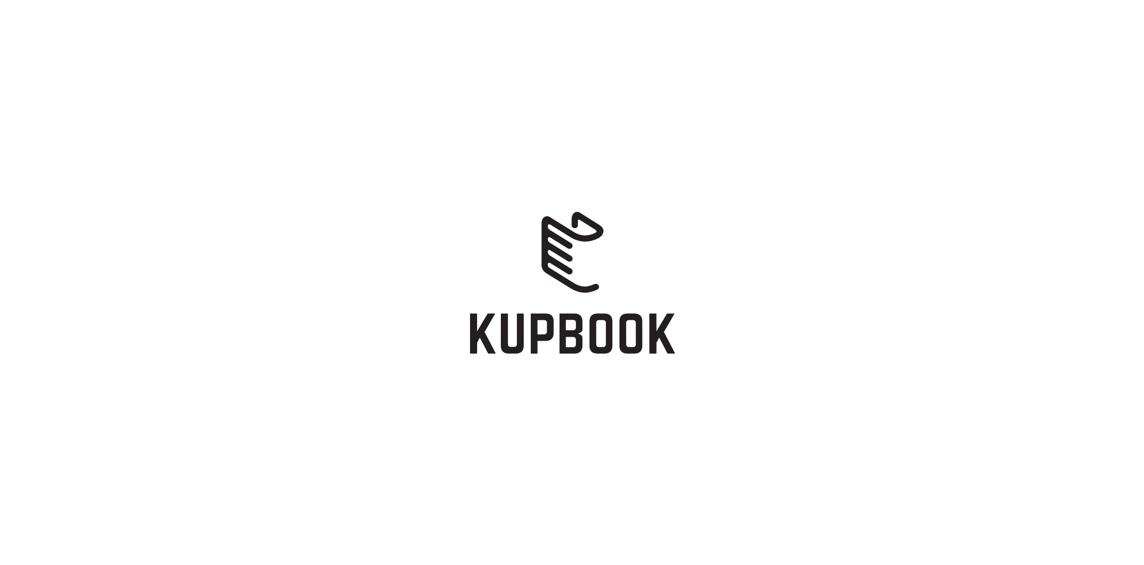
Totally random logo design for a training and my personal 30 Day Logo Challenge. Designed for bookstore "Kupbook".
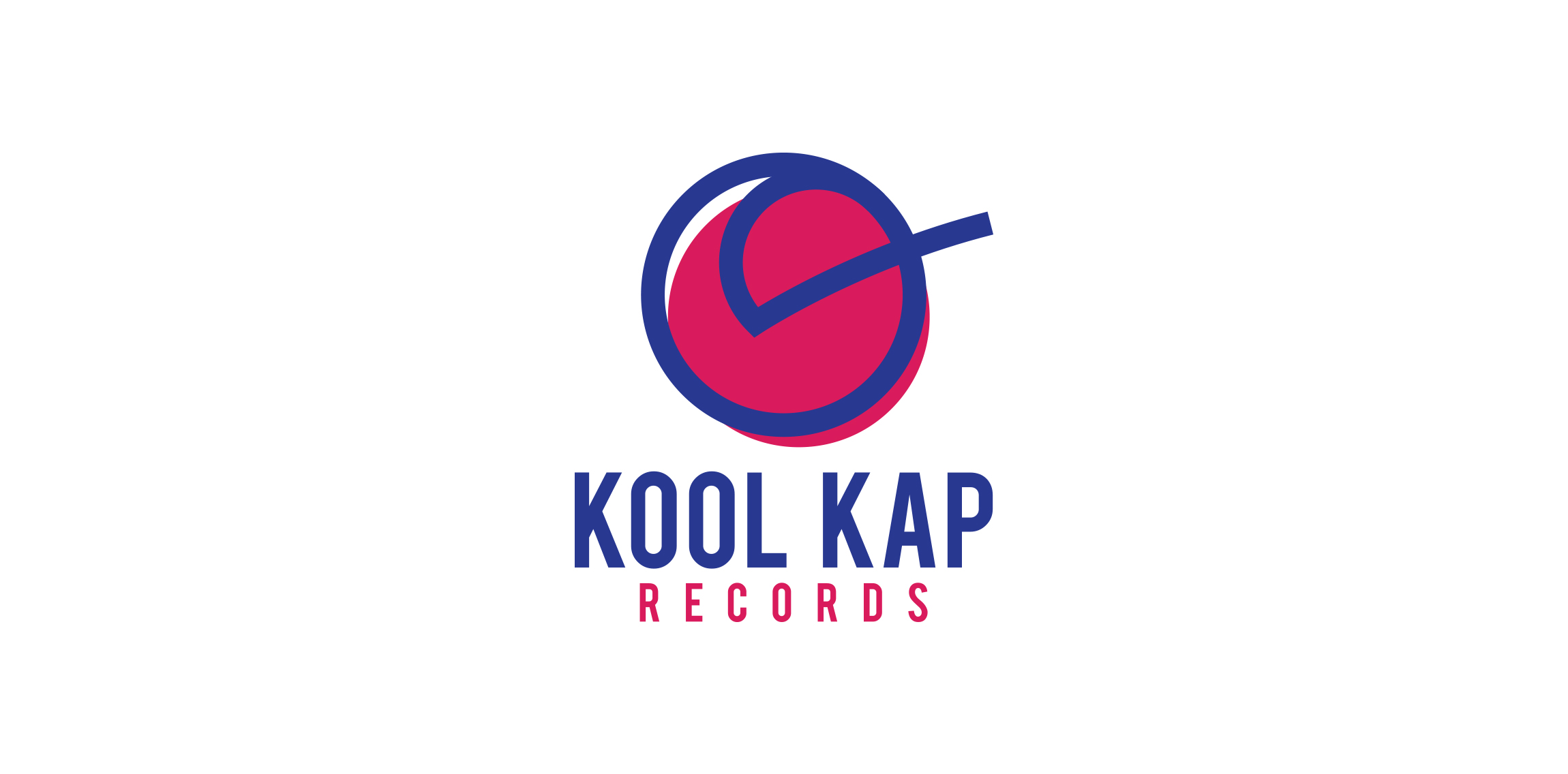
A simple line logo for a recording studio. Their name Kool Kap is somehow their "trademark" and i've used it to create the trademark for the studio.
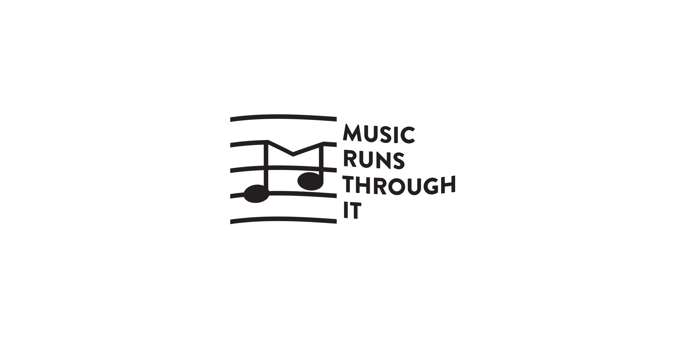
A school for music and music composing asked for a logo with this very large name :) I've created the logo with the usage of a music writing sheet and made a little windy look for it.
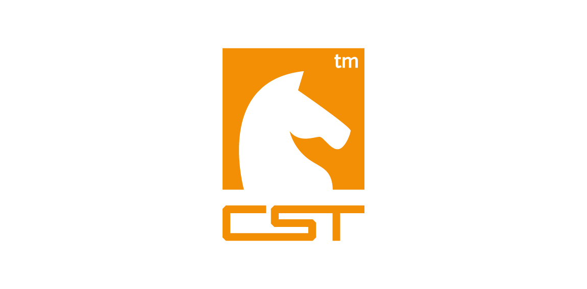
CST is a training company. Symbolism of a chess knight is central to CSTs strategy. It exemplifies dynamism and initiative. Basing on these qualities and the target group in part the automotive branch I have referred in the lettering and composition to the aesthetics of sport cars emblems. Over the course of many sketches, I have created a convincing, minimalistic silhouette. Rendered as negative space against a chess square, it creates a bold, cohesive and legible mark.

Like us on facebook: www.facebook.com/hunapstudio
Logo design done for a jewelry company
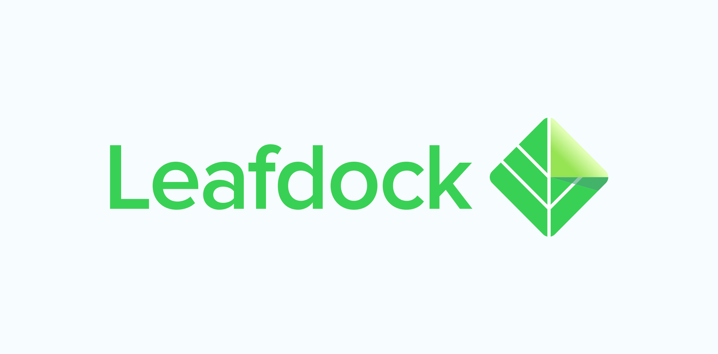
Leafdock is a knowledge management app focusing on easy content creation, powerful search and analytics tool which allows you to work on content that matters the most. Our goal was to create logotype with an independent and recognizable symbol.
SE China Food App Design Author: Orlando Hora http://www.peopleperhour.com/freelancer/orlando/logo-design-x-branding-x-cad/1067789
Logo was made by me,Orlando Hora , for a wild photographer.I only create meaningful beautiful arwork! If you look it's flawless! Hard work brings talent!
A company specializing in making your website load and perform much faster
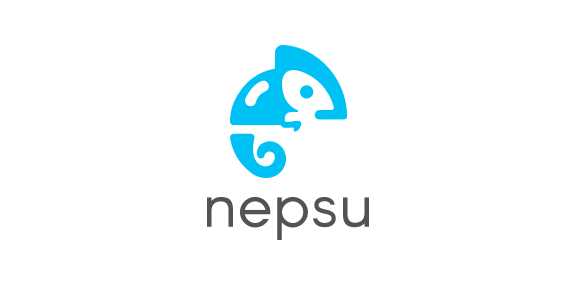
Logo design for home essential electronics startup called Nepsu. Check out their product and maybe you'll understand the reasoning of the chameleon :) http://nepsu.com
Logo for airlines
hop verbicon.

Polish company providing services in the field of metalwork and welding. Logo based on self made letters.
Logo for the manufacturer scrapers for cats.
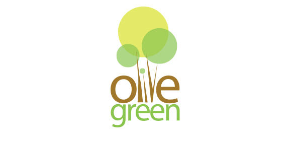
Olive green is an emerging apartment construction company. Dedicated with the idea of not harming the mother nature.Given this situation, logotype identity should be relevant with the name mentioned. Since the logotype was to define the olive green and maintaining green nature. The logotype was made out from the concept design of olive tree and the color combination was maintained as such in nature. With the idea of olive tree, we integrated the name in between the tree on its own wooden color. And the green was made out in the same color to represent the green environment preservation.
Sirotek & Gemerle is an advertising agency based in Prague. The logo combines initials of the founding members with an ampersand.
Our logo inspiration gallery will give you the creative boost you're looking for. Get your daily dose of logo design inspiration to work on your own logo design projects and get your business going. Be amazed by our logo designers and their brand guidelines. We are here to help you impress your clients and our fellow designers. Professionalize your logo design skills and get yourself to a new level. Browse our logo design gallery and discover all the new logo design trends and much more. We know you love logos!