
Modern logos (213)
With a high technical expertise, Jaasp gives its customers new management control tools. The name Jaasp is inspired by the jasper gemstone, known for its many natural colors, which was used for the manufacture of prehistoric tools.


Vielet, meaning to vie for superiority, to let live and inferring the color violet, is a new women's activewear clothing brand featuring Merino wool fabrics and designs that are more feminine, stylish and fashionable.

Armasight is a company who makes night vision products that will be marketed toward the Department of Defense, Special Forces operators, law enforcement, international militaries and hunters/outdoorsmen.
A logo for Młode Miasto
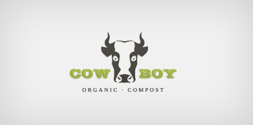
Logo for an organic composting company.
Logo for web design company.
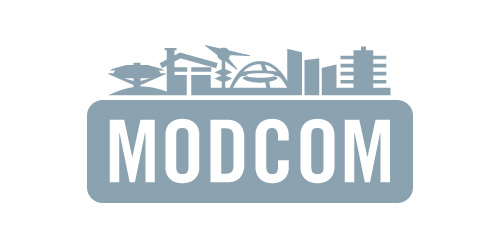
Los Angeles Conservancy's Modern Committee (Modcom) preserves modern architecture in Los Angeles
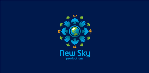
Proposal for New Sky Productions, a passionate, socially responsible company with a global reach based on powerful visual storytelling and compassion through journalism and use a range of multimedia elements to deliver the message.
Logo for my art & design studio.
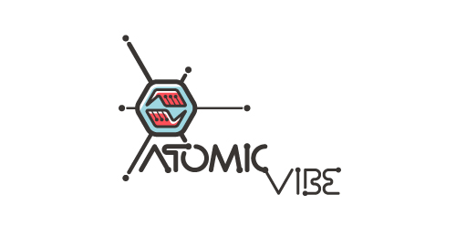
I define ATOMICvibe as the "a-HA!" moment of clarity in the creative process. Like nuclear fusion, it's when tiny ideas coalesce, and then explode into beautiful design.
The logo visually depicts this creative reaction. Forming abstract A & V shapes, the converging hands cradle the tiny beginnings of a big idea, fusing them until they discharge a shockwave of creativity. The custom type, designed to perfectly integrate with the mark, is meant to symbolize electron paths. Heavily inspired by retro imagery from the Atomic Age: science, the Space Race, Sputnik, the iconic George Nelson Ball Clock.
Click here to see the case study for this logo, which chronicles its development, and includes full design rationale, sketches, electronic roughs, and alternate designs.
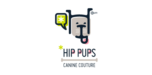
This fictitious company logo is the result of happenstance typographic exploration. I was playing around with H and I letterforms set in Platelet, and, after placing the I within the H, I noticed that it started to look like a dog face. After some modification, and with the addition of a curved P for an extended dog tongue, the resulting typographic illustration spelled "HIP." I thought it would be fun to name this fictitious company Hip Pups, which could be a shop that sells high-end dog accessories. The Registered symbol is integrated creatively into the mark by spelling "RUFF!"
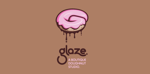
This is a totally fictional company that I refer to as "a boutique doughnut studio." I envision it as a trendy, metropolitan bakery that allows customers to glaze and decorate their own unique doughnuts. I wanted this to look really tactile, gooey, and sweet - like you really want to take a bite. Type for "glaze" is custom, and reflects the roundness of a doughnut. Click here to view my Flickr stream for full design rationale and additional images.
Experimental / concept work
Classic with a modern feel. Black and Yellow
Fun, Clean Logo
Just a modern, clean logo.
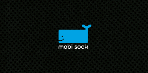
Mobi Sock is a contemporary styled, rectangular shaped, fabric-knit "sock" with draw string (hence the whale's tail) to protect cell phones, ipods and other mobile electronic devices.

iPracticeMD is a nationwide medical billing and revenue cycle management firm in the US.
Terex Environmental Group is a hydrogeology consulting firm based in Calgary, Alberta, Canada providing environmental project management services to the energy sector.
Katapult Design is a firm out of Australia who offers industrial and graphic design services. Concept: Client requested a very, very simple solution. The red corner piece appears as if it's being hurled away and the resulting two pieces are abstract K and D letterforms.
Travel bag and accessory distributor.
Ale beer concept.
Proposal for Combatgrid an online community where aspiring MMA fighters/promoters/gym trainers/ring girls/etc can gain exposure and encourages social networking, blogging, etc, and has tools in place to make it easier for those in the MMA business to advertise themselves.
Proposal for personal protege/mentoring and accountability system.
Logo design for Caymann Entertainment, a California based movie and television production company whose name is a combination of the two partners and a play on a Cayman alligator (hence the subtle alligator eyeball in the symbol).