
Orange logos (125)
Logo for a tour guide in Alexandria.


Studio Orange Photography (Camera viewfinder + Orange)
http://dribbble.com/shots/1481139-Studio-Orange-Photography
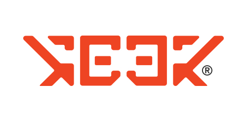
Geek Eyewear ®, who sell chic eyewear celebrates diversity, individuality, and creative enthusiasm of Geek culture.
A flippable, reversible logo that always reads the word ‘GEEK’ no matter which way you look at it. The shape also looks like a geek wearing glasses. The angular shapes relate with the technology industry, whilst also looking like an alien language.
Unfortunately this logo design was not used by the company.
Mugla is a County of Turkey and this is Mugla's logo... 2013
Conceptual logo showing an RSS symbol within a star. For sale.
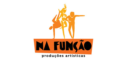
Logo for a Culture Producer, working with actors, dancers, writers, etc, wich lives or has something related to suburbian culture of Brazil (hip-hop, samba, graffitti, street art, literature).
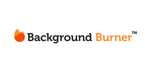
The Background Burner quickly removes the background from any image or photo.
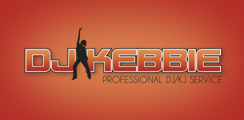
DJ/KJ Services

This logo represents a local heating company who supply plumbing services, underfloor heating and general boilers. The logo represents the water being heated up in the shape of a flame pilot light.
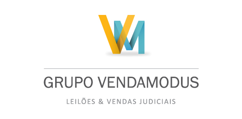
Grupo Venda Modus is a housing and auctioning group. Spot Creative Media designed the new identity, refreshed and updated their current website.

Hi, friends! My new logo for transatlantic shipping company, icon symbolizes package and wings, which means fast and secure service.
Rocket that forms into AM initials
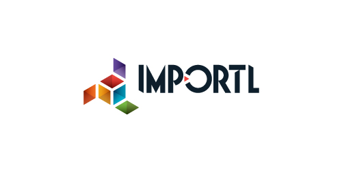
This is a logo for a completely fictitious entity named IMPORTL, which could be an open source web development site, or some type of developer software.
The idea is that the triangular facets form a series of open holes, or "portals," in multidimensional space. The central facets can also be seen to form a cube which is open on three sides. Lying before each opening is another opening on that side's respective "floor," yet, in an Escher-like paradox, where spatial orientation is an irrelevant construct, there is no floor. There is no up, down, left, right, back, or forth. This hyperspatial environment suggests infinite possibilities for the arrangement, manipulation, and exchange of data.
For color, the idea is that the primary colors that form the central cube beget the secondary colors that rotate outward, suggesting expansion, transformation, evolution.
The mark employs a custom typeface that compliments the angularity of the mark.
Click here to see the case study for this logo, which chronicles its development, and includes full design rationale, sketches, electronic roughs, and alternate designs.
This logo is for sale. 1. Fully editable eps and ai file. 2. Lifetime Customer Logo Support. 3. Free revisions. ie; name, color, background and other minor details. Buy it here: Quick and easy! More info? email me: [email protected] Thanks!
Symbol paradigm change! Logo combining the two most powerful ancient symbols there is. Yin & Yang and Flower of Life. In this case it needed to be the basic form of Flower of Life, the Seed of Life, to have the form nicely integrated as one. This logo is for a Feng Shui consultant that asked specifically for the energy of both symbols. The logo is copyrighted. The feminine fuschia color combines the universal loving energy of pink with calming blue, making the logo strong, passionate and confident. Some orange was added to give it an extra energy boost, to add depth and more symbolism.
This is logo for newest HTML template.
Vikin
Logo for a group of instrumental producers.
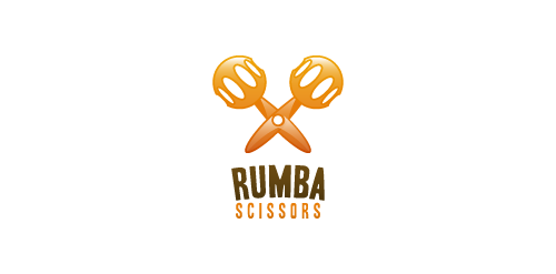
"Rumba Scissors" is a fun logo depicting two symbols merged within one, a pair of scissors and the second, a pair of "maracas" music instruments.
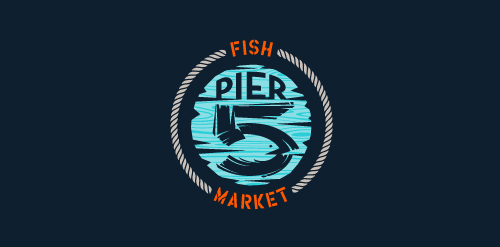
This logo is for a completely fictitious fish market.
The idea came to me when I discovered that it was possible to achieve a fish shape in the negative space within the bowl of the number 5. Dubbing my hypothetical company Pier 5 Fish Market, I created this illustrative mark in the hopes of really capturing the spirit of the nautical and maritime aesthetic. Type is custom for "Pier" and also the number 5, which is hand-rendered to look like it was painted on a wooden sign with a very wide, worn-out, thick-bristled brush. While it was important for the fish to show in negative space, it needed to look like a seemingly happenstance result of logical, real-world brush strokes. This is the minimal, alternate version of this logo.
Click here to see the case study for this logo, which chronicles its development, and includes full design rationale, sketches, electronic roughs, and alternate designs.
Logo for PROFESSIONALS who have a HIGH IQ and/or live with ADHD.

This is a logo for a completely fictitious entity named IMPORTL, which could be an open source web development site, or some type of developer software.
This wordmark features triangular facets — symbolic of the flow of data — that point inward toward the name, reinforcing the namesake.
The mark employs a custom typeface that compliments the triangle shapes.
Click here to see the case study for this logo, which chronicles its development, and includes full design rationale, sketches, electronic roughs, and alternate designs.
Music band from Berlin
Background screening intelligence
Our logo inspiration gallery will give you the creative boost you're looking for. Get your daily dose of logo design inspiration to work on your own logo design projects and get your business going. Be amazed by our logo designers and their brand guidelines. We are here to help you impress your clients and our fellow designers. Professionalize your logo design skills and get yourself to a new level. Browse our logo design gallery and discover all the new logo design trends and much more. We know you love logos!