
Red logos (234)
This logo can be used by many companies: corporate, entertainment, fashion, interior design, games, internet & web and many more.


Logo for a new lifestyle photographer, Serge Berrard.

powefull fuel
Logo for movies studio bulbfield.
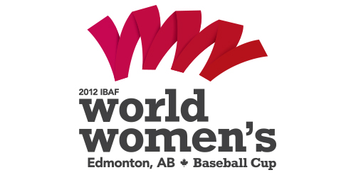
Edmontonians love their sports. Oilers and Eskimos’ games regularly sell out and smaller sporting events are generally well-received. Understanding our ideas would be highly scrutinized, we decided to create an exciting alternative that would stand out among some of the larger sporting events. The biggest challenge was incorporating 40 characters of text (the name, the date, city location) as well as the maple leaf. The shape abstractly references the stitching on a baseball, while making the shape of 2 W’s.
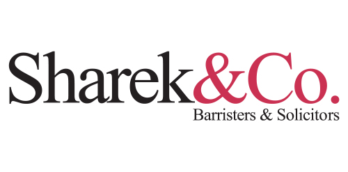
Urban Jungle developed a simple and stylish corporate identity that was initiated by distilling the firm’s name to simply Sharek&Co. From there, the wordmark and colour palate were created. The updated identity is contemporary yet classic, professional yet relaxed, it’s personable and balanced—just like the firm and its staff.
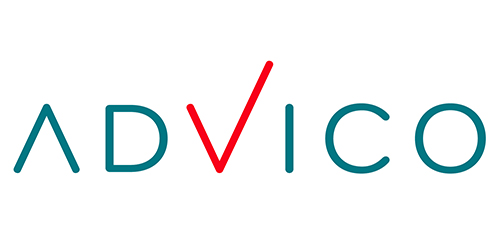
Urban Jungle was given the mandate to put in place a complete corporate identity program for financial planning firm, Advico Professional Investment Services. This wordmark incorporates a customized font treatment to the the Bryant Pro typeface.
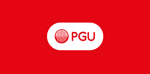
Polish Golf Union logo redeign.
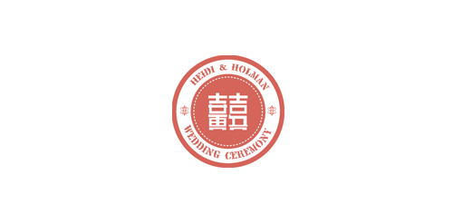
THE wedding ceremony name in chinese is "喜喜". Using the first name in chinese of each name which call "黄" and the name first name of "吴" to combine together with "喜喜" to be this logo. Playing the typo of chinese in this logo.
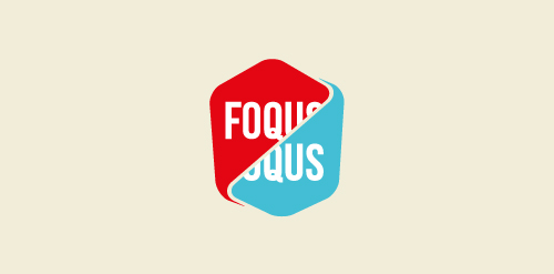
'Foqus Jongeren Filmfestival' was the name of my graduation project, a fictional film festival which focusses on old-school 3D movies. Anaglyph baby!
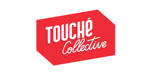
Touché Collective is a young creative collective from The Netherlands. Check them out at www.touchecollective.com
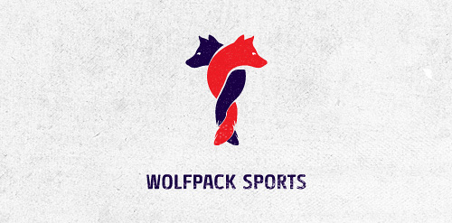
Logo design for Wolfpack Sports Client: RAINFALL
Logo for a new tourism company that offers free walking tours in NYC.
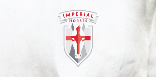
Company sells English thoroughbred racing horses. Client wants royal, imperial look.
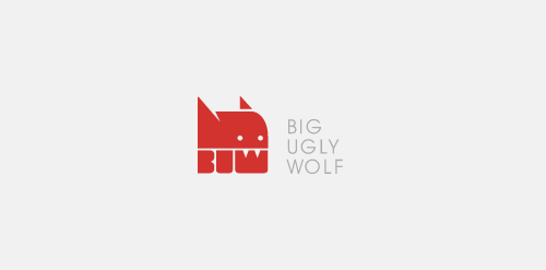
Logo for a graphic design studio: http://biguglywolf.com/ Concept of this logo was based on a wolf's head with initials from the "Big Ugly Wolf" name. That way We have received wolf's fangs due cutout in letter "W".
Clinic
Logo design proposal for a Canadian financial firm based in Ottawa.
Logo made it for firts person shooter (FPS) community (Colombia).
Logo for Heating, Air Conditioning services.
Logo for a business conference for women.
Custom logo as part of a design study of the TV program 'x:enius' running on arte. Detail: http://dribbble.com/shots/396196-x-enius/attachments/21789
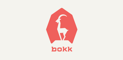
I recently realized I've never designed anything animal related. So I decided to give it a try with this ibex. The logotype was custom made and incorporates characteristics of the ibex. (The name bokk is derived from the word sprinbok.)
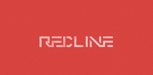
REDLINE: convenience stores/gas station. CONCEPT: I tried to use just lines for this custom typeface.
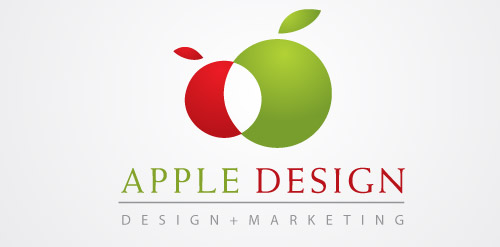
Apple in abstract in both red in green. A logo rendition of the apple fruit. Use for any of your logo design needs. Under Creative Commons 3.0 Attribution. Enjoy. http://www.logoopenstock.com/1079-Apple-Design-vector
Our logo inspiration gallery will give you the creative boost you're looking for. Get your daily dose of logo design inspiration to work on your own logo design projects and get your business going. Be amazed by our logo designers and their brand guidelines. We are here to help you impress your clients and our fellow designers. Professionalize your logo design skills and get yourself to a new level. Browse our logo design gallery and discover all the new logo design trends and much more. We know you love logos!