
Seal logos (18)
Selo de 10 anos para a rádio 89 FM A Rádio Rock, da cidade de São Paulo. Seal of 10 years for the radio 89 FM Radio Rock, of the city of São Paulo.


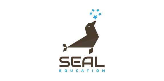
Animal logo in the shape of a seal in conjunction with five stars with brown and blue colors. Logo for sale : https://inovalius.com/item/seal

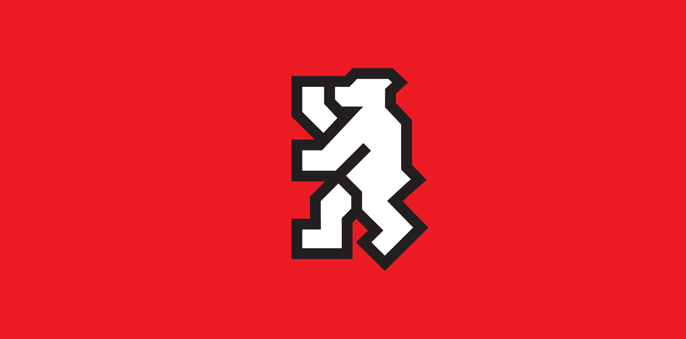
Homage of the famous Berlin bear.
Logo for an interior design company. Based on a traditional Chinese decorative element.
Logo design for a company which produces storage boxes for tobacco products
This logo is for a completely fictitious fish market.
The idea came to me when I discovered that it was possible to achieve a fish shape in the negative space within the bowl of the number 5. Dubbing my hypothetical company Pier 5 Fish Market, I created this illustrative mark in the hopes of really capturing the spirit of the nautical and maritime aesthetic. Type is custom for "Pier" and also the number 5, which is hand-rendered to look like it was painted on a wooden sign with a very wide, worn-out, thick-bristled brush. While it was important for the fish to show in negative space, it needed to look like a seemingly happenstance result of logical, real-world brush strokes. This is the minimal, alternate version of this logo.
Click here to see the case study for this logo, which chronicles its development, and includes full design rationale, sketches, electronic roughs, and alternate designs.
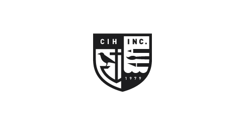
Since 1979 C. I. Hood, Inc. has been providing graphic design, illustration, and advertising design to its customers in the Pacific Northwest, West Coast and Around the World.
Logo proposal for an App development company. Wax seal is used to represent their expertness and various colors suggests various services they provide.
Sensimmo is a real estate broker for high quality homes.
A simple Seal Energy logo.
This is a logo for accounting software for small businesses. The logo is not just a book (accounting), but also a laptop.
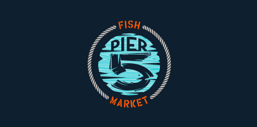
This logo is for a completely fictitious fish market.
The idea came to me when I discovered that it was possible to achieve a fish shape in the negative space within the bowl of the number 5. Dubbing my hypothetical company Pier 5 Fish Market, I created this very maximalist and illustrative mark in the hopes of really capturing the spirit of the nautical and maritime aesthetic. Type is custom for "Pier" and also the number 5, which is hand-rendered to look like it was painted on a wooden sign with a very wide, worn-out, thick-bristled brush. While it was important for the fish to show in negative space, it needed to look like a seemingly happenstance result of logical, real-world brush strokes. In the full lockup, the addition of the life preserver takes less emphasis off this gimmick, allowing one to slowly discover the fish.
Click here to see the case study for this logo, which chronicles its development, and includes full design rationale, sketches, electronic roughs, and alternate designs.
Antique, ornate, brass lion head door knocker logo for a growing and expanding mortgage company that wanted a new look, name, brand and image for their company. The brass knocker represents the entry way into the threshold of the home and the comfort a home signifies.
A web design & communications company.
Indoor/outdoor music venue and restaurant serving the best food from around the world.
A special program for gifted readers Age 3 - 6, the formative years
A yacht detailing business.
An unused proposal for an executive home staffing company which I turned into an high-end event planner agency. Combining pineapple, a symbol of hospitality, and fleur-de-lys, a symbol of elite.
Our logo inspiration gallery will give you the creative boost you're looking for. Get your daily dose of logo design inspiration to work on your own logo design projects and get your business going. Be amazed by our logo designers and their brand guidelines. We are here to help you impress your clients and our fellow designers. Professionalize your logo design skills and get yourself to a new level. Browse our logo design gallery and discover all the new logo design trends and much more. We know you love logos!