
Stroke logos (13)
LOGO PARA EMPREENDIMENTO IMOBILIÁRIO. LOGO FOR REAL ESTATE DEVELOPMENT.


Some experiment about verbicon, i hope you like :)

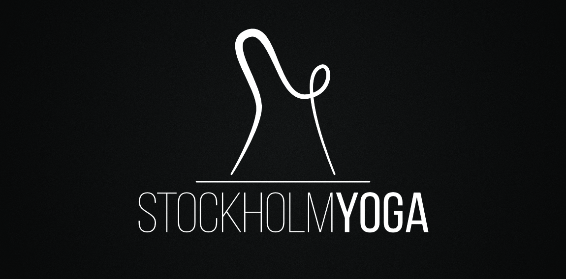
A downward dog design displaying the letters S & Y.
Playing with name & letters.
Logo para minha empresa de design gráfico
Just playing with letters :) • • • follow us on www.instagram.com/triptic.pl
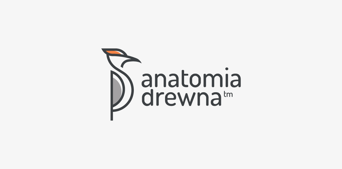
A mark created for company dedicated to woodworking wooden furniture, houses, toys, gadgets etc. Woodpecker perfectly fit as a symbol of handcraft of woodworking. Anatomia drewna mean "wood anatomy". • • • follow us on www.instagram.com/triptic.pl
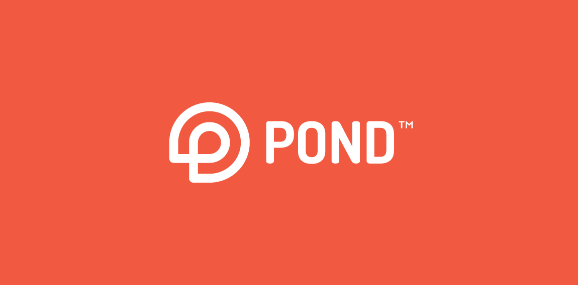
Logo design made for new dating site/app. Mark is a combination of "P" letter with simplified shape of water lily (very characteristic part of pond). • • • follow us on www.instagram.com/triptic.pl
Hello everybody :) I just launched my new website so if you have time, please visit it and let me know your thoughts - if not, just left a homophobic comment :) www.triptic.pl
logo for art company
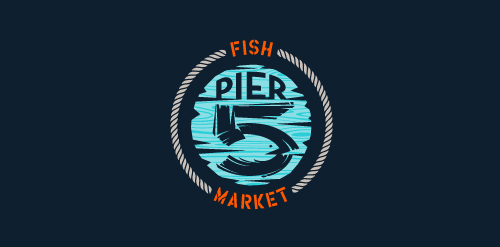
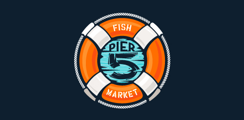
This logo is for a completely fictitious fish market.
The idea came to me when I discovered that it was possible to achieve a fish shape in the negative space within the bowl of the number 5. Dubbing my hypothetical company Pier 5 Fish Market, I created this illustrative mark in the hopes of really capturing the spirit of the nautical and maritime aesthetic. Type is custom for "Pier" and also the number 5, which is hand-rendered to look like it was painted on a wooden sign with a very wide, worn-out, thick-bristled brush. While it was important for the fish to show in negative space, it needed to look like a seemingly happenstance result of logical, real-world brush strokes. This is the minimal, alternate version of this logo.
Click here to see the case study for this logo, which chronicles its development, and includes full design rationale, sketches, electronic roughs, and alternate designs.
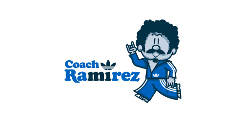
Fictional logo for an Adidas-themed résumé. This is in no way affiliated with Adidas.
Earlier this year, Adidas Originals had an open Design Director position in their Portland HQ, and, being a lover of the brand, I decided to apply. To demonstrate not only my skills as a graphic designer, but also my knowledge and respect for the adidas brand and its legacy, I designed a self-promo booklet (a highly-conceptual adaptation of my current résumé) that is aesthetically inspired by adidas Originals marketing brochures. The booklet chronicles the accomplishments of a fictional alter-ego, Coach Ramirez — an adidas track suit wearing, afro'd, mustachioed designer — and is written as if he's actually the Design Director at adidas Originals. Sadly, I didn't get the job.
Click here to view my Flickr stream for full design rationale and additional images.
This logo is for a completely fictitious fish market.
The idea came to me when I discovered that it was possible to achieve a fish shape in the negative space within the bowl of the number 5. Dubbing my hypothetical company Pier 5 Fish Market, I created this very maximalist and illustrative mark in the hopes of really capturing the spirit of the nautical and maritime aesthetic. Type is custom for "Pier" and also the number 5, which is hand-rendered to look like it was painted on a wooden sign with a very wide, worn-out, thick-bristled brush. While it was important for the fish to show in negative space, it needed to look like a seemingly happenstance result of logical, real-world brush strokes. In the full lockup, the addition of the life preserver takes less emphasis off this gimmick, allowing one to slowly discover the fish.
Click here to see the case study for this logo, which chronicles its development, and includes full design rationale, sketches, electronic roughs, and alternate designs.
Our logo inspiration gallery will give you the creative boost you're looking for. Get your daily dose of logo design inspiration to work on your own logo design projects and get your business going. Be amazed by our logo designers and their brand guidelines. We are here to help you impress your clients and our fellow designers. Professionalize your logo design skills and get yourself to a new level. Browse our logo design gallery and discover all the new logo design trends and much more. We know you love logos!