
Symbol logos (114)
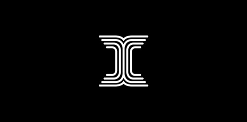
Letter-mark for I


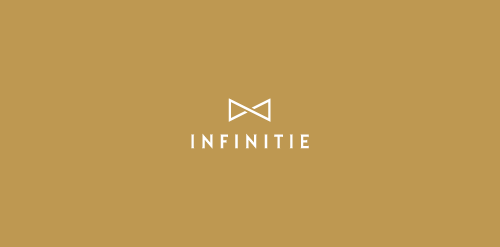
Tie in the shape of an infinity symbol.


Chiron Health provides a secure platform for physicians to connect with patients via video conference for certain types of follow-up appointments.
The linework creates a medical cross sign and a hint to video where the lines connect with each other in the middle.
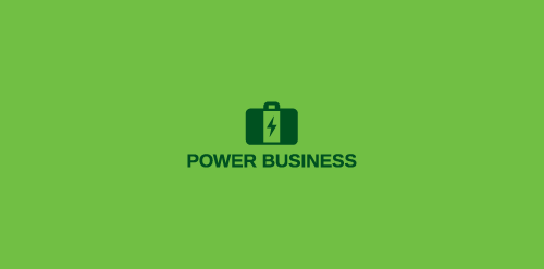
Combination of a battery and a suitcase.
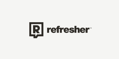
Most popular lifestyle portal in Slovakia and Czech Republic. Keeping you FRESH since 2011. The client approached me to redesign theirs logo. Refresher.sk need new logo that will reflect a primary activity. So I was looking for a way to simplify the logo, but also to have supported the idea and objectives of the portal. Gist for Logomark I chose symbol refresh, as you know for example, web browsers (symbol I wanted to get into logos peacefully and therefore I chose negative space), it is added to the symbol of conversation (bubble), which can be further used in communication portal (printed materials, merchandising, etc.), and the letter R. Scripture for the logo, I chose Helvetica. It is distinctive, timeless and elegant, expressing emotion is just FRESH :)
The client want it a Latter logo something luxury and elegant with the GP so our designer figure it out a unique and great way how to connect Those "GP" and the design got a luxury and modern touch. www.prowaystudios.com
Combination of an eye and a waterdrop. This logo can be used for water inspecting services, eye care etc.
This is a logo for a completely fictitious entity named IMPORTL, which could be an open source web development site, or some type of developer software.
The idea is that the triangular facets form a series of open holes, or "portals," in multidimensional space. The central facets can also be seen to form a cube which is open on three sides. Lying before each opening is another opening on that side's respective "floor," yet, in an Escher-like paradox, where spatial orientation is an irrelevant construct, there is no floor. There is no up, down, left, right, back, or forth. This hyperspatial environment suggests infinite possibilities for the arrangement, manipulation, and exchange of data.
For color, the idea is that the primary colors that form the central cube beget the secondary colors that rotate outward, suggesting expansion, transformation, evolution.
The mark employs a custom typeface that compliments the angularity of the mark.
Click here to see the case study for this logo, which chronicles its development, and includes full design rationale, sketches, electronic roughs, and alternate designs.

Mark for a company specializing in film production / public relations
A result of exploration of the SJ letters combination, without having them too obvious.
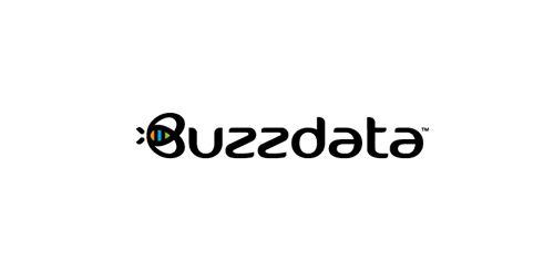
BuzzData is a social platform/network where you can publish and discuss data. BuzzData lets you publish your data in a smarter, easier way. It's about data and a part of it to visualize the information. You can attach articles, visualizations, apps and even source code... etc. www.buzzdata.com Identity solution: A custom made uniqe Typography with a varying thickness shows buzz and motion. The front letter "B"ee can also be used as a standalone favicon which is very important for a social network company since it is easier to incorporate it in very small sizes around the web for buttons and links. The Bee has a uniqe shape, is very memorable and iconic. The colors which are used into the negative space of the bee are resembling the companies main product >data< which comes from the social network users in unlimited variations... everyone can publish and discuss data. The color forms are reminiscent of chart bars, pies (statistics).

For a local anesthesiologist team in the ulm. They wanted the town's landmark incorporated somehow in the logo. The Minister of ulm is the tallest church in the world. For those who don't know the landmark of ulm follow this link for more information: http://en.wikipedia.org/wiki/Ulm_Minster
This logo represents the brand create for my friends in London from Sevilla
This logo represents the brand of advertising in Sevilla
This logo represents my proposal for the election of the new logo for la peña Taurina de Almedijar, Castellon
This logo represents my proposal for the election of the new logo for Real e ilustre colegio de Medicos de Sevilla
Recently designed logo for an young french movie director Gary Sfez.
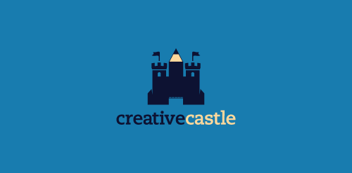
Logo proposal for a webdesign agency. Inspiration: a castle which instead of a middle tower has a pen pointing up.
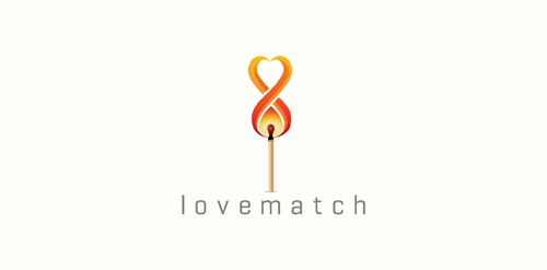
Logo shows match,flames,heart and an infinity symbol.
Light household structures.
Custom type created from some font options I'm exploring.
The concept is based of my ideation process. The dynamite represents the initial spark of an idea, while the pencil relates to the creative result.
Greenosia
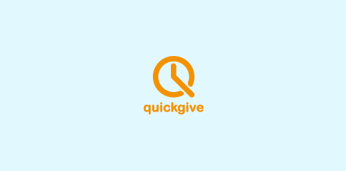
a fast project - very economical - for a company, portal giving a functionality to give quck donations.
Our logo inspiration gallery will give you the creative boost you're looking for. Get your daily dose of logo design inspiration to work on your own logo design projects and get your business going. Be amazed by our logo designers and their brand guidelines. We are here to help you impress your clients and our fellow designers. Professionalize your logo design skills and get yourself to a new level. Browse our logo design gallery and discover all the new logo design trends and much more. We know you love logos!