
Symbols logos (11)
simple logo designs lovelive


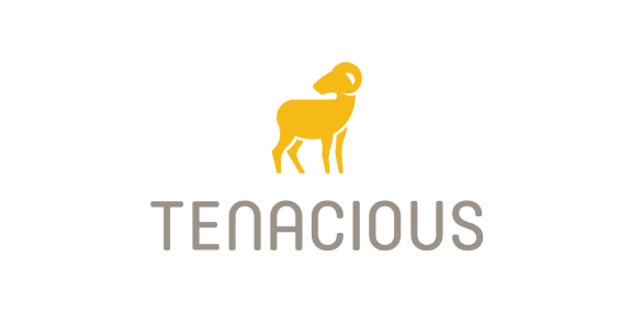
Based in Denver, Colorado, Tenacious Landscaping is involved in projects ranging from town to country gardens, and uses both traditional and contemporary styles. Our design work for the Tenacious Landscaping brand coincided with a revised content and monetisation strategy. So we chose the wild beauty of the bighorn sheep, the State animal of Colorado for this vibrant company’s brand identity. Boasting horns that can weigh up to 14kg and an intrinsic part of Native American mythology, this animal captures the spirit of Colorado wildlife and reflects Tenacious Landscaping’s brand values of power and elegance.
Studio Copper is an american company that handcrafts genuine copper mugs that was born in 2015.

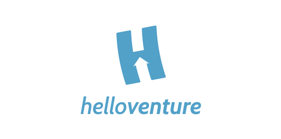
Hello Venture is an organisation that brings start-up communities together and creates spaces for entrepreneurs to learn and work. In this case, the brand identity that we created focuses on the letter H with an arrow inside to symbolise the progressive growing of the new enterprises. The H is flying up. The logotype is set in lowercase letters to emphasise the company’s humble and friendly approach. The colour scheme represents security and confidence. The result is a minimalist identity with customised typeface and flexible print material.
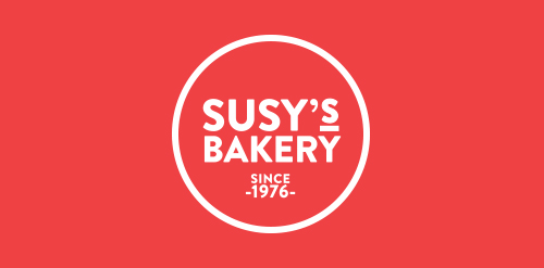
Susy’s Bakery ® is a premium quality bakery and food retail space founded and established by Azucena Romero Camarena since 1976 in Guadalajara, Mexico. The corporate identity is directly derived from the profile of the company: a small business which bakes signature gourmet cookies, cakes, cupcakes, pies, and choux, priding itself of having the best homemade touch of the region. Susy's Bakery’s packaging is quite simple and very easy to apply; we use parchment paper to wrap the different products, which is printed with a pattern of pictograms specially designed for the brand. Circular stickers are also printed with pictograms to stick on laminated packaging; finally, when delivering the client their purchase we use recycled paper bags printed with different designs, each made for small bags and for larger bags.
Personal ID-Logo, located for a freelancer in Germany.
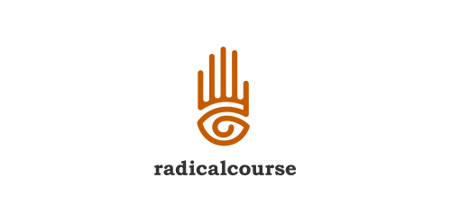
When you see, you act, so seeing is acting - a path to radical transformation. The Eye in Hand symbol is a multi-cultural expression of the interactive bond between two essential human functions: 1) Eye: sensing, knowledge, observation, omniscience (all-knowing), and 2) Hand: doing, power, acting, omnipotence (all-powerful). "It is only when you see the conditioning and the danger of it immediately, and as you see a precipice, that you act. So seeing is acting."
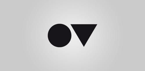
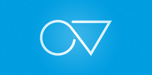
Personal logo for a creative agency, located in Germany. Kreisdreieck stands for the geometrical symbols circle (Kreis) and triangle (Dreieck). The symbols are placeholders for the first letters from my name. O and V. Simple as well ;)
Fire Lovelo
5 Way Design
A simple personal logo project working with negative space, shadows and unusual colors.
Our logo inspiration gallery will give you the creative boost you're looking for. Get your daily dose of logo design inspiration to work on your own logo design projects and get your business going. Be amazed by our logo designers and their brand guidelines. We are here to help you impress your clients and our fellow designers. Professionalize your logo design skills and get yourself to a new level. Browse our logo design gallery and discover all the new logo design trends and much more. We know you love logos!