
Type logos (157)
Its a clean and luxurious logo that can be used by any companies.This can be used for companies related to fashion,restaurant,entertainment,media etc.


Its a typography logo. Logo will fit for any type of business.

The key to open plan living!
Exploration of calligraphy. Custom lettered Cocobolo.

Its a colorful logo.
As a degree project, I designed an identity for Korea by manipulating Hangul, the Korean alphabet, to form English alphabet.
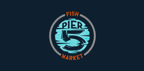
This logo is for a completely fictitious fish market.
The idea came to me when I discovered that it was possible to achieve a fish shape in the negative space within the bowl of the number 5. Dubbing my hypothetical company Pier 5 Fish Market, I created this illustrative mark in the hopes of really capturing the spirit of the nautical and maritime aesthetic. Type is custom for "Pier" and also the number 5, which is hand-rendered to look like it was painted on a wooden sign with a very wide, worn-out, thick-bristled brush. While it was important for the fish to show in negative space, it needed to look like a seemingly happenstance result of logical, real-world brush strokes. This is the minimal, alternate version of this logo.
Click here to see the case study for this logo, which chronicles its development, and includes full design rationale, sketches, electronic roughs, and alternate designs.
Logo for a street wear company due to launch this year
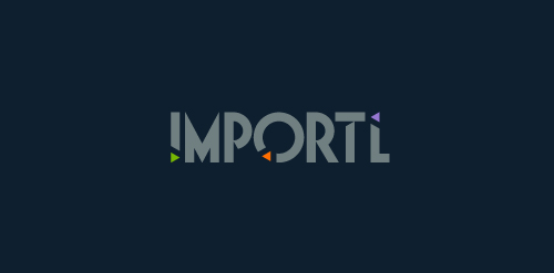
This is a logo for a completely fictitious entity named IMPORTL, which could be an open source web development site, or some type of developer software.
This wordmark features triangular facets — symbolic of the flow of data — that point inward toward the name, reinforcing the namesake.
The mark employs a custom typeface that compliments the triangle shapes.
Click here to see the case study for this logo, which chronicles its development, and includes full design rationale, sketches, electronic roughs, and alternate designs.
Logo for online newspaper in Trinidad and Tobago. More images in behance: http://bit.ly/VL6df5
Polish software house strongly devoted to Research & Development in cutting-edge telecommunication solutions.
Official retro styled logo redesigned for Ianiverse Designs.

A logo made for a mobile service

Entry for a logo competition for the famous dubstep dj Rusko
Self identity, custom typeface.
The Scrapstore is a charity that collects safe waste from business which can be re-used as a low cost creative resource by its member groups.
Logo for luxury London based interior design consultancy LLI Design
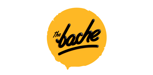
The Bache is the name of own small business in video productions and graphic design. It is pronounced as ‘The Badzje'. Little shameless self-promotion right here: www.thebache.nl
Unused proposal for a restaurant that donates a plate for each plate consumed.
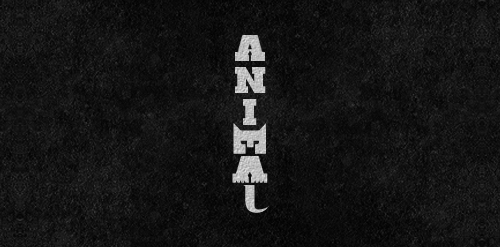
Letters 'M', 'A' used to form the animal and 'L' for its tail...
Art projects using toothbrushes.
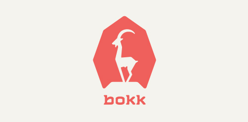
I recently realized I've never designed anything animal related. So I decided to give it a try with this ibex. The logotype was custom made and incorporates characteristics of the ibex. (The name bokk is derived from the word sprinbok.)
Logotype project not accepted
Our logo inspiration gallery will give you the creative boost you're looking for. Get your daily dose of logo design inspiration to work on your own logo design projects and get your business going. Be amazed by our logo designers and their brand guidelines. We are here to help you impress your clients and our fellow designers. Professionalize your logo design skills and get yourself to a new level. Browse our logo design gallery and discover all the new logo design trends and much more. We know you love logos!