
Typography logos (394)
Logo design for a Manchester-based Collective, 2011.


Hand lettered wordmark 'Shabby'. Collaboration with Gert van Duinen (cresk.nl).
Vikin
Logo & identity design for Ecological & Green products. Created by Hatim Alami for Altam Med Morocco.
Logo design for a Design Brand, Morocco. By Hatim Alami.
Logo design for a Consulting – Import / Export company, Morocco. Created by Hatim Alami
Its a clean and luxurious logo that can be used by any companies.This can be used for companies related to fashion,restaurant,entertainment,media etc.
Its a typography logo. Logo will fit for any type of business.
K/A Monogram for a fashion designer.
Custom typography for Gatmo.
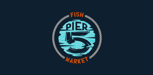
This logo is for a completely fictitious fish market.
The idea came to me when I discovered that it was possible to achieve a fish shape in the negative space within the bowl of the number 5. Dubbing my hypothetical company Pier 5 Fish Market, I created this illustrative mark in the hopes of really capturing the spirit of the nautical and maritime aesthetic. Type is custom for "Pier" and also the number 5, which is hand-rendered to look like it was painted on a wooden sign with a very wide, worn-out, thick-bristled brush. While it was important for the fish to show in negative space, it needed to look like a seemingly happenstance result of logical, real-world brush strokes. This is the minimal, alternate version of this logo.
Click here to see the case study for this logo, which chronicles its development, and includes full design rationale, sketches, electronic roughs, and alternate designs.
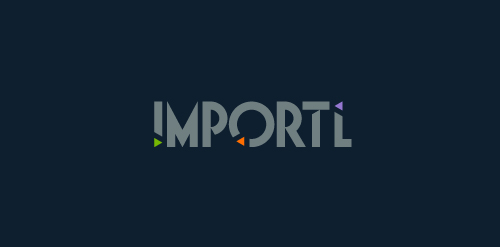
This is a logo for a completely fictitious entity named IMPORTL, which could be an open source web development site, or some type of developer software.
This wordmark features triangular facets — symbolic of the flow of data — that point inward toward the name, reinforcing the namesake.
The mark employs a custom typeface that compliments the triangle shapes.
Click here to see the case study for this logo, which chronicles its development, and includes full design rationale, sketches, electronic roughs, and alternate designs.
Tricord Technologies provides technical solutions and assistance, connecting clients and businesses.
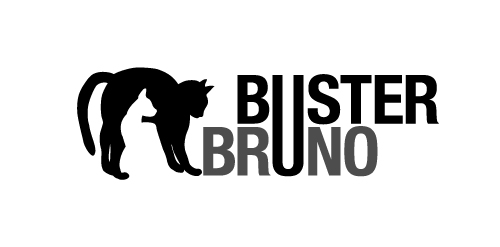
This is a personal project to create a positive/negative identity for a typographic illustrative children’s book called Buster Bruno.
Simple use of the distinctive profiles of Buster and Bruno my two cats uses the negative/positive space to created logo mark. The linking of the u from both words unites the two cats as they are brothers.
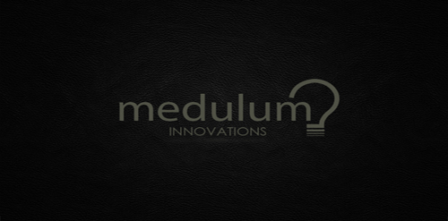
This is a logo I created for a start up company. Medulum refers to the brain's involuntary functions. Innovation as second nature was the theme behind the name, and the light bulb suggest thoughts, ideas and a spark.
Self logo and identity of my face.
Logo for a custom made wine labels and winery.
Logo design for Market Events, a corporate event planning organization.
This is my personal logo as a freelance designer. It's simple, my name and surname connected and creating a pencil.
For typography & graphics academic circle in Wyższa Szkoła Technologii Informatycznych w Katowicach.
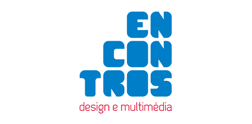
[see more in behance @ http://bit.ly/W8GJLS] Encontros Design e Multimédia is an event. It has being taken place since 2009 and consists in a week dedicated to promote and develop design and multimedia activities, workshops and meetings in the city of Braga. It's promoted by Escola Profissional de Braga. The design, organisation and communication of the event is the responsibility of a finalist student. [The brief] Encontros Design e Multimédia had a clear ambition, grow year after year, it wanted to inspire, involve and thrill the students, professionals and enthusiasts about Design and Multimedia. The logo was to be used in the website, facebook, promotional material, including posters, flyers, video, and a lot more. The goal couldn't be clearer, it had to be unusual. [The solution] The logo represents Encontros's strong ambition. It has all the elements to succeed, it's simple, relevant, it incorporates tradition, it's distinct, memorable, versatile and it stands out from the crowd. It's designed to be filled. Filled with photos, images, participants, speakers, filled with design and multimedia. It has no icons of design or multimedia and doesn't need them, it has all the qualities of both and all the creativity to be anything. [Typography] Encontros has a unique typeface, its custom and it's designed specifically for this brand. It's a bold geometric typeface designed to be filled and to get noticed in every contexts. [Colors] The colors are one of the most important elements of Encontros. The chromatic scheme is very expressive, it's a variation of the well known CMYK, providing a vast number of combinations making the brand very dynamic and inspiring as well. [see more in behance @ http://bit.ly/W8GJLS] [joserodrigues @ http://be.net/joserodrigues]
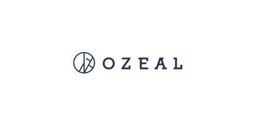
Ozeal is a group of ambitious adventurers, a large family, based in London, leading different ways of life but sharing the same mission: providing all our customers with high quality, richly designed yet low-priced glasses. The idea to set up a website and sell high quality glasses at a low price to anyone in need was brought up about 3 years ago and then we started to embark on this journey. The truth is: we do enjoy it. We name our website as OZEAL. Because we are enthusiasts, we are passionate and we are carrying on our mission through this website with great zeal. Most importantly, we want to pass this zeal on to any of you.
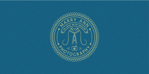
A monogram within a badge for a photographer which is in love with nature. Style required: minimal, retro. The heart is composed by 2 leafs turned upside down with the crests joining.
Our logo inspiration gallery will give you the creative boost you're looking for. Get your daily dose of logo design inspiration to work on your own logo design projects and get your business going. Be amazed by our logo designers and their brand guidelines. We are here to help you impress your clients and our fellow designers. Professionalize your logo design skills and get yourself to a new level. Browse our logo design gallery and discover all the new logo design trends and much more. We know you love logos!