
Typography logos (394)
Logo was made for the web-based business management software systems.


A signature style logo for a jewelry company.

Combining the letter of "i" and the letter of "V" to be the first letter of wedding (W). This logo is for the wedding of Iris & Vincent
Logo for luxury London based interior design consultancy LLI Design
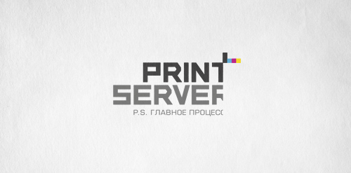
Logo for print shops. Font create by me. Slogan - P.S. the main thing is the process. Thanks for watching. Logosapiens.
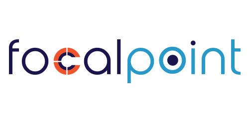
Logo design for an electrical and hardware shop called Focal Point
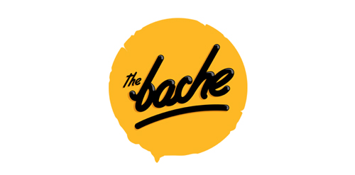
The Bache is the name of own small business in video productions and graphic design. It is pronounced as ‘The Badzje'. Little shameless self-promotion right here: www.thebache.nl
Calligraphic lettering.
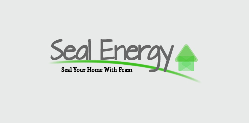
A simple Seal Energy logo.
Calligraphic lettering.
Lettering for calendar of The Birds.
Calligraphic lettering.
Logo for the electronic music project.
Calligraphic lettering.
Stream is an internal content management and communication tool developed by Usman Group.
Calligraphic lettering for online store.
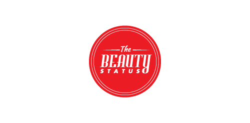
This logo was created for a hockey blog that discusses the good and bad things going on in the hockey world. The logo is meant to look like a stamp and is used to grant 'TheBeautyStatus' to certain players and teams.
Digital Marketing and Design Agency.
Unused proposal for a restaurant that donates a plate for each plate consumed.
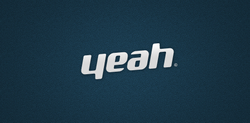
"yeah" like an ambigram.
Many don’t realize that each typeface we encounter in our day-to-day lives is a result of a very intricate creative process, that requires considerable effort on the part of it’s designer. Yet, the hallmark of any great typeface is humbleness: when you aren’t even aware of it while reading, then it’s good. That is the conflict I wish to resolve by raising awareness of the world of typography. I wish to pay my respect to the great masters by capturing their likeness in a series of portraits, composed of the very typefaces they brought into existence. Please take a moment to absorb these images and realize: in any great typeface, each and every letter is born of hours of care and effort, to people who really love their craft. László Sándor
Custom type created from some font options I'm exploring.
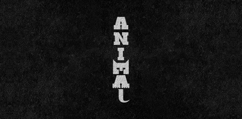
Letters 'M', 'A' used to form the animal and 'L' for its tail...
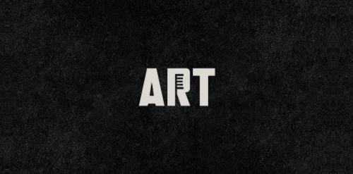
Art projects using toothbrushes.