
White logos (127)
Logo design for a fashion line.


Logo for online store with suitcases and bags. Seen on www.e-walizki.pl www.onedot.pl

Logo
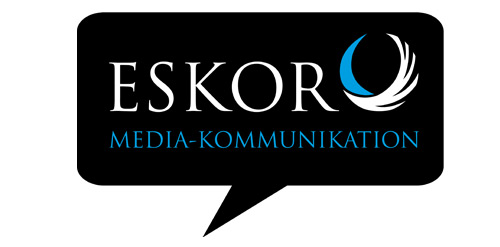
The ESKOR Logo symbolize the communication of our agency.
Start up companies logo
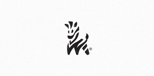
Zebra Brandmark ©
Logo design for a charity based in the UK
Logo for Hootik.es
Audit specializes in implantable hearing solutions.
Approved logo design for Antonio Gouveia a fine art photographer based in the UK who is also a fellow deviant AntonioGouveia you can view his work here, antoniogouveia.deviantart.com/. His work is clean and professional while mostly done in Black and White. He wanted a minimal professional logo to be used on black or white background with his initials "A" and"G" with photography theme. Design is in use by the client.
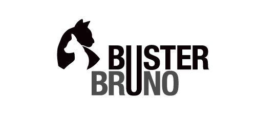
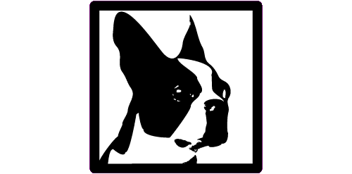
This is a personal project to create a positive/negative identity for a typographic illustrative children’s book called Buster Bruno. Simple use of the distinctive profiles of Buster and Bruno my two cats uses the negative/positive space to created logo mark. The linking of the u from both words unites the two cats as they are brothers.
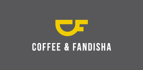
Logo design for 'Coffee & Fandisha' an independent coffee shop based in Baltic Triangle, Liverpool.

Brand name: Hoppy Juice Bars - Field: Beverage Year: 2014 - Location: Vietnam - Web: www.hoppyjuicebars.vn - More About It: https://www.behance.net/gallery/16790135/Hoppy-Juice-Bars
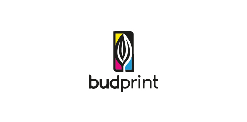
Printing logo (bud to blossom).
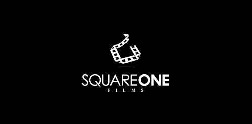
Logo for a new independent film studio/production company.
To update the clients 'Boys Toys' brand using the same black, red and white colours and to appeal not just to teenage children but to juniors. The rocket was used as a retro element but also shows a moving forward toy brand to inspire imagination within children.
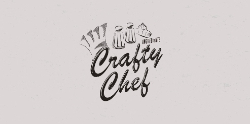
Concieved as a Crafty Chef range of branding products, this focuses on ingredients.
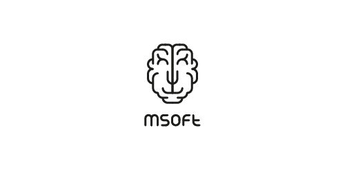
MSoft - this is a young team it-specialists. The name stands for MindSoft. Based on this, we have created a logo transformer schematic showing the brain. Sign acquires different characters thanks to those who entered into it. A myriad of options that allows you to personalize each carrier branding, while fully preserving the recognizability.
Logo design for a Manchester-based Collective, 2011.
A new logo for a travel photographer.
Logo for a company that develops online storefronts that are targeted for selling gift cards and virtual (eGift) cards.
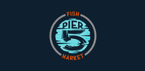
This logo is for a completely fictitious fish market.
The idea came to me when I discovered that it was possible to achieve a fish shape in the negative space within the bowl of the number 5. Dubbing my hypothetical company Pier 5 Fish Market, I created this illustrative mark in the hopes of really capturing the spirit of the nautical and maritime aesthetic. Type is custom for "Pier" and also the number 5, which is hand-rendered to look like it was painted on a wooden sign with a very wide, worn-out, thick-bristled brush. While it was important for the fish to show in negative space, it needed to look like a seemingly happenstance result of logical, real-world brush strokes. This is the minimal, alternate version of this logo.
Click here to see the case study for this logo, which chronicles its development, and includes full design rationale, sketches, electronic roughs, and alternate designs.

For a local anesthesiologist team in the ulm. They wanted the town's landmark incorporated somehow in the logo. The Minister of ulm is the tallest church in the world. For those who don't know the landmark of ulm follow this link for more information: http://en.wikipedia.org/wiki/Ulm_Minster
An idea studio and multi-purpose vintage furniture store
Our logo inspiration gallery will give you the creative boost you're looking for. Get your daily dose of logo design inspiration to work on your own logo design projects and get your business going. Be amazed by our logo designers and their brand guidelines. We are here to help you impress your clients and our fellow designers. Professionalize your logo design skills and get yourself to a new level. Browse our logo design gallery and discover all the new logo design trends and much more. We know you love logos!