
White logos (127)
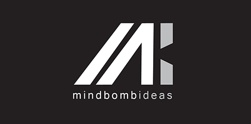
Logo study for our start-up company


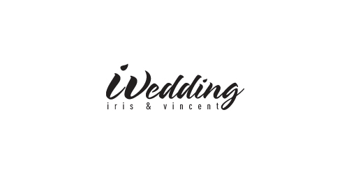
Combining the letter of "i" and the letter of "V" to be the first letter of wedding (W). This logo is for the wedding of Iris & Vincent

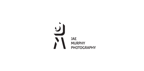
Logo for photographer from USA, California.
J, M, camera and tripod in negative space.
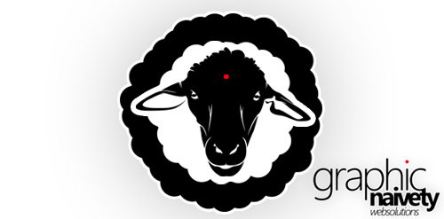
Because the sheep's for me the most naive "thing" on earth... I think graphicNAIVETY is proudly represented in this one !
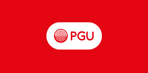
Polish Golf Union logo redeign.
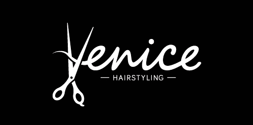
A logo for a new hair salon in The Netherlands
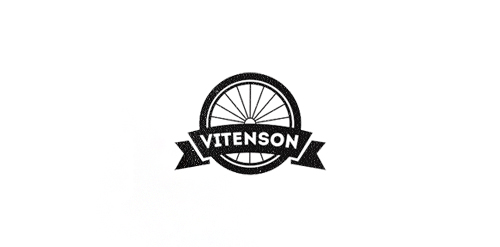
Logo concept for company which creates unique bicycles. Client requested some vintage and retro mood.
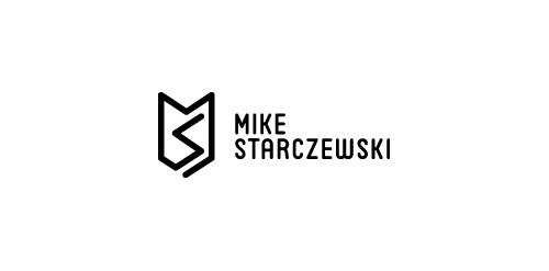
Personal monogram mark with type for fellow designer and US army war vet Mike Starczewski
Beltway Brewing
Logomilk.com The usp with the Logo Milk gallery is that all logos submitted are in black and white. In-fact the whole site is monochromatic making it very distinct.
Company sells English thoroughbred racing horses. Client wants royal, imperial look.
Digital Marketing and Design Agency.
Dance City (Šokių miestas) - Dance Studio Logo
Logotype created for a women's online fashion website.
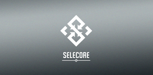
Selecore is company located in Finland, primarily focusing on importing new innovative products and secondary focus is in exporting items produced in Finland. Client wanted serious, modern and strong logo. He also mentioned that he loves when the logo has a hidden feature or message.
In the mark letter "S" is made of arrows pointing inside (import). In the negative space you can see arrows pointing out(export). The negative space also forms a cross which is connection to Finnish flag.
Graphics company.
Bank logo
Created for an independent film company.
a logo made for a portal with info, documents and tips on interviewing both for interviewers and interviewed.
Skate-influenced brand identity for a clothing line called "Hiromi (宏美) VM (Visual Media)". The reason we decided to move on from this design was because it did capture the skate mentality and feel, and it looked nice, BUT it didn't quite capture feel of the "slim, sleek, futuristic, chic" brand the client was going for.
Graphic identity for the Oslo based musical group Midi Mantra. Focusing on the word such as Midi Mantra was the starting point of a good idea; we combined these two words to be a creative outcome with a clear visual language and a strong logo signature and a style that follows a certain set of strength and clarity to organize the creative outcome. To top it all we created a visual language that will help the logo/name of the band to come out clearly and communicate the right associations the band want to convey in their visual and musical language. Hoping to leave a massive impression when visual language is carried out amongst other posters on a poster bulletin board.
Designer: Denis Aristov Client: Panorama Industry: Cinema Keywords: square, red, white, legs, typographic, cinema, naming, very well
Nice Black Chip is a small, intelligent team of experts in fields of electronics hardware and software.
Client wanted strong, clean design in black and white.
logobully
Our logo inspiration gallery will give you the creative boost you're looking for. Get your daily dose of logo design inspiration to work on your own logo design projects and get your business going. Be amazed by our logo designers and their brand guidelines. We are here to help you impress your clients and our fellow designers. Professionalize your logo design skills and get yourself to a new level. Browse our logo design gallery and discover all the new logo design trends and much more. We know you love logos!