
June 2011 logos (176)
For this unique complex of reception halls in western Paris, Brand Brothers wanted to design a festive and retro identity, away from commonplaces, and express the essence of what makes great parties. A complete branding including a website, signage, publishing and advertising is in development: success guaranteed!


Reseller and consultant, specialist in interactive solutions for education and businesses, Motiv'Solutions is operating in a booming market. With an innovative and complete strategy, the company offers complete solutions: consulting, services, installation, training... Here at Brand Brothers, our challenge was to design for them a professional and reassuring visual identity and branding, that would leave a mark in people's minds.
La Maison de Tante Agathe (Aunt Agatha's House) is a french brand that specializes in culinary products and premium tableware. Located in Paris and Nantes, the brand also has a strong online presence through various websites. Brand Brothers worked with the brand and its company since the beginning. We created for them a premium brand image through a global branding, based on authenticity, good taste and quality.
For a manufacturer of instrument strings - Guitar, Cello, Violin, etc. Nickel Steel, Phosphor Bronze & Nylon. The mark is inspired by an Australian Lyrebird.

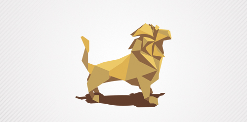
a lion created whit paper!
Modern business center
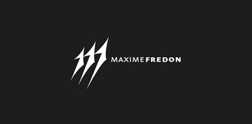
Maxime Fredon is a french self-taught painter. He wanted a clean logotype that could reflect a personal aspect of himself as an artist. After some research & experiments, I focused on his signature, the only element that was recurrent on all his painting. It was clearly a meaningful & logic orientation.
Decision was then made to simplify it from "Max" and work on “M”, the predominant letter.
Details on the design process can be seen here :
http://www.franckjuillot.com/#1367835/Maxime-Fredon
Yoon freelance designer, personal sign.
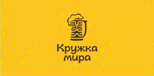
Logo for my pub. Based on https://www.logomoose.com/logo-design/indi/ It means «mug (or pint) of peace» =) Like a peace pipe (calumet).
Avita Inc. - New Business Consulting Firm
Logo for anything related to banking or payments. This could be a bank, a financial advicer or a small payment service. You can buy it here: Payments
Logo for a dog grooming parlor
The basic line of activity creation of landscape decisions from designing before realization on the basis of ready modular decisions.
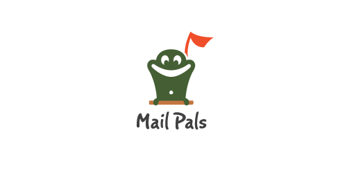
Mail Pals, an in-school program to keep kids writing, setup pen pals & post letters.
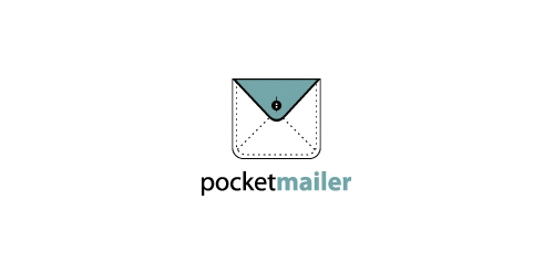
Brand/icon/logo for a mass mailer/email sender webpage or software.
Logo for a design/creative studio or anything related to design business would be perfect.
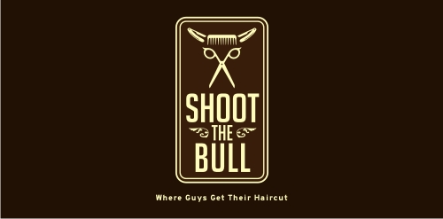
logo for barbershop
This logo communicates a fun, playful message while presenting the “g” that makes Geoff’s name unique. The splat was created by throwing paint soaked objects at board, and scanned in to get the perfect splat. The “g” is created from the negative space to provide an aesthetically interesting symbol, while allowing this mark to be produced in a wide variety of printing and post-printing methods.
Facelift of an existing brand (South Africa)
logo for a law office in Varese
?
Logo for media streaming company
Top of the shelf design by Savael. This renewed logo has a better feel with his font, colors and kerning.
New logo design for UK based video production company Storm Foundry
Our logo inspiration gallery will give you the creative boost you're looking for. Get your daily dose of logo design inspiration to work on your own logo design projects and get your business going. Be amazed by our logo designers and their brand guidelines. We are here to help you impress your clients and our fellow designers. Professionalize your logo design skills and get yourself to a new level. Browse our logo design gallery and discover all the new logo design trends and much more. We know you love logos!