Interested in this domain and website? Contact [email protected]
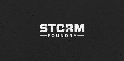
Storm Foundry
Storm Foundry
- Get unique ready made logos for $99.99
- New logo design for UK based video production company Storm Foundry
- Submitted: 03/28/2011 • Featured: 06/03/2011
 June 2011 • Logo of the year 2011
- Stats: This logo design has 40079 views and is 6 times added to someone's favorites. It has 79 votes with an average of 4.08 out of 5.
Our logo inspiration gallery will give you the creative boost you're looking for. Get your daily dose of logo design inspiration to work on your own logo design projects and get your business going. Be amazed by our logo designers and their brand guidelines. We are here to help you impress your clients and our fellow designers. Professionalize your logo design skills and get yourself to a new level. Browse our logo design gallery and discover all the new logo design trends and much more. We know you love logos!



Excellent!
Btw, did I miss something about textures? I’ve seen it a lot on dribbble too these days. Everything get’s a texture slapped on.
ReplyLol, I think you didn’t miss anything. I’m using textures as long as I can remember, even in my photography. In fact, I specifically shot texture photos for a couple of years.
Thanks for your comment nevertheless!
ReplyOh, forgot to mention that this logo will be on black letterpress businesscards with silver letters. So I thought I would be cool to mimic that style just a little bit in advance :P
ReplyThis looks great.
ReplyReally good!
ReplyLove the simplicity and the strength of the type.. Great work
ReplyThan you for your great comments guys, appreciate it.
ReplyReally Stunning Logo! love it!
ReplyThank you!
ReplySuper strong. Nice work!
ReplyThanks Herby.
ReplyLogo of the month June 2011 – Congratulations!
ReplyThank you very much, much appreciated!
ReplyI love surprises!
congrats, Gert. well deserved, man. love this. so solid.
ReplyThanks Mike. nice to see you around :P
Replycongrats mate!
ReplyCongrats, Gert!
ReplyAs expected!! Congrats mate!
ReplyIt came as a surprise to me, but thanks mate!
ReplyCongrats
ReplyJaaaaa Gert! Goed zeg! Gefeliciteerd! :-)
ReplyThank you José! To be honest I completely forgot about this one posted here :)
ReplyCongrats Gert,…unique logo
ReplySo simple, but so powerful!
ReplyGreat concept. Congrats!
Thanks mate!
Replyfuckin’ good work, man!
ReplyTnx! ;)
ReplyLogo of the year 2011, congrats Gert!
ReplyThank you all for the votes and those who participated.
Again, congrats to those who participated. To me all 12 logos are the winners of 2011 !
ReplyAAAAAAAAAAAA!!! Congrats, it was the best one!!!
ReplyThank you for you support Yana!
ReplyCongratulations Gert!
ReplyHey Tim, cheers dude!
ReplyGreat achievement Gert, congrats! Enjoy and celebrate buddy, cheers.
ReplyCongratulations Gert! You deserved it.
Replyancitis & Jan – Thank you for support fellows!
ReplyBIG TIME CONGRATS, Sir Gert. well deserved, bud. Always loved this baby. Soild work.
ReplyAnd yeah I agree with you, there was a lot of talent shown in all 12 this year, all should be proud for sure.
ReplyCongratulations on LOTY!
ReplyThanks Mikey!
ReplyVery stylish negative space logo :)
ReplyMy Congrats, Gert!
Thank you Dmitry !
ReplyCongrats, Gert! Well deserved, a great logo with a clever yet simple execution. I appreciate your kind words and agree that it was an honor for all of us to have been in the running for this, such great talent all around and am honored I was even within the mix of such talent. Congrats again!
Replyyes this is great. Congratulations!
ReplyMy third comment here.. Well deserved..
ReplyCongratulations on winning logo of the year brother! After browsing around, I see it’s quite the honor. Logomoose looks like on of the best logo design galleries around…along with the pond of course.
BTW, your web site looks great, I actually tried to click the anchor points around the image borders haha!
ReplyHey Raja, thanks a lot man. Always appreciate some nice words from the master himself.
Haha, you actually tried to move those anchor points right, lol!
ReplyBtw, that site is being redesigned and redeveloped right now.
Thank you too Sean, Neilan & Shihab. Cheers fellas!
ReplyConrats, Gert!
Replyhmm it seems I’m the only one who doesn’t understand the great concept behind this. its about the Z lightning shape between the letters? That’s all?
Reply