
Logo inspiration
Inspirational logos


Spicy Camel is a logo inspired from the ever so large quantity and quality of oriental spices.
Logo made for the occasion of Jump From Space by Felix Baumgartner & RedBull Stratos. How it's made: http://www.behance.net/gallery/Felix-Jump-from-Space/5520283
A high profile classy italian restaurant in an eclectic part of Tirana, Albania
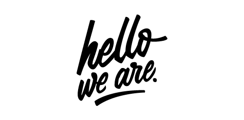
Lettering logotype for "hello, we are." a studio based in Austria which specializes in animation and visuals.
Country names, logotypes
Russian Photo Contest 2011
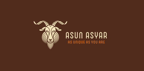
Online shop selling personalized, high-quality cashmere products. Client`s initial wish was to base the design on a front-facing goat`s head. It had to be sophisticated, structured, strong and suggesting luxurious products. Later on we have decided to go in a different direction.
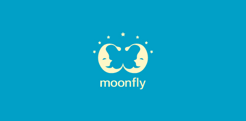
The main characters of the logo designed using positive space are two "sleepy" moons! There is however another character- hidden in the design! Seek for it!
Hand craft ideas for interior
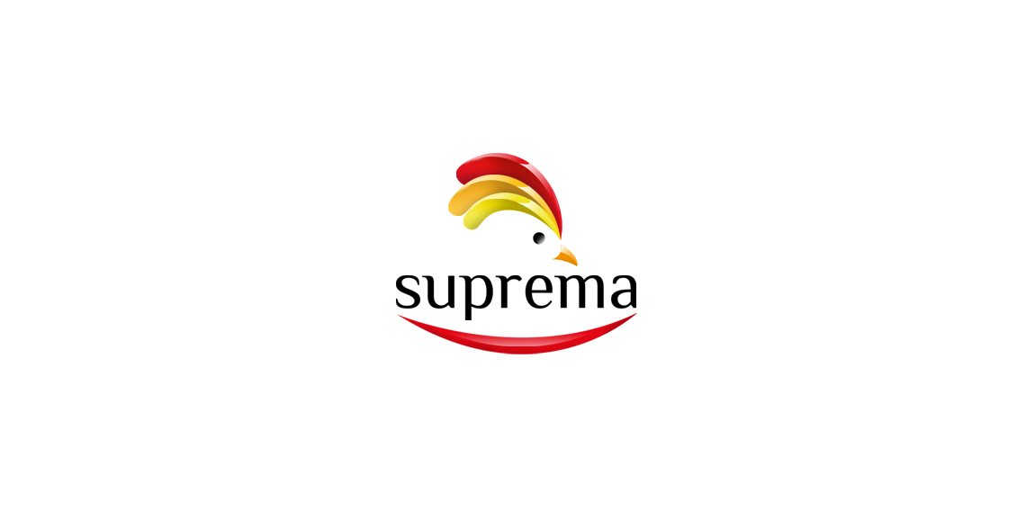
https://www.behance.net/gallery/7975715/Polleria-Suprema (Supreme, an essential part of the chicken that manages to draw the two sides on the side of the chicken breast skeleton. The brisket. Each of them open with a knife carefully, since the meat is very delicate, it flattens. They are ideal for them with a variety of fillings, rolled and cooked as a stiff, or make patties and other foods.)
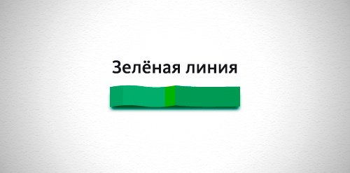
Designer: Denis Aristov Client: Administration of Perm City Industry: Tourism (Main Walking Route of Perm) Keywords: green, line, tourism, walking, route, Perm
Logo for art photographer.
Monogram TS (Torg Style)
A logo designed for a property lettings management agency.
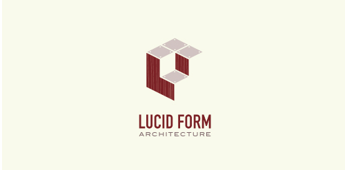
This logo is for a completely fictitious architecture studio called Lucid Form Architecture.
The icon is based on an optical illusion of a cube within a cube. Primarily, the form depicts a big cube, made of wood walls and metal-plated top surfaces, with a notch cut out of the center, resulting in a 3-D "L" shape. However, the longer one looks at this, perception begins to shift, resulting in a couple of different interpretations: 1) a small cube with a wooden wall and metal-plated bottom, in the corner of a room, hovering near the top of a tiled ceiling; 2) a room, tilted 90° clockwise, with hardwood floors, tiled walls, and a cube with a wood countertop and metal-plated side on the floor in the corner. This perception shift is important to the name, because it presents an ironic twist. To make "lucid" means to make clear, and while the icon seems to initially baffle and confuse, it ultimately encourages the viewer to challenge his or her preconceived notions of "perception." So too is the Lucid Form methodology for creating seeming impossible structures.
maybe for http://ww.anda.com.pl/ company saling the building stuff

Fresh, juicy, tasty... but most of all funny and friendly logo full of happiness suitable for a wide variety of business. Sky is the limit ;) ...floomba!
Logo for male gift service...
A clothing brand with a minimalistic traditional take on modern fashion, inspired by Japan.
logo for administration company.
☆ HONORS ☆

-
shtef-sokolovich
190 logos
-
Boldflower Design Studio
189 logos
-
Ailton Marques
115 logos
-
Light Rainer
114 logos
-
Alek • Triptic.pl
107 logos
-
almosh82
96 logos
-
sadany
96 logos
-
Duminda Perera
93 logos
-
pizelato™
91 logos
-
Aleksandar
91 logos

Recent comments
حسین:
please send me...
chirag_j:
Hello is the above issue resolved?...
mrgraphics:
great logo...
Aleksandar:
Thank you Gile!...
fraGile:
Thanks a lot!...
Marko Bulatovic:
Great work!...
Popular tags
Our logo inspiration gallery will give you the creative boost you're looking for. Get your daily dose of logo design inspiration to work on your own logo design projects and get your business going. Be amazed by our logo designers and their brand guidelines. We are here to help you impress your clients and our fellow designers. Professionalize your logo design skills and get yourself to a new level. Browse our logo design gallery and discover all the new logo design trends and much more. We know you love logos!