
Logo inspiration
Inspirational logos
Dutch cafe-bakery


logo for a mexican breakfast restaurant.
WINGSO is fresh modern dynamic brand with short easy memorable name. It will suite well to any business or industry.
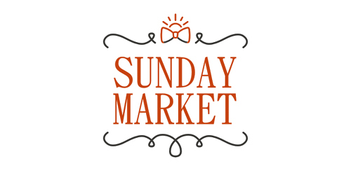
SUNDAY MARKET - it's very atmospheric project. Every Sunday in Omsk, the club Atma-Sphere held SUNDAY MARKET, where a warm and friendly atmosphere you'll find a unique jewelry and clothing, choose a toy or a beautiful handmade notebook, can meet a truly original gift for a friend or for Mom. Live music, free workshops and presentations, as well as free tea and delicious homemade sweets.
Logo for a consulting company.
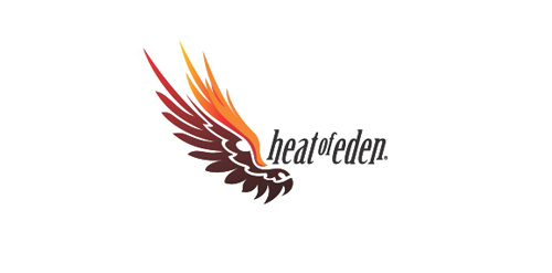
Wing, dragon face & flame = Heat Of Eden An effective logo for a wide range of industry. A "tribal" look is perfect for a tattoo workshop.
Cosmetics brand. More info: www.onedot.pl
Logo design for boutique cake makers in Cambridge, UK. House of Cake
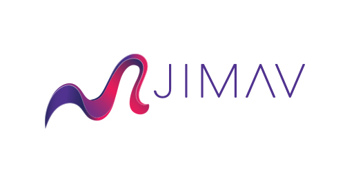
The identity of the builder JIMAV is based on the inspiration that we had with organic architecture. With curved forms we achieved a symbol with plenty life, which is balanced with a simple, legible and solid typography. The logo is a form developed with the approach of the letter “J” of Jiménez and the letter “A”of Avelar, which compound the name of the builder JIMAV. We developed a variety of the logo’s versions and compositions for the use in different applications and to make easier it’s reproduction.
company is engaged in marketing of aroma - aromatization of various premises, activities, points of sale
A logo for herbal based medicine factory
OWIO is fresh modern dynamic brand with short easy memorable name. It will suite well to any business or industry.
Burrito Ninjas
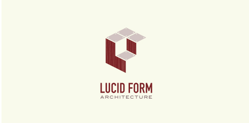
This logo is for a completely fictitious architecture studio called Lucid Form Architecture.
The icon is based on an optical illusion of a cube within a cube. Primarily, the form depicts a big cube, made of wood walls and metal-plated top surfaces, with a notch cut out of the center, resulting in a 3-D "L" shape. However, the longer one looks at this, perception begins to shift, resulting in a couple of different interpretations: 1) a small cube with a wooden wall and metal-plated bottom, in the corner of a room, hovering near the top of a tiled ceiling; 2) a room, tilted 90° clockwise, with hardwood floors, tiled walls, and a cube with a wood countertop and metal-plated side on the floor in the corner. This perception shift is important to the name, because it presents an ironic twist. To make "lucid" means to make clear, and while the icon seems to initially baffle and confuse, it ultimately encourages the viewer to challenge his or her preconceived notions of "perception." So too is the Lucid Form methodology for creating seeming impossible structures.
Ready made logo.
A logo design of a security ring that is made into a map pin. Logo design is available for sale.
Logo for upcoming sharing app
Fitness Center Logo
☆ HONORS ☆

-
shtef-sokolovich
190 logos
-
Boldflower Design Studio
189 logos
-
Ailton Marques
115 logos
-
Light Rainer
114 logos
-
Alek • Triptic.pl
107 logos
-
almosh82
96 logos
-
sadany
96 logos
-
Duminda Perera
93 logos
-
pizelato™
91 logos
-
Aleksandar
91 logos

Recent comments
حسین:
please send me...
chirag_j:
Hello is the above issue resolved?...
mrgraphics:
great logo...
Aleksandar:
Thank you Gile!...
fraGile:
Thanks a lot!...
Marko Bulatovic:
Great work!...
Popular tags
Our logo inspiration gallery will give you the creative boost you're looking for. Get your daily dose of logo design inspiration to work on your own logo design projects and get your business going. Be amazed by our logo designers and their brand guidelines. We are here to help you impress your clients and our fellow designers. Professionalize your logo design skills and get yourself to a new level. Browse our logo design gallery and discover all the new logo design trends and much more. We know you love logos!