
Blue logos (328)
Crest made for English soccer team Brighton & Hove Albion.


Logo made for a action sports company.
Jack Russell Kennel.

Logo for an event organiser who required a lightweight and simple design. Neon green and blue colours were applied, and toned down to create a calming visual.
Conceptual design for a record label, using a fun, casual and quirky typeface. The headphones wedged inbetween the words seals the deal.
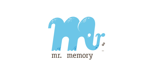
This completely fictitious company logo is the result of happenstance typographic exploration.
Through modification, I discovered that a lowercase M, set in Matrix Script Bold, began to resemble an elephant. Realizing the potential for a self-initiated logo development exercise, I dubbed my hypothetical company "Mr. Memory," an allusion to the idiom, "an elephant never forgets." With the addition of the R and the peanut as a punctuation replacement, the character exists both as an elephant as well as Mr. Memory, himself. This company could be one that manufactures RAM or external hard drives, or it could be a learning center.
Click here to see the case study for this logo, which chronicles its development, and includes full design rationale, sketches, electronic roughs, and alternate designs.

A logo that represents the global presence in wealth management and promote the name of the company, Dougherty Wealth Management. This client needed to move from a "company look" to a "corporate look". It was important to reference the new logo from the client's older logo but give it a fresh new look, more polished and sophisticated. The client wanted more of a "3D feel" rather than a flat color. The blue diagonals and curves represent global motion while the bold classic "D" promoted the name "Dougherty".
Logo Design for Sally Barrett, 2011.
Logo for my creative studio in Amsterdam.
A logo I designed for a web security company last year combining a UCLA throwback color scheme w/ a modernized Trojan helmet.
Large ministry working mainly in Haiti, running relief projects, schools, orphanages and building complexes.

Logo for the blog about ecology, nature etc.
.
Logo for web design/development house GO BIG LABS (www.gobiglabs.com)
Logo for spin-out company dedicated to the professional preparation of EU projects. Logo symbolizes letter F and man raising hand.
Logo for an exclusive event management company which specializing in corporate events.
I started a small graphic tshirt and poster print company. Launching this September...hopefully.
This logo is most suitable for some kind of technology c.ompany. This doesn’t mean that it couldn’t be suitable for any other type of business, because it might even fit yours. You can buy it here: My Technologies
Logo for optometry clinic.
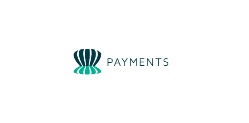
Logo for anything related to banking or payments. This could be a bank, a financial advicer or a small payment service. You can buy it here: Payments

Volari, a new smartphone communications service for international travellers. Volari is a play on “Volare” which is Italian for flight or soar.

Road Construction Company
Proposed concept.
This logo successfully represents this land developing and civil engineering firm as a contemporary business with their eye on the future. The mark is inspired by a standard target tool used in their industries. Because the majority of W+A’s clients are from within these industries, this provides an excellent communication. The negative space from within the typography creates the “+” in the name, but also serves as a crosshair, as seen in the tools of their trade.
Our logo inspiration gallery will give you the creative boost you're looking for. Get your daily dose of logo design inspiration to work on your own logo design projects and get your business going. Be amazed by our logo designers and their brand guidelines. We are here to help you impress your clients and our fellow designers. Professionalize your logo design skills and get yourself to a new level. Browse our logo design gallery and discover all the new logo design trends and much more. We know you love logos!