
Brand logos (367)
A logo and identity that we have designed for a community project, run by The Body Shop Foundation.


Hi everyone! My latest logo design for háerko - HR Agency. The point is the hidden men/women at the end of the logo. To be fair, I made multi-sex versions :) Check full version on my dribbble: http://bit.ly/1R8fp9v

Tres Magos is Spanish for the Three Wise Men / Kings / Magi The name, referencing the distinguished foreigners who visited Jesus after his birth, bearing gifts, was meant to represent a producer of smart furniture for children, designed according to the Montessori education method. The logomark portrays both the Magi – as three coloured silhouettes or wizard hats, as well as Kings – in the form of a crown, which symbolises also the highest quality of products. The pleasent colours, rounded corners and use of basic shapes, signals the childrens theme.
CST is a training company. Symbolism of a chess knight is central to CSTs strategy. It exemplifies dynamism and initiative. Basing on these qualities and the target group in part the automotive branch I have referred in the lettering and composition to the aesthetics of sport cars emblems. Over the course of many sketches, I have created a convincing, minimalistic silhouette. Rendered as negative space against a chess square, it creates a bold, cohesive and legible mark.

FASHION HOUSE Group is a developer and operator of fashion outlets from UK. A rebranding – the new logo was developed from a bold and surprising, albeit logical evolution of the old logomark. The abstract form of rising geometric solids invokes associations with both developer and operator activity of the Group. It references spatial dimension, development and growth. The colorful and multipart construction of the mark reflects the wide spectrum and multiple directions of FH Group’s activity. Graphic motifs derived from the mark’s structure form spectacular configurations to be used in layouts of publications and advertisements, while the colour palette allows building navigation with use of the colour code.
CS
The hand holding the money
Event Flipper it is an event planning site which helps people struggling to take already developed event and flip them for the better one.
Sayed Essam is a 16 years old Designer based in 10th of Ramadan City, worked on himself in the design field since the age of 10, started working on multiple graphic work since 12. Ambition is what keeps him moving, struggling to achieve his dream. Working on himself in manipulation, motion graphics, web design, branding, marketing and social media. Creativity, Quality, Self Learning, Improvement and Hard-Working been his habits forever.
COFFEE BRAND
Conceptual logo design for internal communication system software.
Logo exploration on an animal curious deer This was done just for fun But if you're interested in this logo it is for sale Thanks for clicking
I tried to make logo for myself to put it in photos, projects etc. I am looking for constructive critique. :)
Simple logo i made for myself
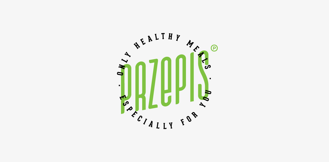
A hipster emblem designed for small company offers healthy meals with delivered to your workplace. "Przepis" means "recipe". • • • Made for Motyf Studio • • • follow us on www.instagram.com/triptic.pl
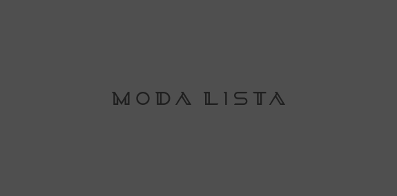
Logotype design for a fashion company from NYC. Made from scratch. www.dominikpacholczyk.com
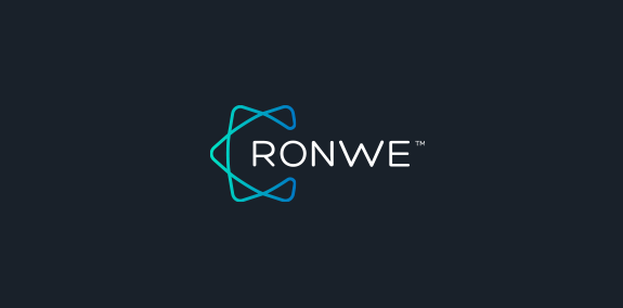
Alternative logo design for one of my branding projects. Final case study you can check on www.dominikpacholczyk.com/ronwe
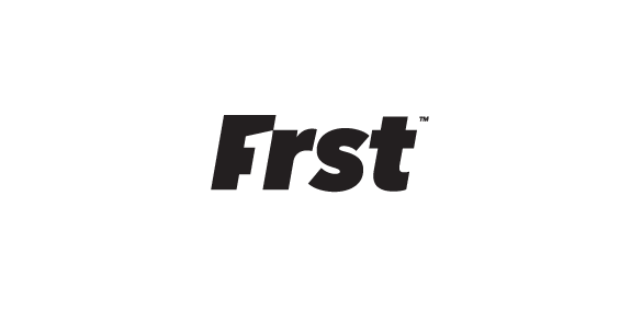
First - F1rst - wordmark concept.
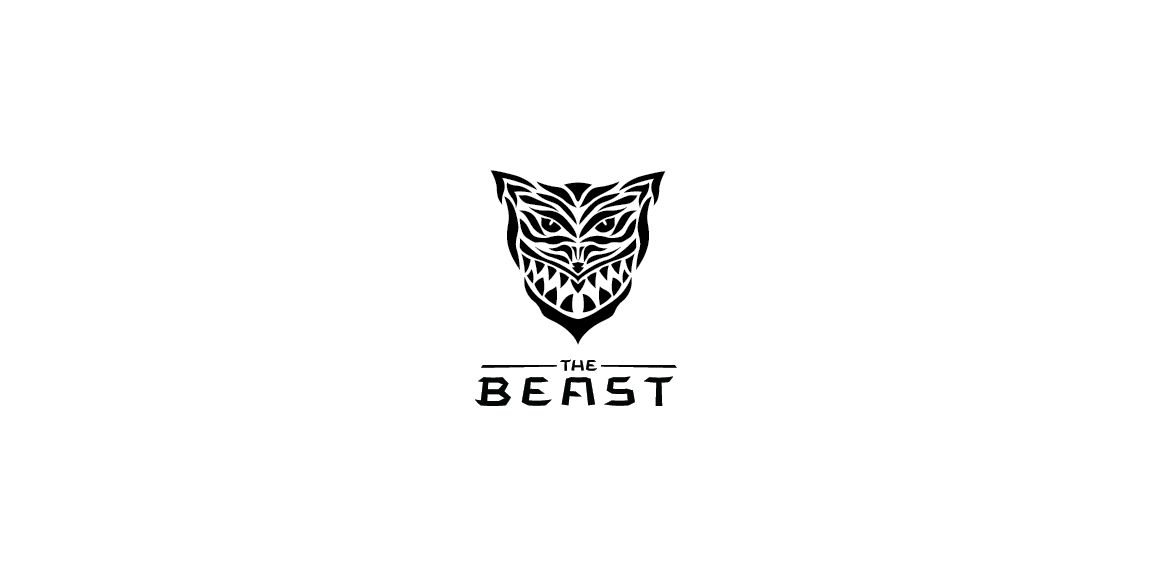
The Beast - My personal brand
An option logo for architecture company
Custom letters created for marketing company. "K" letter has incorporated a rook/tower shape which refers to "protect the King" idea. • • • Follow us on www.instagram.com/triptic.pl
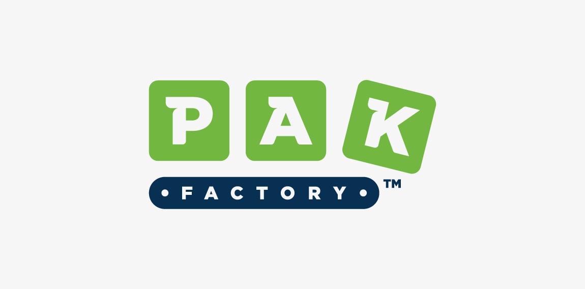
PakFactory is a canadian company producing and selling eco-friendly packages. Logotype is a combination of conveyor belt (factory) with moving boxes (packs).
Flower Store.
This is lovely fox logo design for "FOXO" and its construction. Icon simulates fox creating "O" – round, elegant & endless shape.
Our logo inspiration gallery will give you the creative boost you're looking for. Get your daily dose of logo design inspiration to work on your own logo design projects and get your business going. Be amazed by our logo designers and their brand guidelines. We are here to help you impress your clients and our fellow designers. Professionalize your logo design skills and get yourself to a new level. Browse our logo design gallery and discover all the new logo design trends and much more. We know you love logos!