
Icon logos (222)
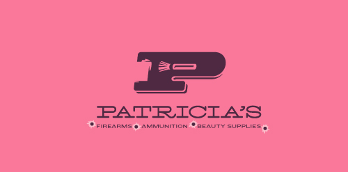
This logo for a completely fictitious company started when I noticed that the negative space with the letter P set in the typeface Blackoak looked a bit like a gun firing a bullet. This got me thinking of how interesting it would be if there were a super-girly, female-owned and operated boutique, catering only to women, which sells not only firearms and ammunition, but also beauty supplies. Everything a modern woman needs! Hey, if you're gonna make up a logo and a company to go with it, why not have a little fun with it? Here, the left side of the P reveals the profile of a gun barrel in negative space, while the negative space within the bowl of the P reveals a makeup brush, which doubles as a bullet being fired. The P mark, based on the Blackoak letterform, is constructed by hand, and the type for "Patricia's" is based on Archive Antique Extended, and is also constructed by hand. I did this because I wanted rounded corners and edges to give the logo a more feminine touch.
Click here to see the case study for this logo, which chronicles its development, and includes full design rationale, sketches, electronic roughs, and alternate designs.


Logo for a church in Lincoln, NE.

This logo was created for a collaborative social network project, Organism. The icon represents people networking together to create a larger network, and these networks working together - communicated through the graphic of gears made up of abstract people. Visit www.groworganism.com to learn more.
This logo was designed for IMS, a landscape lighting and irrigation maintenance company. We created an iconic brand identity that successfully represents their industries, and presents them in a professional, contemporary capacity. Furthermore, IMS's objectives are to become more prominent in the lighting industry, which is reflected in the iconic branding graphics.
This logo successfully represents this land developing and civil engineering firm as a contemporary business with their eye on the future. The mark is inspired by a standard target tool used in their industries. Because the majority of W+A’s clients are from within these industries, this provides an excellent communication. The negative space from within the typography creates the “+” in the name, but also serves as a crosshair, as seen in the tools of their trade.
Eyekon
Our logo inspiration gallery will give you the creative boost you're looking for. Get your daily dose of logo design inspiration to work on your own logo design projects and get your business going. Be amazed by our logo designers and their brand guidelines. We are here to help you impress your clients and our fellow designers. Professionalize your logo design skills and get yourself to a new level. Browse our logo design gallery and discover all the new logo design trends and much more. We know you love logos!