
Orange logos (125)
I saw this logo in my dream. So gathered all that memory to this MISHKA logo.


The shop of fruit and vegetables with home delivery. http://www.domfruktov.ru
Logo for a new cool startup company.
Designer: Denis Aristov Client: Sweden Group Industry: Advertising Agency Keywords: advertising agency, square, cube, apple, orange, green
Designer: Denis Aristov Client: MacrosCop Industry: Monitoring & Guard Keywords: video, monitoring, guard, cop, sight, point, orange, black

Logo for the Department of a hospital.
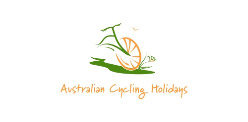
Logo for company, that organise cycling holidays for individuals, families and groups, in beautiful locations around Australia.
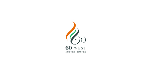
60 west is a modem serviced apartment and hotel conveniently located near the central business. It is perfect home for hong kong's busy and discerning executives who pursue taste of life in fully serviced apartments with an array of deluxe facilities.
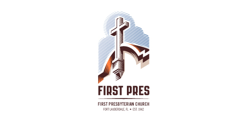
Redesign of the church's old logo in a stylized, illustrative manner, making it more welcoming, contemporary, friendly, casual, & upbeat. Client specified a rendering of the church’s architectural arch and cross in the perspective in this photo, and required an emphasis on the church's nickname, “First Pres."
Here, crisp, exacting vectors emphasize the architectural soundness of the church — a metaphor for the concept of faith as the solid foundation in one's life. This design makes use of hatching to add gradient dimensionality, enabling it to easily reduce down to 1-color. Colors are indicative of the building itself, including terracotta roof. Check my Flickr case study or Dribbble for more images, detail, and full design rationale.
Logo for a local software and app development company.
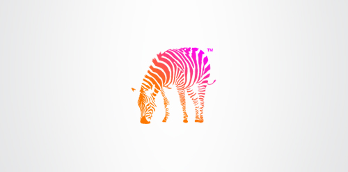
Zebra is a fictional charity that aims to help the conservation efforts for Zebras. The concept it clear, simple and respectful. Created as part of a genuine brief.

Private psychotherapy practice providing individual, couples, and family therapy.
Business continuity planning and software.
The official logo used for The National Federation of Professional Trainers.
Como Votan Logo
Logo for clothing company.
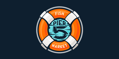
This logo is for a completely fictitious fish market.
The idea came to me when I discovered that it was possible to achieve a fish shape in the negative space within the bowl of the number 5. Dubbing my hypothetical company Pier 5 Fish Market, I created this very maximalist and illustrative mark in the hopes of really capturing the spirit of the nautical and maritime aesthetic. Type is custom for "Pier" and also the number 5, which is hand-rendered to look like it was painted on a wooden sign with a very wide, worn-out, thick-bristled brush. While it was important for the fish to show in negative space, it needed to look like a seemingly happenstance result of logical, real-world brush strokes. In the full lockup, the addition of the life preserver takes less emphasis off this gimmick, allowing one to slowly discover the fish.
Click here to see the case study for this logo, which chronicles its development, and includes full design rationale, sketches, electronic roughs, and alternate designs.

Q3 Marine Training Solutions
...
Logo made for a action sports company.

Conceptual design for a record label, using a fun, casual and quirky typeface. The headphones wedged inbetween the words seals the deal.
Binalogue is a cross-disciplinary design studio founded in Australia with established branches in America, Europe and Australia. Our steadily growing team is comprised of talented and passionate members from all corners of the world, constantly pushing their boundaries and looking at each project as uniquely challenging and fun.
With design as our starting point, we direct and develop creative content and communication solutions for a wide range of media, focusing on broadcast (network branding, motion graphics, vfx) and online (interactive design & development) platforms.
New logo concept for the barley & rye malt based drink »im nu«. See the process behind the custom type here: http://dl.dropbox.com/u/14259079/im_nu_process.png Big view including »Chocolate
..
Our logo inspiration gallery will give you the creative boost you're looking for. Get your daily dose of logo design inspiration to work on your own logo design projects and get your business going. Be amazed by our logo designers and their brand guidelines. We are here to help you impress your clients and our fellow designers. Professionalize your logo design skills and get yourself to a new level. Browse our logo design gallery and discover all the new logo design trends and much more. We know you love logos!