
Retro logos (76)
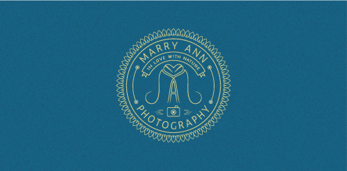
A monogram within a badge for a photographer which is in love with nature. Style required: minimal, retro. The heart is composed by 2 leafs turned upside down with the crests joining.


MPB - My Poor Brain. The design and illustration alter-ego of Tim Smith. Brain powered graphics fun.
Logo for a belgian restaurant between 2 and 3 star segment.
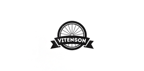
Logo concept for company which creates unique bicycles. Client requested some vintage and retro mood.
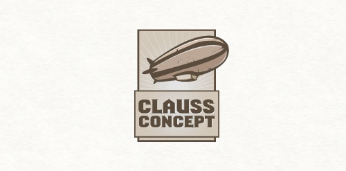
Clauss Concept
This is my own logo for my brand as a graphic designer.
Unused proposal for vintage women clothing.
The concept convey a worker silhouette and a basketball ball.
A 24/7 restaurant located in a rural area of north Texas (Jolly) and have been in business since 1969. Concept: A retro texas carrige wheel.
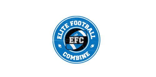
EFC is a football combine testing event for high school age players to test their physical skills. Athletes are tested in speed, agility, strength, and skill.
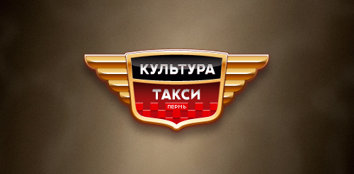
Designer: Denis Aristov Client: «Такси Культура» (Culture Taxi) Industry: Taxi Keywords: taxi, culture, emblem, heraldic, retro, wings, checkers, gold, red, auto
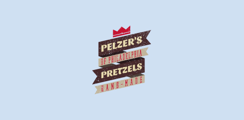
Created for a Philly-based pretzel shop located in Brooklyn.
Logo design for a personal project. Work in progress
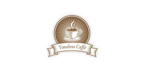
A perfect emblem for any retro/vintage caffe.

Logo made for Digital Project Manager Anthony Guennegou, who were seeking for a retro look & feel. The logo is based on a combination of "a" & "g" letter.
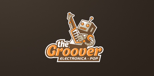
Logo for an iOS music app specializing in electronica-pop genre.
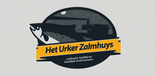
Design made for a company based in a small village called Urk in the Netherlands. They Buy and Sell salmon.
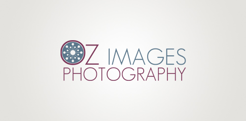
OzImages Photography Logo
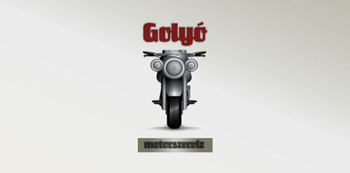
This logo is an motorcycle service made.
Logo for my art & design studio.
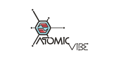
I define ATOMICvibe as the "a-HA!" moment of clarity in the creative process. Like nuclear fusion, it's when tiny ideas coalesce, and then explode into beautiful design.
The logo visually depicts this creative reaction. Forming abstract A & V shapes, the converging hands cradle the tiny beginnings of a big idea, fusing them until they discharge a shockwave of creativity. The custom type, designed to perfectly integrate with the mark, is meant to symbolize electron paths. Heavily inspired by retro imagery from the Atomic Age: science, the Space Race, Sputnik, the iconic George Nelson Ball Clock.
Click here to see the case study for this logo, which chronicles its development, and includes full design rationale, sketches, electronic roughs, and alternate designs.
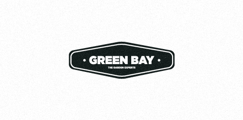
Logo for a garden sevices agency, at Puerto Vallarta, México, this is the black and white application and green for a color use.
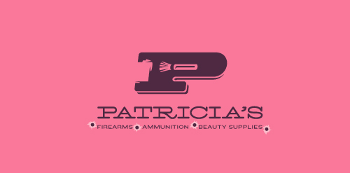
This logo for a completely fictitious company started when I noticed that the negative space with the letter P set in the typeface Blackoak looked a bit like a gun firing a bullet. This got me thinking of how interesting it would be if there were a super-girly, female-owned and operated boutique, catering only to women, which sells not only firearms and ammunition, but also beauty supplies. Everything a modern woman needs! Hey, if you're gonna make up a logo and a company to go with it, why not have a little fun with it? Here, the left side of the P reveals the profile of a gun barrel in negative space, while the negative space within the bowl of the P reveals a makeup brush, which doubles as a bullet being fired. The P mark, based on the Blackoak letterform, is constructed by hand, and the type for "Patricia's" is based on Archive Antique Extended, and is also constructed by hand. I did this because I wanted rounded corners and edges to give the logo a more feminine touch.
Click here to see the case study for this logo, which chronicles its development, and includes full design rationale, sketches, electronic roughs, and alternate designs.
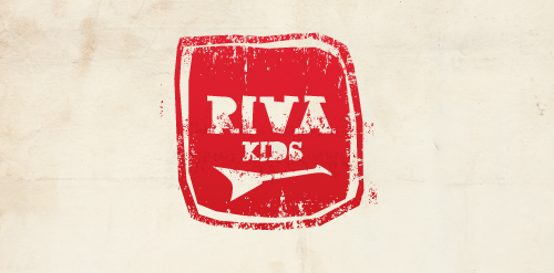
Logo design proposal for a new Dutch kids wear label.
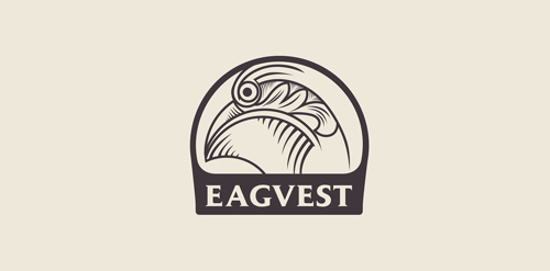
Eagvest. Inspired by Victorian ornaments.
Our logo inspiration gallery will give you the creative boost you're looking for. Get your daily dose of logo design inspiration to work on your own logo design projects and get your business going. Be amazed by our logo designers and their brand guidelines. We are here to help you impress your clients and our fellow designers. Professionalize your logo design skills and get yourself to a new level. Browse our logo design gallery and discover all the new logo design trends and much more. We know you love logos!