
Sign logos (24)
Science and Business Centre ''Żak''. The largest network of post-secondary school in Poland. / www.zak.edu.pl


Netbox
Conceptual logo design for internal communication system software.

Conceptual logo design made for fun. Quick idea and quick execution.
Custom made triple logo concept. Made from scratch.
An idea of the logo as a birthday present for a person, who is falling into various stories associated with the salvation of people, due to his specific nature.
Driving school in The Netherlands. The logo features a highway icon in the shape of an H and A.
Logo for online exchange, crypto-currencies trading and bitcoins mining.
iGadest is a website about games, streams, videos and design.
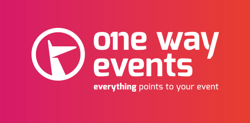
There's only one company for your event. Everything points to your event...
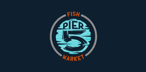
This logo is for a completely fictitious fish market.
The idea came to me when I discovered that it was possible to achieve a fish shape in the negative space within the bowl of the number 5. Dubbing my hypothetical company Pier 5 Fish Market, I created this illustrative mark in the hopes of really capturing the spirit of the nautical and maritime aesthetic. Type is custom for "Pier" and also the number 5, which is hand-rendered to look like it was painted on a wooden sign with a very wide, worn-out, thick-bristled brush. While it was important for the fish to show in negative space, it needed to look like a seemingly happenstance result of logical, real-world brush strokes. This is the minimal, alternate version of this logo.
Click here to see the case study for this logo, which chronicles its development, and includes full design rationale, sketches, electronic roughs, and alternate designs.
group of companies
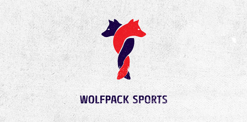
Logo design for Wolfpack Sports Client: RAINFALL
Logo design for law office. Legal shield for your needs.
Designed by www.logodesigncreation.com
![Ideas Infinitas [infinite ideas]](https://www.logomoose.com/wp-content/uploads/2013/04/ideasinfinitas-01-01.jpg)
Logotipo de mi próxima agencia de diseño. Como el nombre lo dice representa una constante producción de ideas originales. Los dos bulbos aluden a las IDEAS, que al unirse (los bulbos) forman el símbolo de INFINITO.
[My next logo design agency. As the name implies is a constant production of original ideas. The two bulbs refer to the IDEAS, which to join (the bulbs) are the symbol of infinity.]
Videosystems
building
sign for sale
After a long time I refreshed the EC logo. I tried a lot of variations between the emblem and the logotype. Finally I decided to make it more mathematical, using the a composition upon the golden ratio. I think this composition-form fit well to the subject.
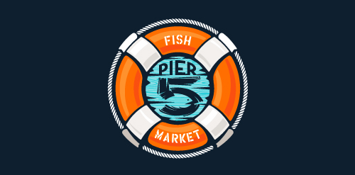
This logo is for a completely fictitious fish market.
The idea came to me when I discovered that it was possible to achieve a fish shape in the negative space within the bowl of the number 5. Dubbing my hypothetical company Pier 5 Fish Market, I created this very maximalist and illustrative mark in the hopes of really capturing the spirit of the nautical and maritime aesthetic. Type is custom for "Pier" and also the number 5, which is hand-rendered to look like it was painted on a wooden sign with a very wide, worn-out, thick-bristled brush. While it was important for the fish to show in negative space, it needed to look like a seemingly happenstance result of logical, real-world brush strokes. In the full lockup, the addition of the life preserver takes less emphasis off this gimmick, allowing one to slowly discover the fish.
Click here to see the case study for this logo, which chronicles its development, and includes full design rationale, sketches, electronic roughs, and alternate designs.

love to logo
Logo for a church in Lincoln, NE.
Thinking of bee... Very neath & recognizable brand suitable for many different industries.
Our logo inspiration gallery will give you the creative boost you're looking for. Get your daily dose of logo design inspiration to work on your own logo design projects and get your business going. Be amazed by our logo designers and their brand guidelines. We are here to help you impress your clients and our fellow designers. Professionalize your logo design skills and get yourself to a new level. Browse our logo design gallery and discover all the new logo design trends and much more. We know you love logos!