
Typography logos (394)
Custom lettering logo for LA Bikini.


Custom lettering work for "Aireus".
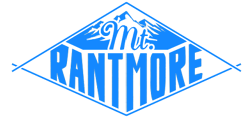
This is the logo we designed for our ranting blog which discusses sports, booze, and general tom-foolery. It's a play on words for Mount Rushmore, as there are four of us.
My personal logo.
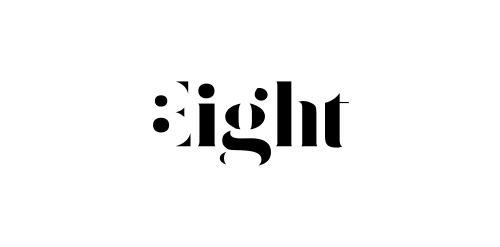
Expressive typography logo with negative number 8 hidden in the first letter.
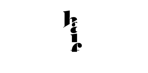
Expressive typography logo that presents 1/2. Made for fun.
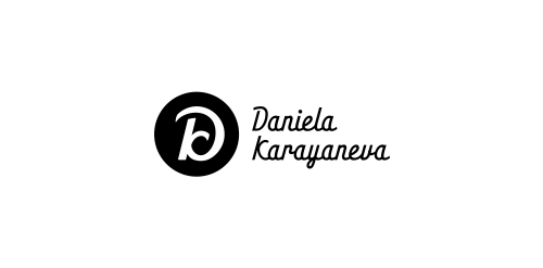
A logo monogram created from the first letters of company's name and, actually the owner's name.
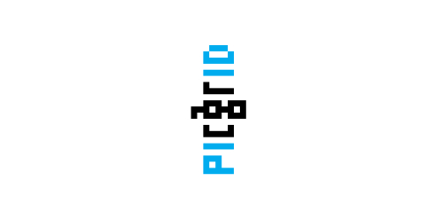
Logo that expresses smiled face within perfectly arranged letters in pixel grid. Rejected proposal.
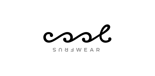
Typographic logo for water sportswear brand that expresses the waves & turning just like in the surfing.
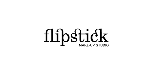
Naming & typographic logo for make-up studio. The idea was to create something connected to fashion and make-up art. So, the name came from F + lipstick. The Fashionable inscription look & the twisted ligatures (just like women twirl their lipstick) make the logo in harmony with the name and communicates the desired message.
A logo for coffee lovers.
A logo I made for my brother's company
A simple logo for bear lovers.
A logo design for Boston Terrier breeders.
Logo design for a company which produces storage boxes for tobacco products
Logo for a small scooter and motorcycle shop.
Awesome identity for an awesome studio.
Logo for http://pixotico.com Main focus was on minimalism and simplicity.
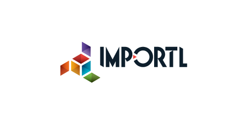
This is a logo for a completely fictitious entity named IMPORTL, which could be an open source web development site, or some type of developer software.
The idea is that the triangular facets form a series of open holes, or "portals," in multidimensional space. The central facets can also be seen to form a cube which is open on three sides. Lying before each opening is another opening on that side's respective "floor," yet, in an Escher-like paradox, where spatial orientation is an irrelevant construct, there is no floor. There is no up, down, left, right, back, or forth. This hyperspatial environment suggests infinite possibilities for the arrangement, manipulation, and exchange of data.
For color, the idea is that the primary colors that form the central cube beget the secondary colors that rotate outward, suggesting expansion, transformation, evolution.
The mark employs a custom typeface that compliments the angularity of the mark.
Click here to see the case study for this logo, which chronicles its development, and includes full design rationale, sketches, electronic roughs, and alternate designs.
Logo design for a online fashion store company, U.S.A.
Cautor, an fashion thing.
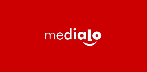
Marketing agency. One of initial proposals presented to the client. Face hidden in lettering and underscored with a smile may not be a revelation, but it still works pretty well. Gradual increasing of letter`s weight directs viewer to the face and in a way symbolizes company`s job - magnifying marketing message of their clients.
Branding concept for a digital company
Typographic logo design.