
Typography logos (394)
Personal logo for me as a designer. The typography is just build from a simple half circle. The "W" can also be used as a standalone icon which is also a pair of eyes.


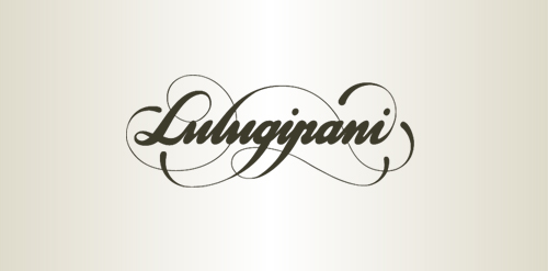
Three loves
Approved logodesign for Realtyweb.com Custom made Typography. RealtyWeb.com combines 3rd party data and information on close to 30,000 state and local real estate markets to help the consumer and the real estate professional make educated decisions.
For a VPN Service (virtual private network) named Privax which helps secure your internet connection + helps protect your online anonymity through encryption. Custom made font. The concept: the x symbolize an abstract protective shield with which you surf anonymously, the red bar is the outside world / hacker etc...
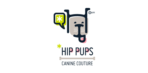
This fictitious company logo is the result of happenstance typographic exploration. I was playing around with H and I letterforms set in Platelet, and, after placing the I within the H, I noticed that it started to look like a dog face. After some modification, and with the addition of a curved P for an extended dog tongue, the resulting typographic illustration spelled "HIP." I thought it would be fun to name this fictitious company Hip Pups, which could be a shop that sells high-end dog accessories. The Registered symbol is integrated creatively into the mark by spelling "RUFF!"
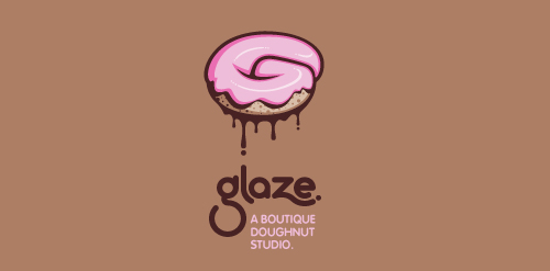
This is a totally fictional company that I refer to as "a boutique doughnut studio." I envision it as a trendy, metropolitan bakery that allows customers to glaze and decorate their own unique doughnuts. I wanted this to look really tactile, gooey, and sweet - like you really want to take a bite. Type for "glaze" is custom, and reflects the roundness of a doughnut. Click here to view my Flickr stream for full design rationale and additional images.
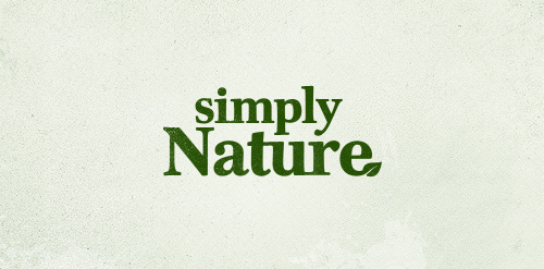
Logo proposal for a new client who is going to sell all sorts of natural health products through subscription based marketing
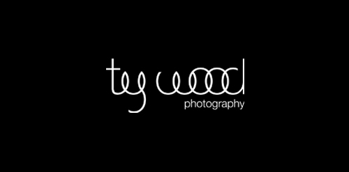
Proposal for a photographer specialized in wedding photography. Custom made wordmark.
Unused proposal for an electronic dance music label, specializing in Tech House and Electro.
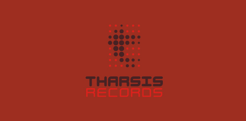
The name is taken from the Tharsis region on Mars, the largest volcano range in our solar system.
The symbol represents the blips and bleeps of the electronic music. Color is indicative of Mars. Custom type coincides with the roundness of the dots, and reflects the synthetic techiness of the music.
Click here to see the case study for this logo, which chronicles its development, and includes full design rationale, sketches, electronic roughs, and alternate designs.
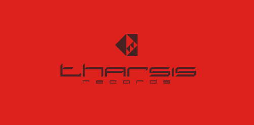
Unused proposal for an electronic dance music label, specializing in Tech House and Electro.
The name is taken from the Tharsis region on Mars, the largest volcano range in our solar system.
The symbol is a stylized, geometrical representation of the unique arrangement of the Tharsis volcanoes, while the individual facets can be seen to represent movement in music. The type is custom, and reflects the 45 degree angles in the symbol. Color is indicative of Mars. Overall, I wanted the aesthetics of the mark to coincide with the synthetic techiness of the music, but I also wanted it to look very futuristic and sci-fi, as if it were an emblem on a Martian spacecraft.
Click here to see the case study for this logo, which chronicles its development, and includes full design rationale, sketches, electronic roughs, and alternate designs.
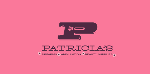
This logo for a completely fictitious company started when I noticed that the negative space with the letter P set in the typeface Blackoak looked a bit like a gun firing a bullet. This got me thinking of how interesting it would be if there were a super-girly, female-owned and operated boutique, catering only to women, which sells not only firearms and ammunition, but also beauty supplies. Everything a modern woman needs! Hey, if you're gonna make up a logo and a company to go with it, why not have a little fun with it? Here, the left side of the P reveals the profile of a gun barrel in negative space, while the negative space within the bowl of the P reveals a makeup brush, which doubles as a bullet being fired. The P mark, based on the Blackoak letterform, is constructed by hand, and the type for "Patricia's" is based on Archive Antique Extended, and is also constructed by hand. I did this because I wanted rounded corners and edges to give the logo a more feminine touch.
Click here to see the case study for this logo, which chronicles its development, and includes full design rationale, sketches, electronic roughs, and alternate designs.
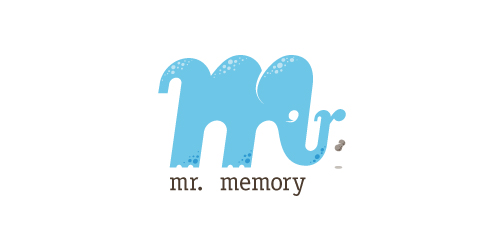
This completely fictitious company logo is the result of happenstance typographic exploration.
Through modification, I discovered that a lowercase M, set in Matrix Script Bold, began to resemble an elephant. Realizing the potential for a self-initiated logo development exercise, I dubbed my hypothetical company "Mr. Memory," an allusion to the idiom, "an elephant never forgets." With the addition of the R and the peanut as a punctuation replacement, the character exists both as an elephant as well as Mr. Memory, himself. This company could be one that manufactures RAM or external hard drives, or it could be a learning center.
Click here to see the case study for this logo, which chronicles its development, and includes full design rationale, sketches, electronic roughs, and alternate designs.
Logo Design for Sally Barrett, 2011.
Typographic logo for a company which sells vector images and illustrations. Type treatment concept. :)
New logo concept for the barley & rye malt based drink »im nu«. See the process behind the custom type here: http://dl.dropbox.com/u/14259079/im_nu_process.png Big view including »Chocolate
Logo and type design for music label owned by Dutch singer Ilse DeLange.
Just a draft idea for British band The Kooks as part of an international design competition that resulted in a second place for me.
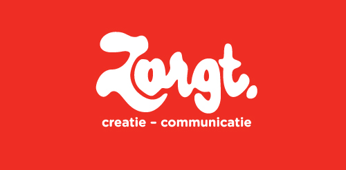
Completely handwritten logo type for Haarlem (The Netherlands) based communication agency. The letter 'o' consists of a subtile heart.
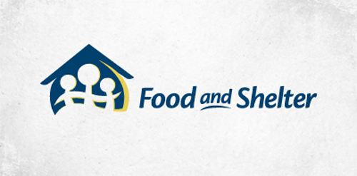
Logo for a non-profit company that helps families in need.
Logo for Jebin Wesley
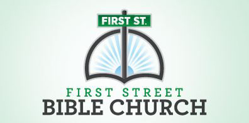
Logo for a church in Lincoln, NE.
Alternate logo for local fashion designer.
This logo was created as a personal brand mark for Geoff, to represent him as a graphic artist. This typographical solution was inspired by the 17th century Romaine du Roi, which features a serif face with its underlying structure. This mark was used previous to the Geoff Matheson Studio "G splat" and is no longer in use.
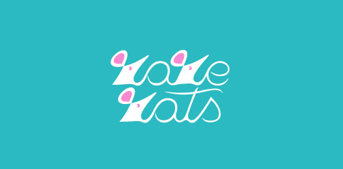
Rarest rats in the entire Universe!
Our logo inspiration gallery will give you the creative boost you're looking for. Get your daily dose of logo design inspiration to work on your own logo design projects and get your business going. Be amazed by our logo designers and their brand guidelines. We are here to help you impress your clients and our fellow designers. Professionalize your logo design skills and get yourself to a new level. Browse our logo design gallery and discover all the new logo design trends and much more. We know you love logos!