
Water logos (111)
Another logo for a short-run of caps, t-shirts, etc.


#1 in a set of logos for short-run prints on caps, t-shirts, etc.

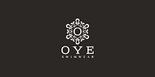
OYE Swimwear is a luxury swimwear brand for women. This symbol is inspired by the work of Dr. Masaru Emoto and his photographs of water crystals as shown in several volumes of his books. "Water crystal" in this design is formed with water drops. :)
Client asked for logo brand developing for their new 'works straight out of the box' water features.
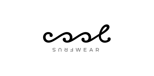
Typographic logo for water sportswear brand that expresses the waves & turning just like in the surfing.
Logo proposal for an Arts, Music, Literature, Film and Dance festival held annually in Colombo, Sri Lanka.
View the complete project on Behance:
http://www.behance.net/gallery/Logo-proposal-for-a-festival/12319151
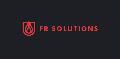
Fire Resistance Solutions: the combination of flame, shield and drop of water in one sign. --- Designer: Piotr Ploch
New brand for Jet skis, and fast boats.
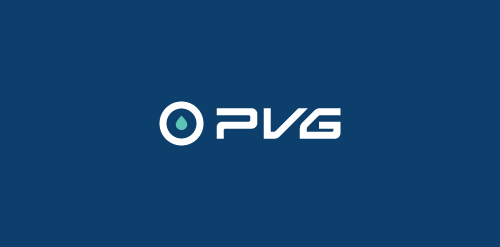
PVG - Perfect Valve Group. Industrial fittings.
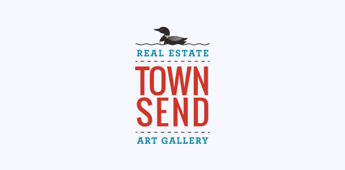
We recently completed this logo for Townsend Real Estate & Art Gallery in Maine. She wanted the logo to encompass the fresh coastal air of Southern Maine.
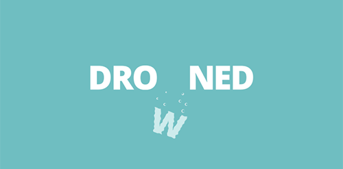
A simple demonstration of drowning using the letter W itself.
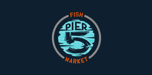
This logo is for a completely fictitious fish market.
The idea came to me when I discovered that it was possible to achieve a fish shape in the negative space within the bowl of the number 5. Dubbing my hypothetical company Pier 5 Fish Market, I created this illustrative mark in the hopes of really capturing the spirit of the nautical and maritime aesthetic. Type is custom for "Pier" and also the number 5, which is hand-rendered to look like it was painted on a wooden sign with a very wide, worn-out, thick-bristled brush. While it was important for the fish to show in negative space, it needed to look like a seemingly happenstance result of logical, real-world brush strokes. This is the minimal, alternate version of this logo.
Click here to see the case study for this logo, which chronicles its development, and includes full design rationale, sketches, electronic roughs, and alternate designs.
To create the Saniport’s logo, the element of inspiration was the water. The logo is thus made up of two droplets whose colors represent the duality / balance of hot and cold. When water vapor meets a cold surface (as in a toilet when bathing, for example), some small water droplets appear, represented by the logo particles.
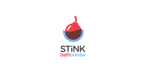
Logo for a company producing uniquely scented Bath Bombs.

Logo design for a company, focussing on saving water and energy, based in Belgium.
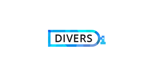
Shop of the equipment for divers.
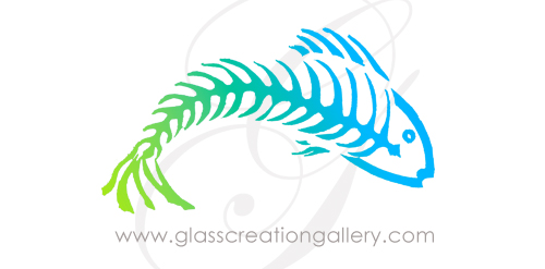
A new logo for a glass artist who specializes in kiln carving designs featuring "the Bonefish Series".
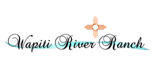
A logo for a New Mexico spa located by therapeutic rivers
Healthy water
Waterproofing Materials
Professional logo for a water and plumbing company. The icon has a tap with a water drip. The pipe also forms a P. This adds a clever touch to the logo design. The blue, black and white colors make the logo look very vibrant. The font has a pipe like feel which adds to the concept of the logo design.
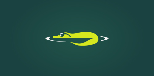
Unused concept. The logo depicts a cool crocodile!
logo for PICATURA
Designed by www.logodesigncreation.com
Our logo inspiration gallery will give you the creative boost you're looking for. Get your daily dose of logo design inspiration to work on your own logo design projects and get your business going. Be amazed by our logo designers and their brand guidelines. We are here to help you impress your clients and our fellow designers. Professionalize your logo design skills and get yourself to a new level. Browse our logo design gallery and discover all the new logo design trends and much more. We know you love logos!