
Logo inspiration
Inspirational logos
Dumma Branding is the design house of Duminda perera. Duminda is currently involved in an ongoing logo project for 365 days, creating one Original, Clever, Wordmark/Verbicons or Negative logo for a day.


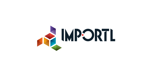
This is a logo for a completely fictitious entity named IMPORTL, which could be an open source web development site, or some type of developer software.
The idea is that the triangular facets form a series of open holes, or "portals," in multidimensional space. The central facets can also be seen to form a cube which is open on three sides. Lying before each opening is another opening on that side's respective "floor," yet, in an Escher-like paradox, where spatial orientation is an irrelevant construct, there is no floor. There is no up, down, left, right, back, or forth. This hyperspatial environment suggests infinite possibilities for the arrangement, manipulation, and exchange of data.
For color, the idea is that the primary colors that form the central cube beget the secondary colors that rotate outward, suggesting expansion, transformation, evolution.
The mark employs a custom typeface that compliments the angularity of the mark.
Click here to see the case study for this logo, which chronicles its development, and includes full design rationale, sketches, electronic roughs, and alternate designs.
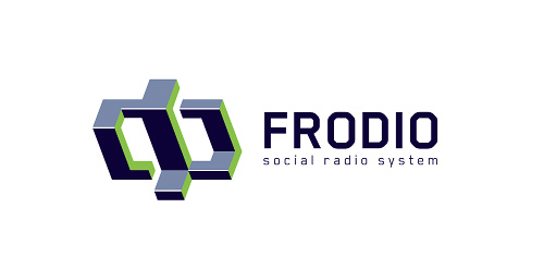
Frodio – Social Radio System http://frodio.com More: http://sitdikov.com/2011/03/frodio-logo-update/
Means pepper in dutch, done for fun
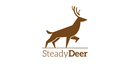
Logo exploration on an animal curious deer This was done just for fun But if you're interested in this logo it is for sale Thanks for clicking
A logo for the company "Žizela" (Giselle) that designs and manufactures ballet and wedding dresses. The company's name is based on the famous Russian ballet Giselle.
Recently designed logo for an young french movie director Gary Sfez.
Logo for Jazz club.

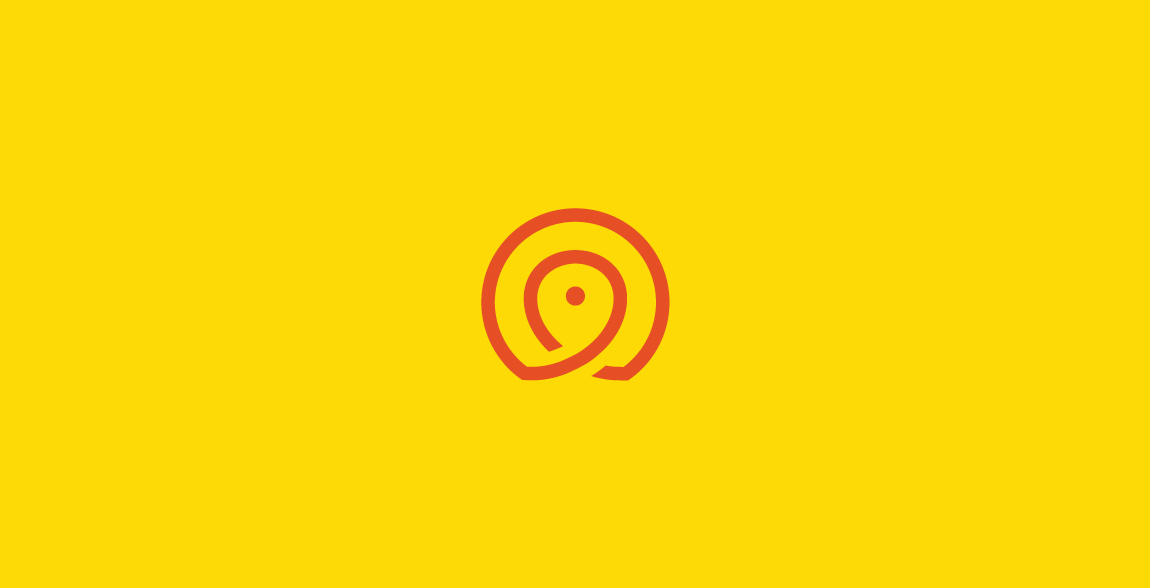
(Map) Pin + Bird
Sorry for reupload - deleted this accidentally :/
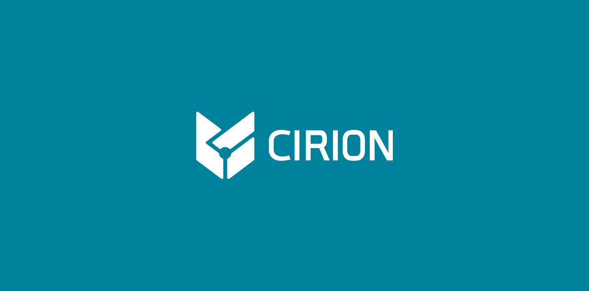
https://www.behance.net/gallery/30876225/CIRION La presente marca tiene como objetivo estratégico representar y comunicar mediante un conjunto de signos visuales, un grupo de ingenieros dedicados al desarrollo de productos y servicios electrónicos. Transmitiendo formalidad, responsabilidad, calidad y continuidad
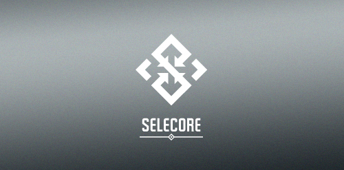
Selecore is company located in Finland, primarily focusing on importing new innovative products and secondary focus is in exporting items produced in Finland. Client wanted serious, modern and strong logo. He also mentioned that he loves when the logo has a hidden feature or message.
In the mark letter "S" is made of arrows pointing inside (import). In the negative space you can see arrows pointing out(export). The negative space also forms a cross which is connection to Finnish flag.
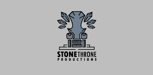
Stone Throne, illustrates royal throne made of stone.
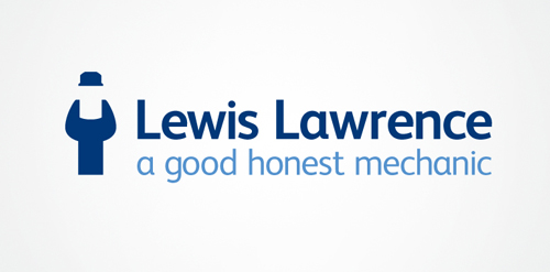
Believing what a mechanic is telling you is always a stretch. But Lewis Lawrence insisted he was good and honest. The mechanic's marque doubles as a spanner and an honest mechanic in overalls, hands held comfortably behind his waist.
sexy shop

Logo design for inbound marketing agency. We used magnet as a symbol of attracting customers through a series of coordinated marketing actions. Additionally, curved bottom edge enhances the impression of attraction. - - - Follow us on www.fb.me/triptic.design
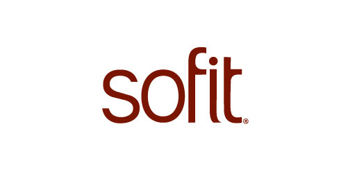
Sofit is a soya based health milk drink. The font characters’ were depicted as thin lean and healthy. The curve on the ‘f’ & ‘t’ makes the identity modern & ownable
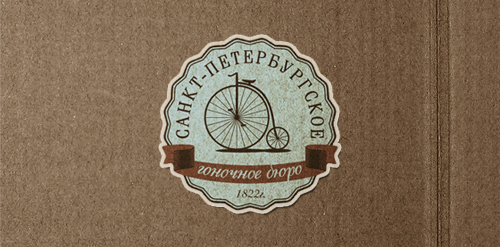
Logo for the company, or rather the workshop, which builds bikes the old-spiders. Penny-farthings. (wrong year)

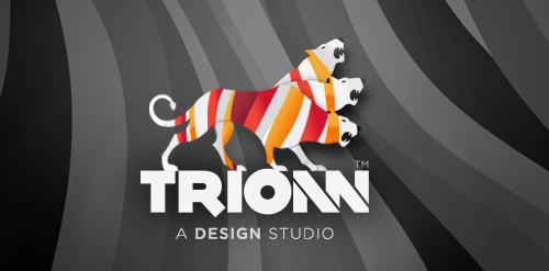
There is one small story behind the meaning of TRIONN DESIGN LOGO Trionn Design is A Design Studio. 15+ years of professional experience in Website design. We are working on HTML5, CSS3, jQuery, UX, UI, RESPONSIVE DESIGN.
☆ HONORS ☆

-
shtef-sokolovich
190 logos
-
Boldflower Design Studio
189 logos
-
Ailton Marques
115 logos
-
Light Rainer
114 logos
-
Alek • Triptic.pl
107 logos
-
almosh82
96 logos
-
sadany
96 logos
-
Duminda Perera
93 logos
-
pizelato™
91 logos
-
Aleksandar
91 logos

Recent comments
حسین:
please send me...
chirag_j:
Hello is the above issue resolved?...
mrgraphics:
great logo...
Aleksandar:
Thank you Gile!...
fraGile:
Thanks a lot!...
Marko Bulatovic:
Great work!...
Popular tags
Our logo inspiration gallery will give you the creative boost you're looking for. Get your daily dose of logo design inspiration to work on your own logo design projects and get your business going. Be amazed by our logo designers and their brand guidelines. We are here to help you impress your clients and our fellow designers. Professionalize your logo design skills and get yourself to a new level. Browse our logo design gallery and discover all the new logo design trends and much more. We know you love logos!