
Logo inspiration
Inspirational logos
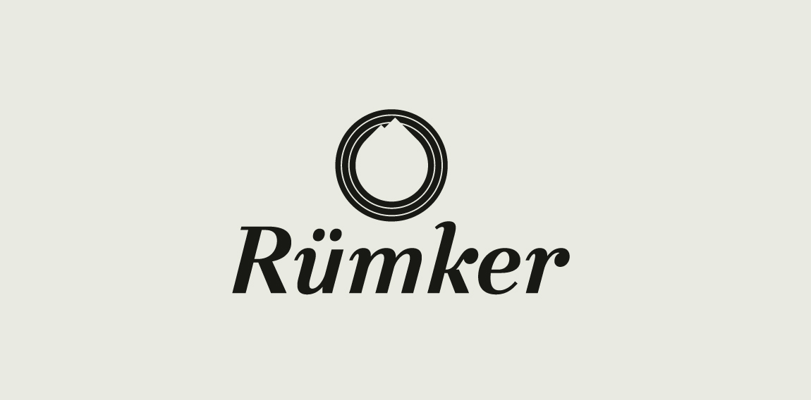
A Montreal based design studio // A mountain on the moon.


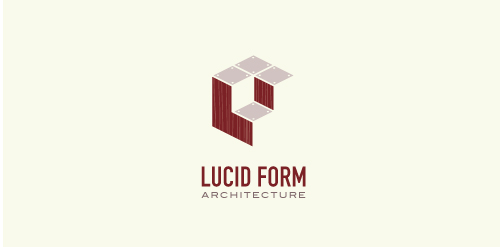
This logo is for a completely fictitious architecture studio called Lucid Form Architecture.
The icon is based on an optical illusion of a cube within a cube. Primarily, the form depicts a big cube, made of wood walls and metal-plated top surfaces, with a notch cut out of the center, resulting in a 3-D "L" shape. However, the longer one looks at this, perception begins to shift, resulting in a couple of different interpretations: 1) a small cube with a wooden wall and metal-plated bottom, in the corner of a room, hovering near the top of a tiled ceiling; 2) a room, tilted 90° clockwise, with hardwood floors, tiled walls, and a cube with a wood countertop and metal-plated side on the floor in the corner. This perception shift is important to the name, because it presents an ironic twist. To make "lucid" means to make clear, and while the icon seems to initially baffle and confuse, it ultimately encourages the viewer to challenge his or her preconceived notions of "perception." So too is the Lucid Form methodology for creating seeming impossible structures.
For sale.
Logo for Green Valley Tractors. They have an upscale vineyard, sell agriculture equipment and kubota tractors.
Logo for premium travel agency, who organizes yacht cruises.
Logo was created for Slovak yoyo nationals in 2014.
Logo for music store.
"E-sun" is a sunny brand.
logo for an art gallery based in mexico.
Southeastern Homeschool Sports Athletics Logo
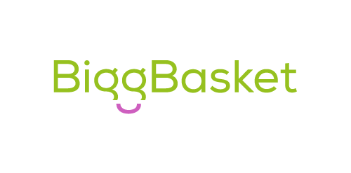
The idea behind comes as follows: BiggBasket is an online grocery retailer so the logo mark must represents/include ‘A Happy Smile of A Customer’. The customer is happy from their hassle free service and great quality of products to buy online. Also the logo mark should be simple yet very impressive and spread the message of client’s focused and professional approach towards their customers which finally resulting into happy and smiling customers.
Branding identity for Risorgimento di Milano
https://www.behance.net/gallery/34442955/Spiritual-Wisdom-Americas «Spiritual Wisdom Americas nace en la Montaña Sagrada del Ausangate, Perú, en Julio 2011, en un viaje de búsqueda de visión, donde en cada paso hay un diálogo directo con la Sabiduría de la montaña y sus Guardianes»
Minternet, is the Web Design and Development company from Mike Munro. The logo has been designed to represent communication and collaboration between developer and client to create a diamond product. Within the negative space, directional arrows split to represent web development.
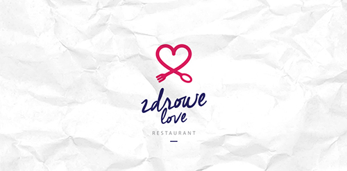
Zdrowe Love Restaurant. Restaurant with a healthy and natural food.
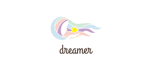
Dreame achived.
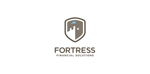
Proposed logomark to a financial advisor.
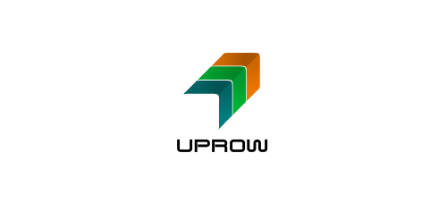
Uprow
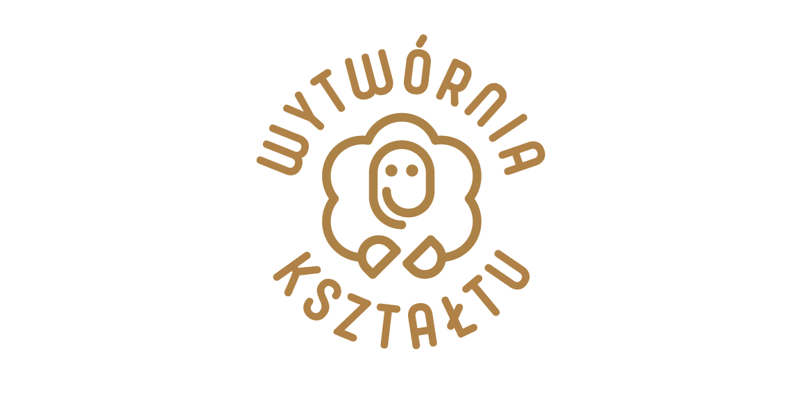
The logo design for the ceramics atelier had to be a simple and one-color symbol, allowing it to be embossed in clay. The owner wished also for it to have a friendly and carefree spirit. Her answer to a aptly posed question lead us to the motif of a smiling sheep, characteristic of her work. I showed the sheep en face, instead of a profile, like she appears usually, and I gave her hooves gestures of creative activity. It accounted for a highly inviting, distinctive and memorable mascot logo in a form of a seal.
Concepts design for a School Newspaper reporting website.
☆ HONORS ☆

-
shtef-sokolovich
190 logos
-
Boldflower Design Studio
189 logos
-
Ailton Marques
115 logos
-
Light Rainer
114 logos
-
Alek • Triptic.pl
107 logos
-
almosh82
96 logos
-
sadany
96 logos
-
Duminda Perera
93 logos
-
pizelato™
91 logos
-
Aleksandar
91 logos

Recent comments
حسین:
please send me...
chirag_j:
Hello is the above issue resolved?...
mrgraphics:
great logo...
Aleksandar:
Thank you Gile!...
fraGile:
Thanks a lot!...
Marko Bulatovic:
Great work!...
Popular tags
Our logo inspiration gallery will give you the creative boost you're looking for. Get your daily dose of logo design inspiration to work on your own logo design projects and get your business going. Be amazed by our logo designers and their brand guidelines. We are here to help you impress your clients and our fellow designers. Professionalize your logo design skills and get yourself to a new level. Browse our logo design gallery and discover all the new logo design trends and much more. We know you love logos!